7 Days of UI Design Challenge
Figma | Prototyping | After Effects | Photoshop | Adobe Illustrator
The 7 days of UI Design was a personal challenge I set myself following the completion of the Daniel Scott Advanced Figma training course. Offering both personal and professional development, the challenge allowed me to apply my new skills whilst advancing my thinking and design skills across a range of real-world design tasks.
The daily brief through ChatGPT provided details of the task, along with some background context. While my outcomes reflect the brief, industry and explorations within each, they are not intended as complete branding-driven outcomes, but UI and UX design-focused tasks.
Day One - The Login Page
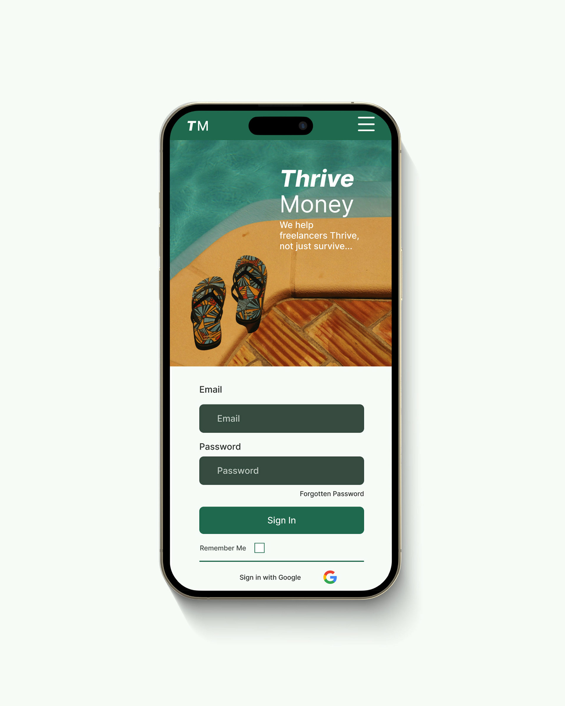
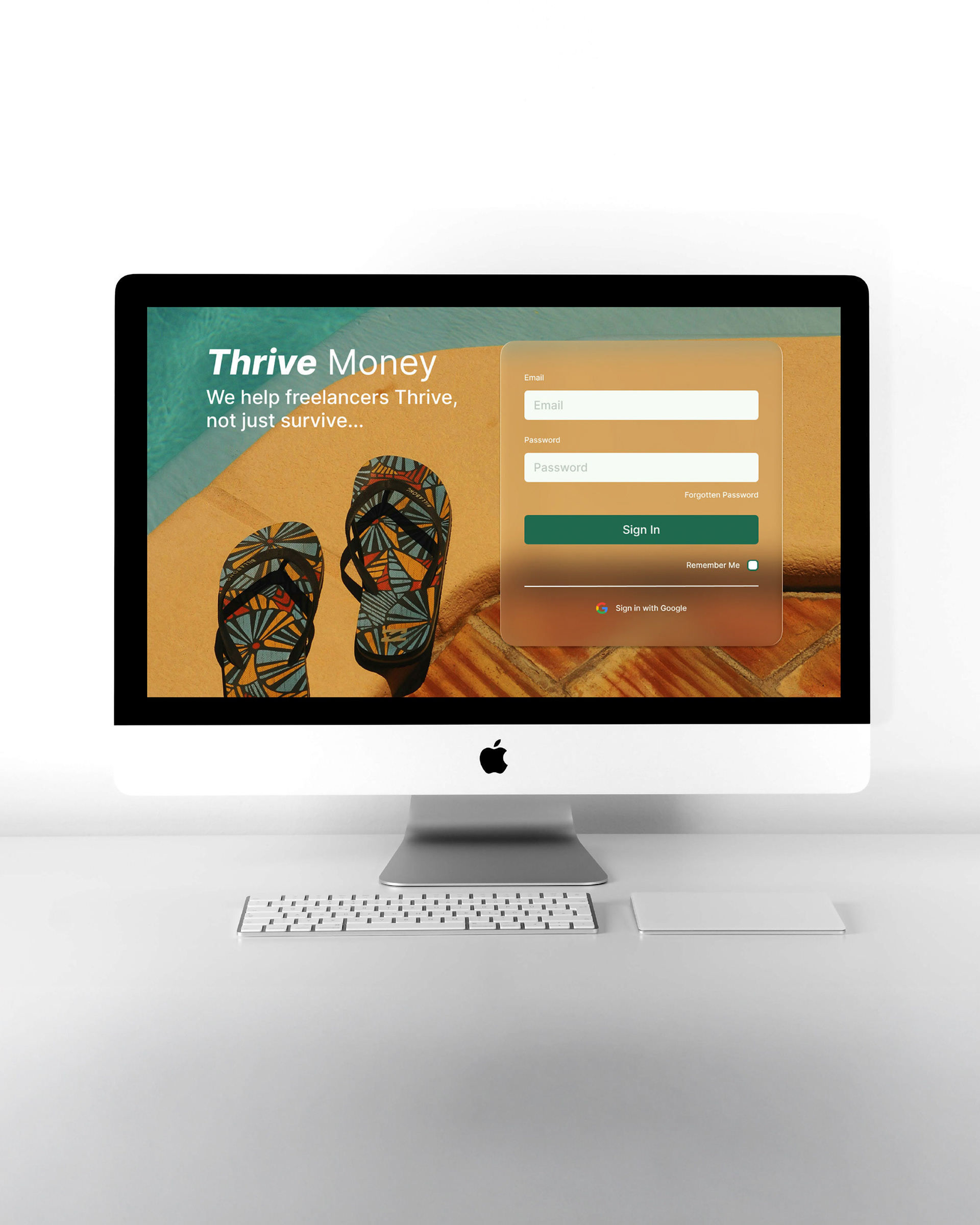
Context: Design a customer login page for a fintech business that helps freelancers with their admin and invoices. Consider error states and alternative login methods.
Task: The login page needed to function cohesively and responsively across desktop and mobile, while further exploration and research of the error states was needed.
Action: Thrive Money positions the app as a way for freelancers to regain lost time for themselves. The design was applied for both mobile and desktop, responding to these different design spaces, without losing their visual cohesion and usability.
Results: Advanced animation through the application of component sets and variables to animate text fields, highlight error states and enhance user affordance through button animation.
Day Two - Customer Dashboard
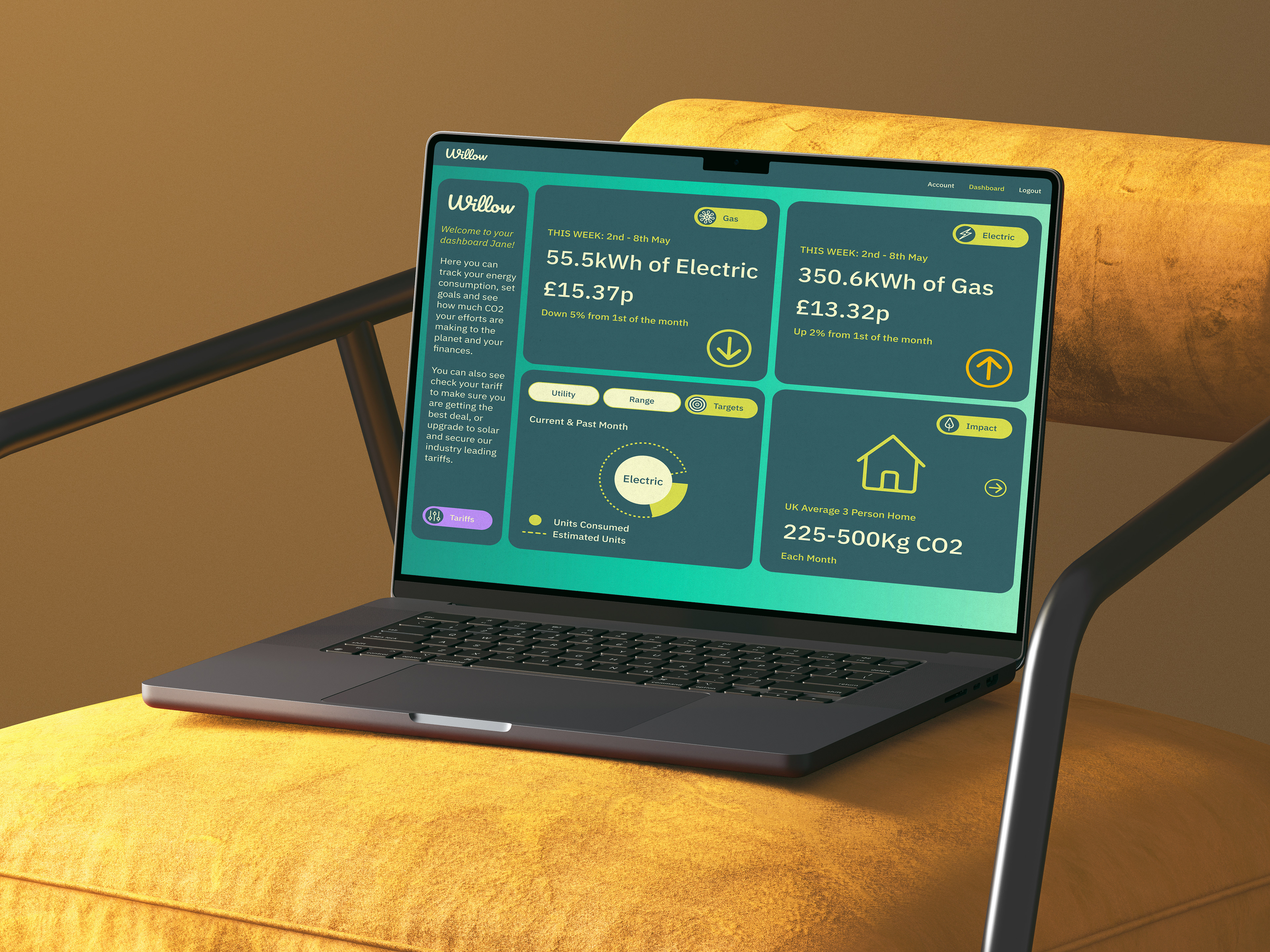
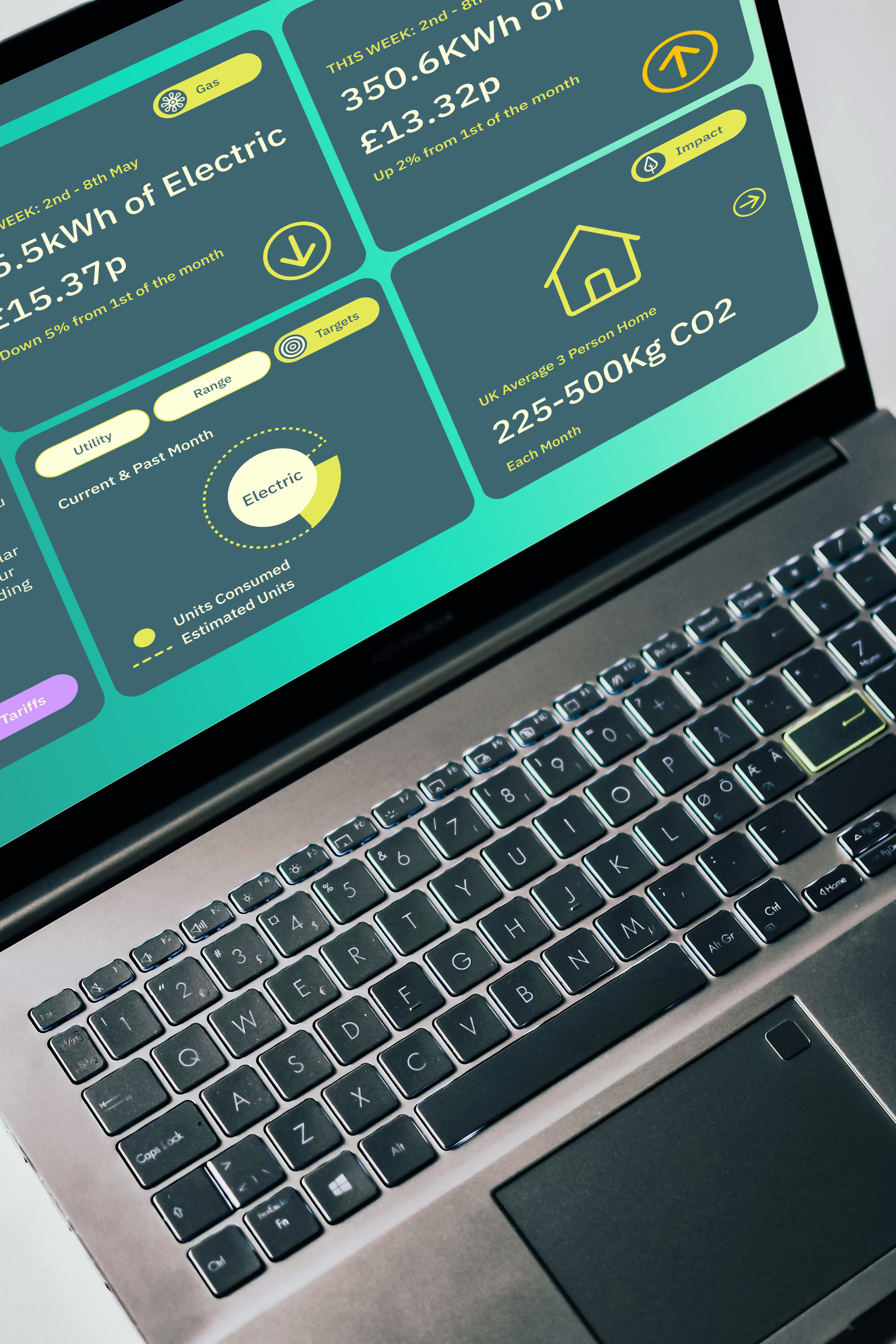
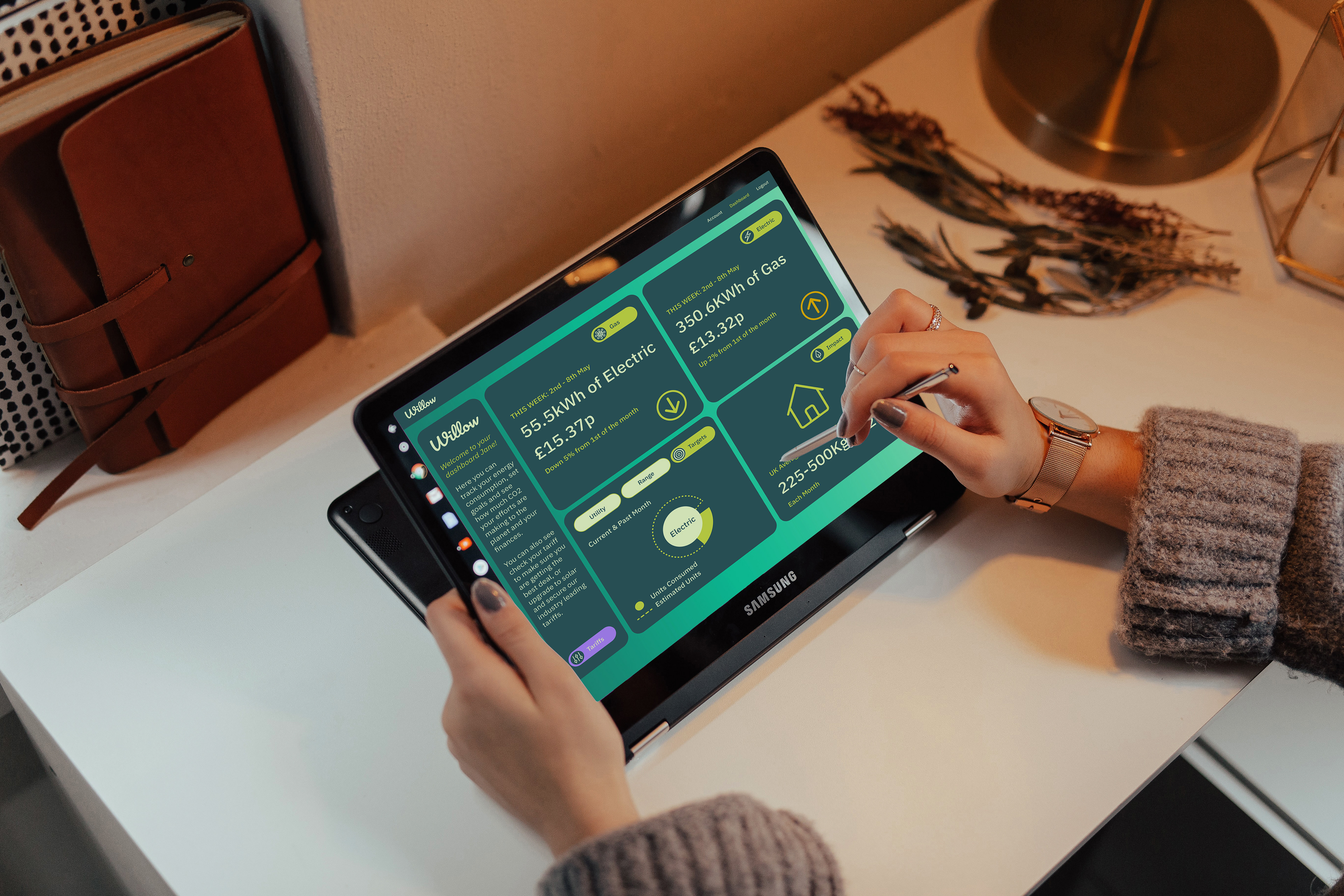
Context: Design a customer dashboard for a sustainable energy provider.
Task: The login page needed to identify savings and usage through a clear hierarchy and visualisation of the data. Accessibility of the design was important, as was a clear pathway for switching tariffs.
Action: The Willow dashboard offers customers a clear global view on their energy consumption with data points shared in several ways, such as percentages, charts and graphics. The interactive dashboard allows customers to explore their energy usage in different ways and contexts, while also encouraging them to adopt energy-saving steps, through consumption awareness, environmental impact and tariff selection.
Results: New exploration of drop-down menus and animation through Component sets. Applied overlays and navigation buttons to bring interactivity and expand visualisation and engagement. Ensured all elements achieved AA standards for accessibility.
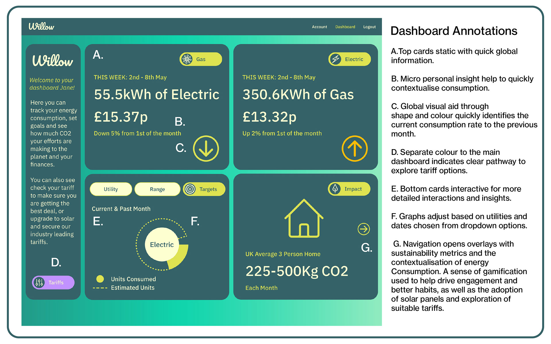
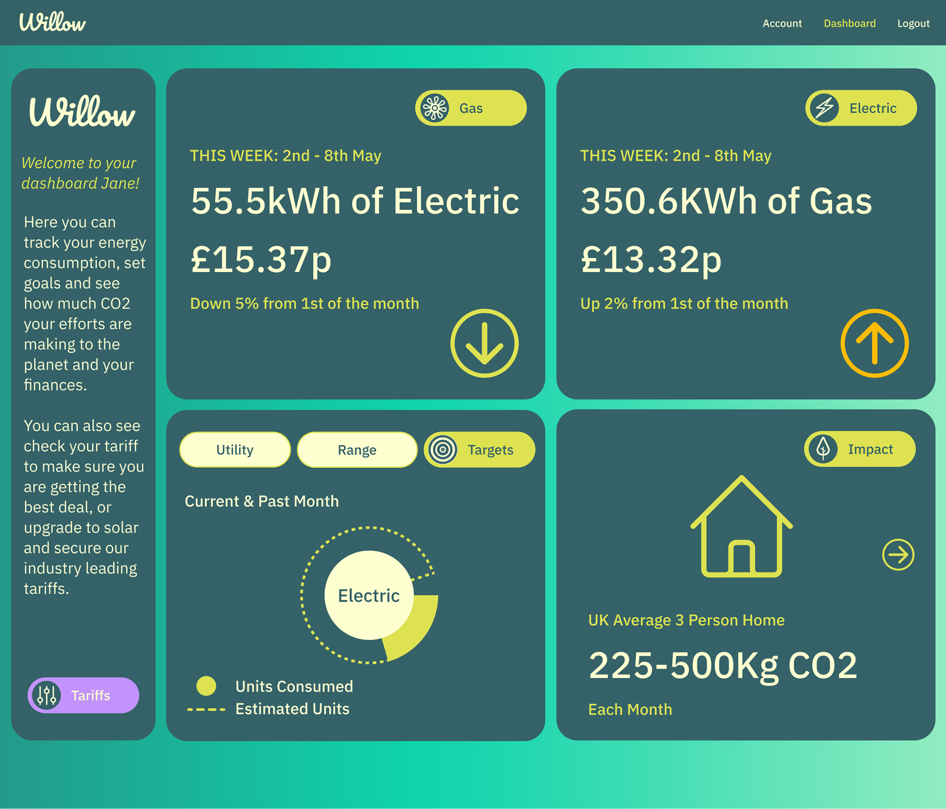
Home Page
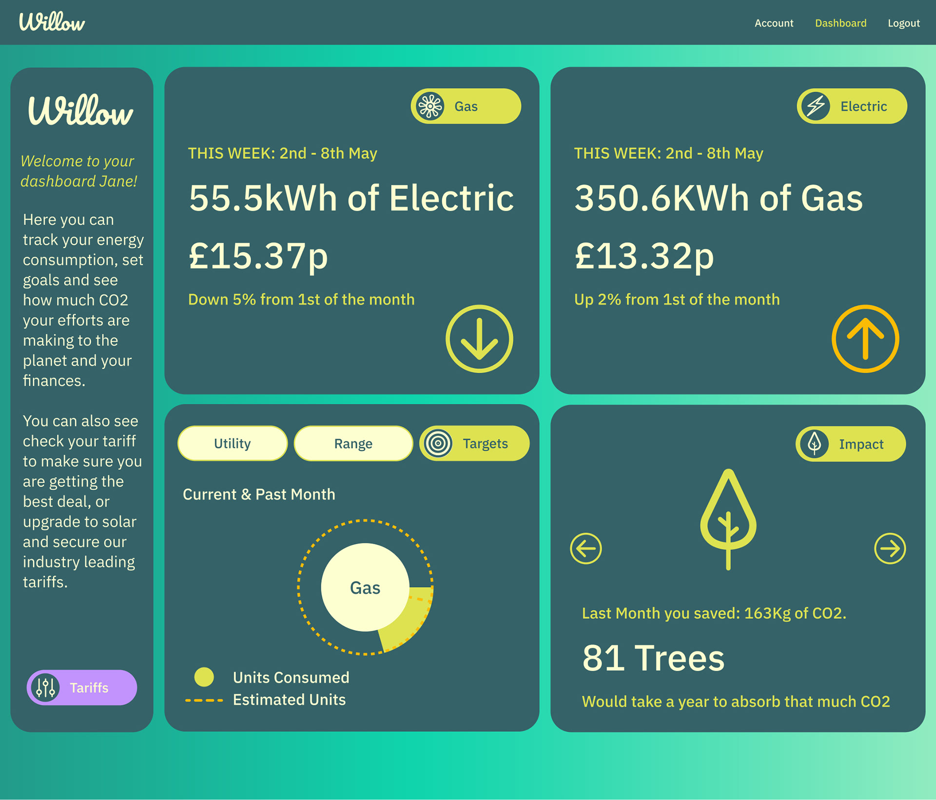
Alternate Utility Chart & Impact Graphic (bottom left & right).
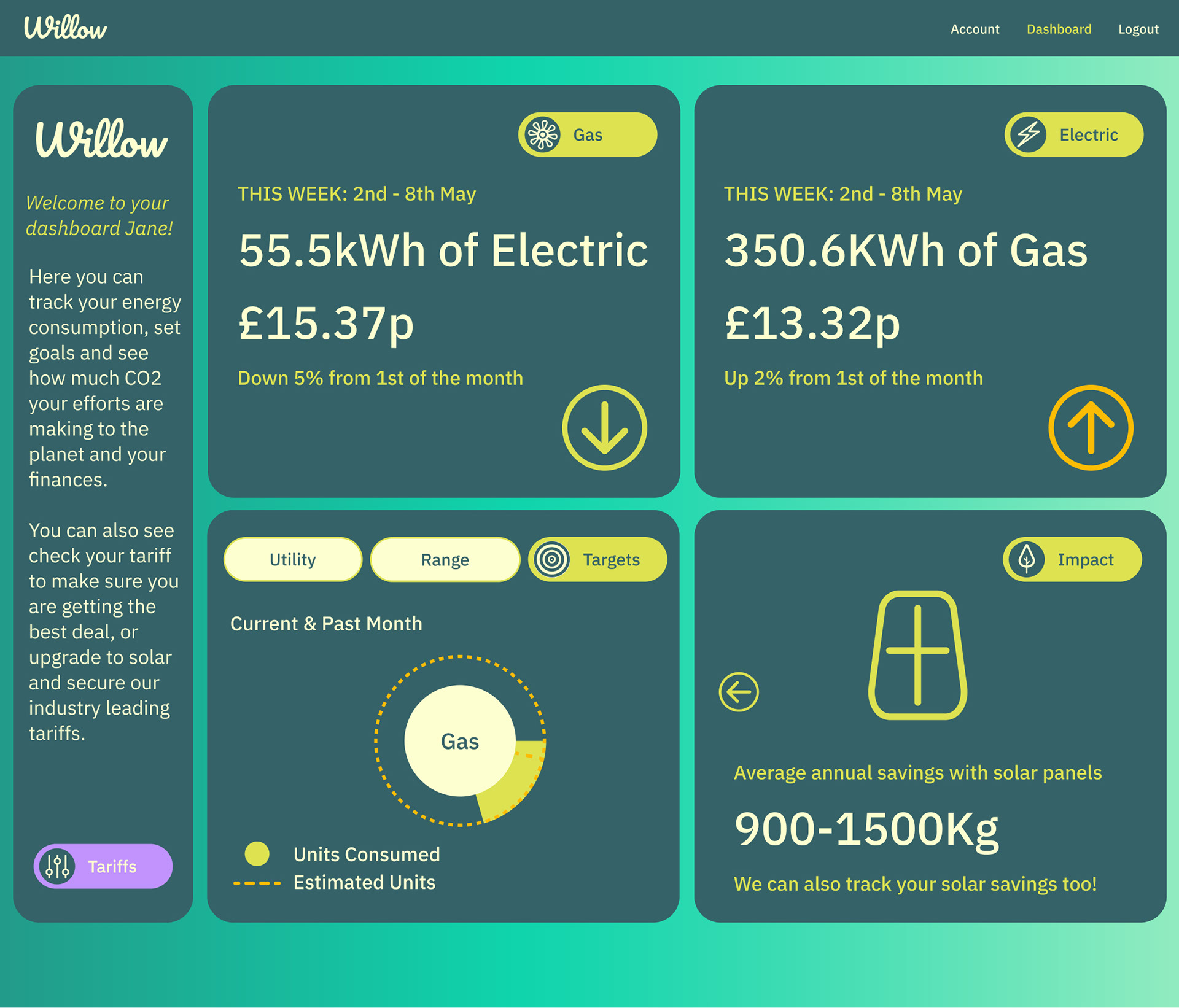
Alternate Impact graphic - bottom right.
Day Three - Booking Flow
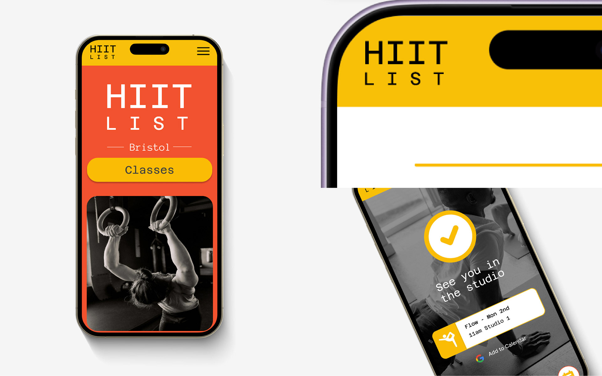
Context: A boutique fitness studio with limited capacity delivering High intensity interval training based classes.
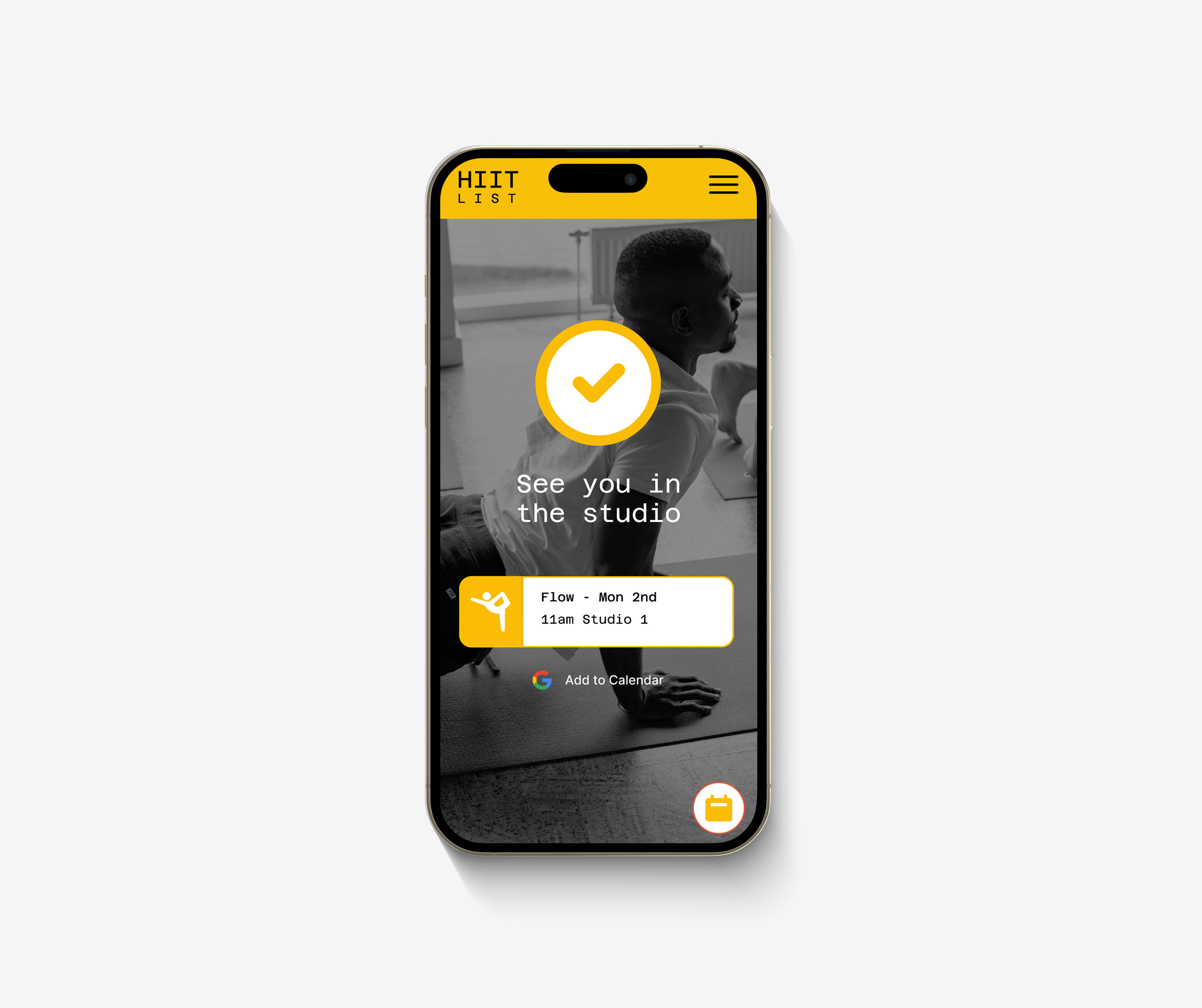
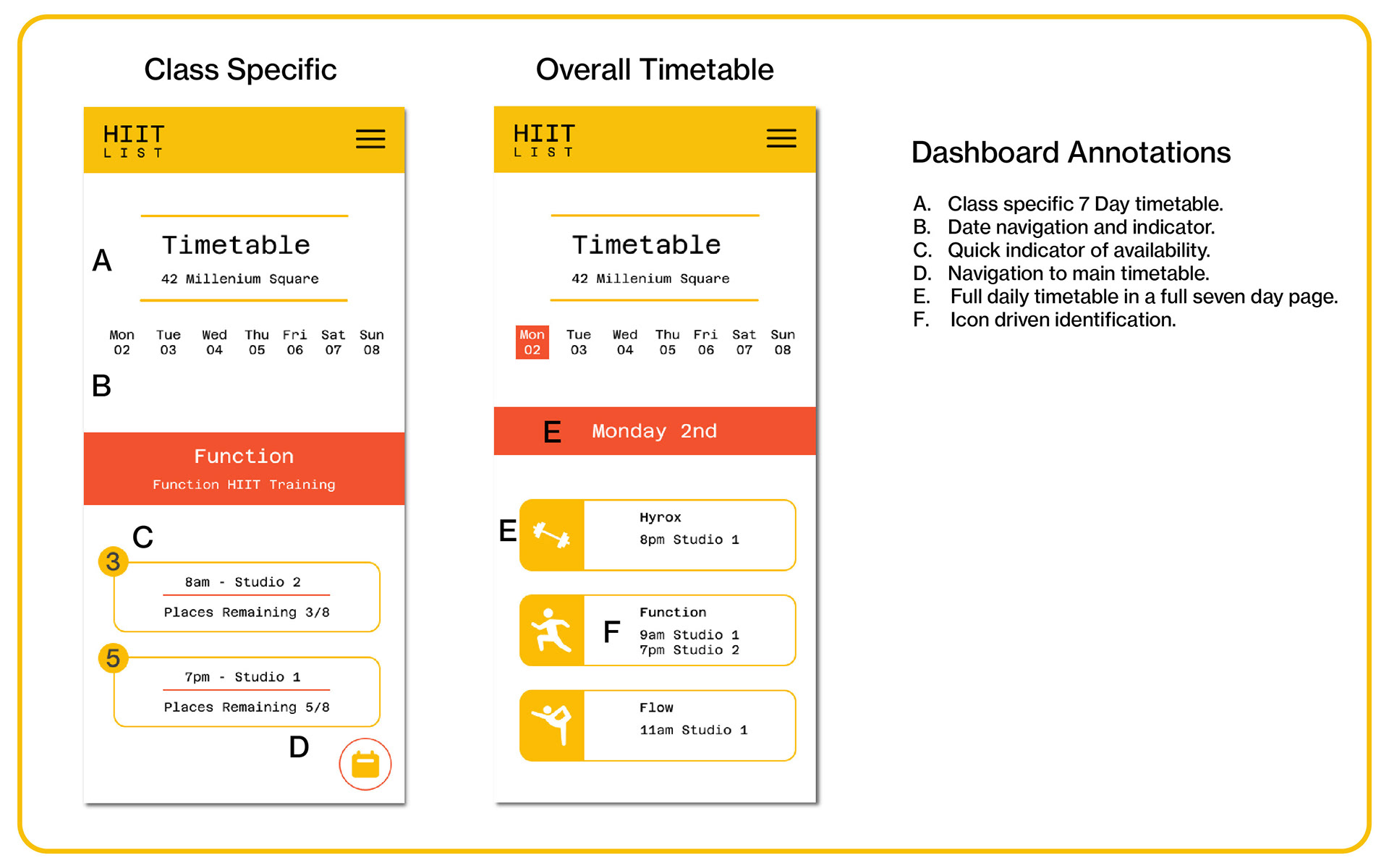
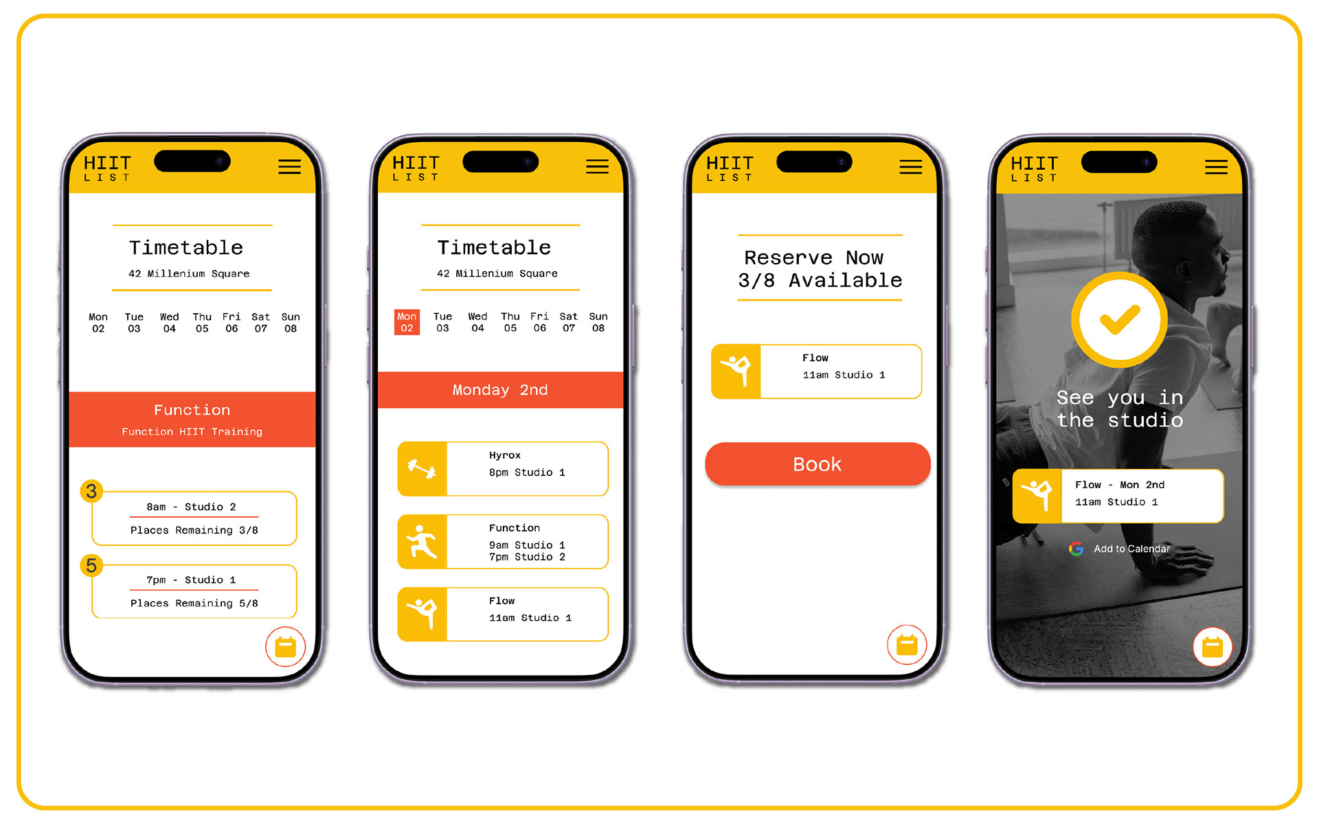
Task: Create the class booking userflow (mobile). Attention needs to be paid to the visibility and availability of class places, wait lists and ease of calendar usability, along with a clear confirmation to limit no shows.
Action: The UI design is clean and clutter-free with a strong emphasis on user navigation from multiple touchpoints to shorten the time needed to book a class. This was done from the perspective of booking your first class, a specific class, date, or browsing the overall availability. Final confirmation incorporates Google Calendar integrations and a separate confirmation page, while availability was approached through corner badges for quick referencing.
Results: Progression of my systems thinking and how a simple task, such as booking a class, can be approached by different stakeholders in a range of ways. The outcome aims to address these approaches and would be an important part of my user testing to establish the gap between assumptions and usability.
Day Four - Fully Responsive Design
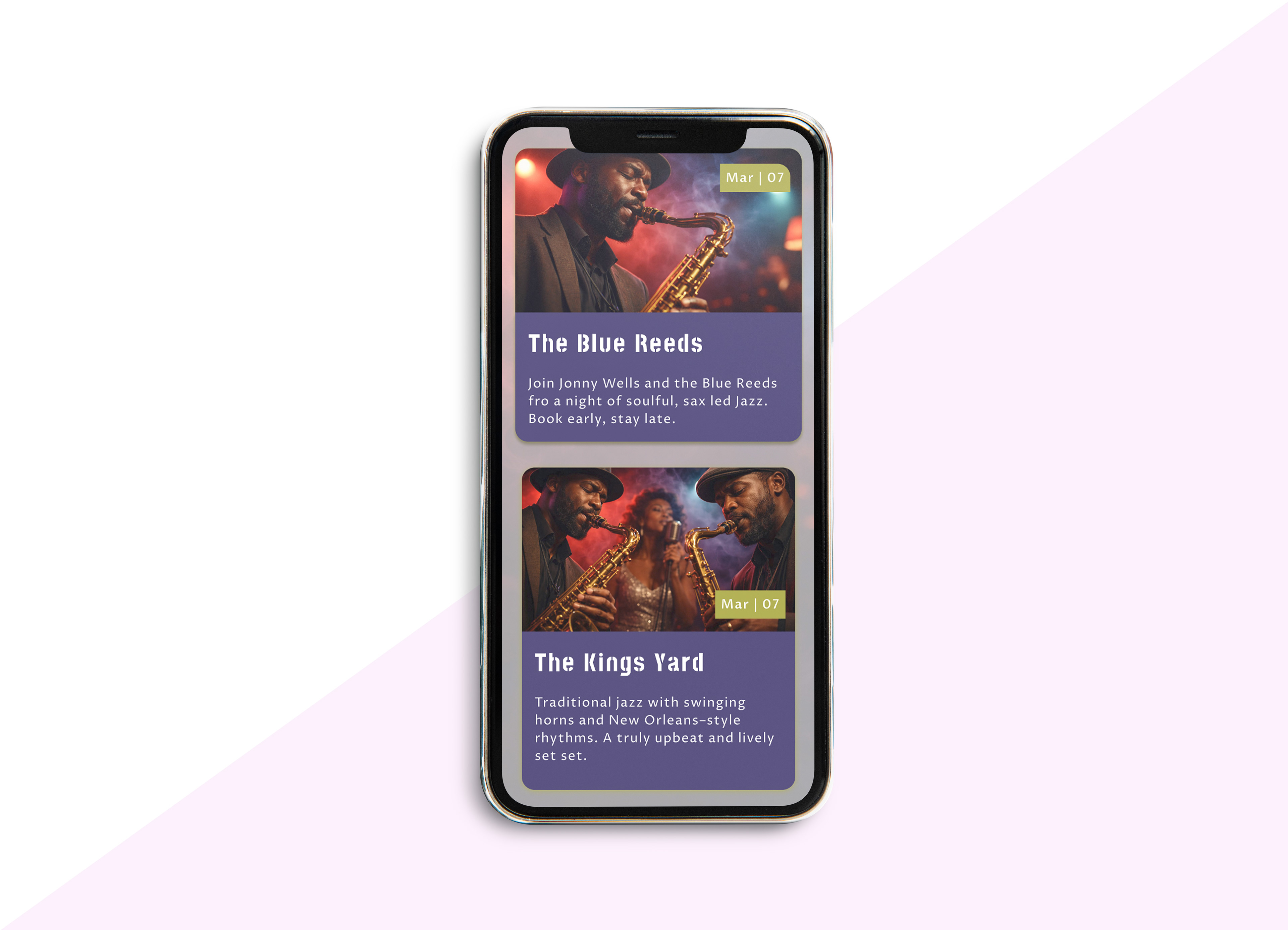
Context: Create a UI card for a live events venue. The event card will be editable as the performers change, so it must be suitable for a range of bands and performers, whilst accessible across a range of devices.
Task: Create a consistent customer experience, cross-device and cross performance/ band being showcased.
Action: The design showcases the event through image, although this could also be video. The date is presented clearly within the hierarchy, while the band name leads the secondary information to facilitate booking.
Results: This outcome helped me apply both my responsive Figma skills and autolayout, but also the application of the 8 point grid for the developer's needs. Within the task, I applied Ai skills to generate placeholder imagery and text to better contextualise the outcomes with a client or user testing..
Day 5: Business Dashboard
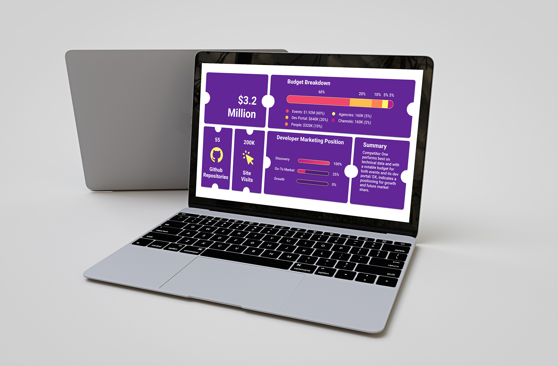
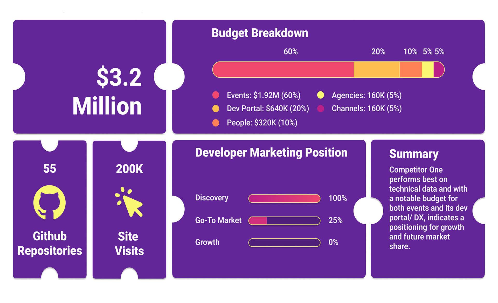
Context: Create a one page summary dashboard from a data set to communicate a Live event ticketing company's marketing position.
Task: Data visualisation and contextualisation. Working within a provided set of brand guidelines and data to create a clear visual summary of their marketing and budget position at a glance.
Action: This task was about the clear hierarchy of the data set and providing a clean overview with a quick to digest layout and visualisation. Rather than interactivity, I focused on layout and contrasting the design elements clearly to provide flow within the data, making it easy to digest and cross referecne.
Outcome: An understanding that systems thinking and classic design skills, such as hierachy also play a central role in UI/UX design and that these traditional skills still hold an important place in this digital and interactive design space.
Day Six: Video Player
Context: Create an integrated video player that can be embedded within a website to help a business showcase its digital content.
Task: Presenting digital video content in a way that enhances the user experience and that is not lost within the wider page/web content.
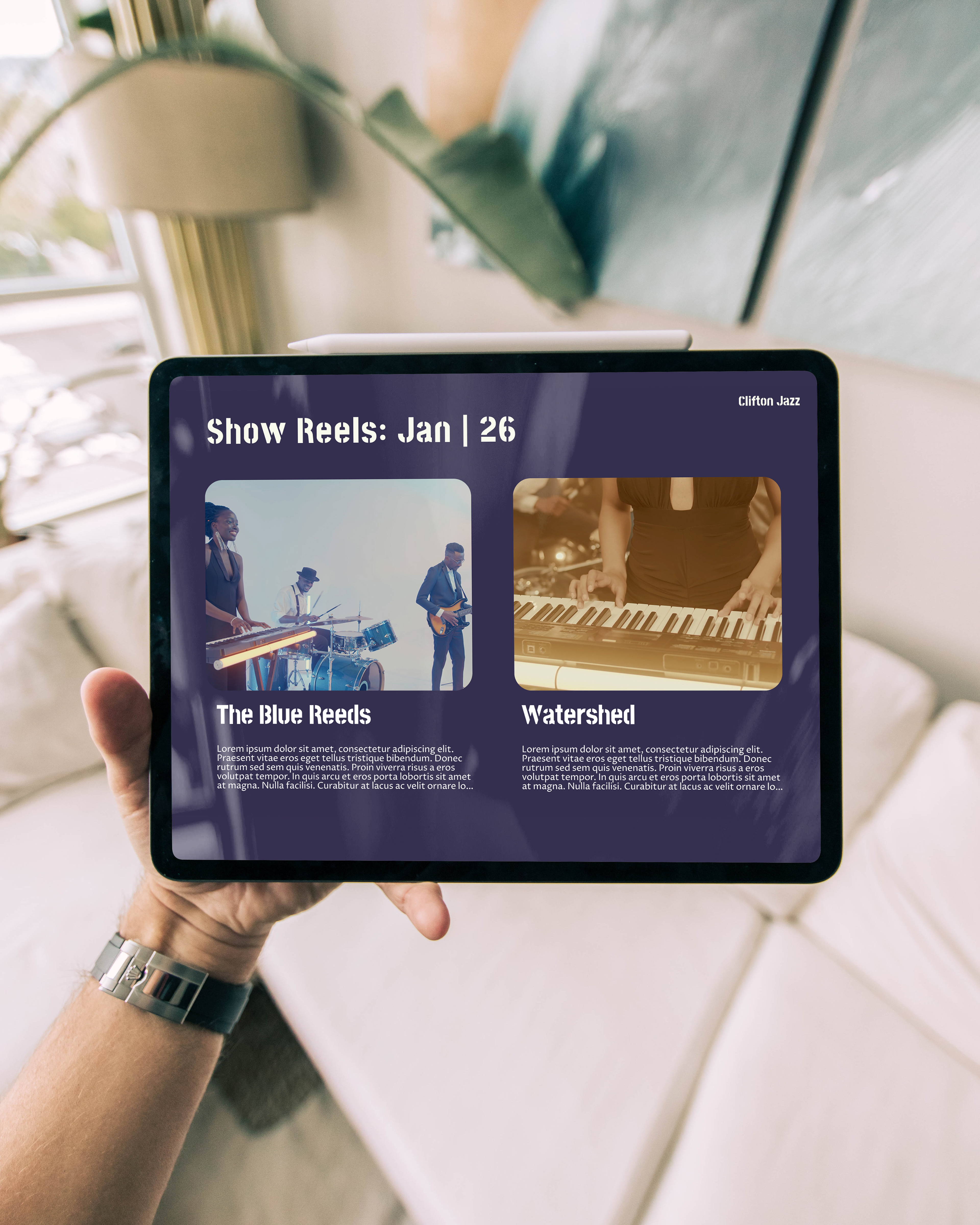
Action: Creating a dedicated show reels gallery communicates clearly that this is an interactive space. Current reels could be pulled through to the homepage, but here content is given more space to breathe. Videos do not autoplay, but expand out to create more immersive, intentional experiences for users.
Results: I applied more complex animation overlay techniques and sequencing to achieve a clean outcome, while also exploring anomorphic glass effects. The project also allowed me to apply Ai generative video skills through Gemini to help provide working prototypes and better contextualisation for clients and user testing.
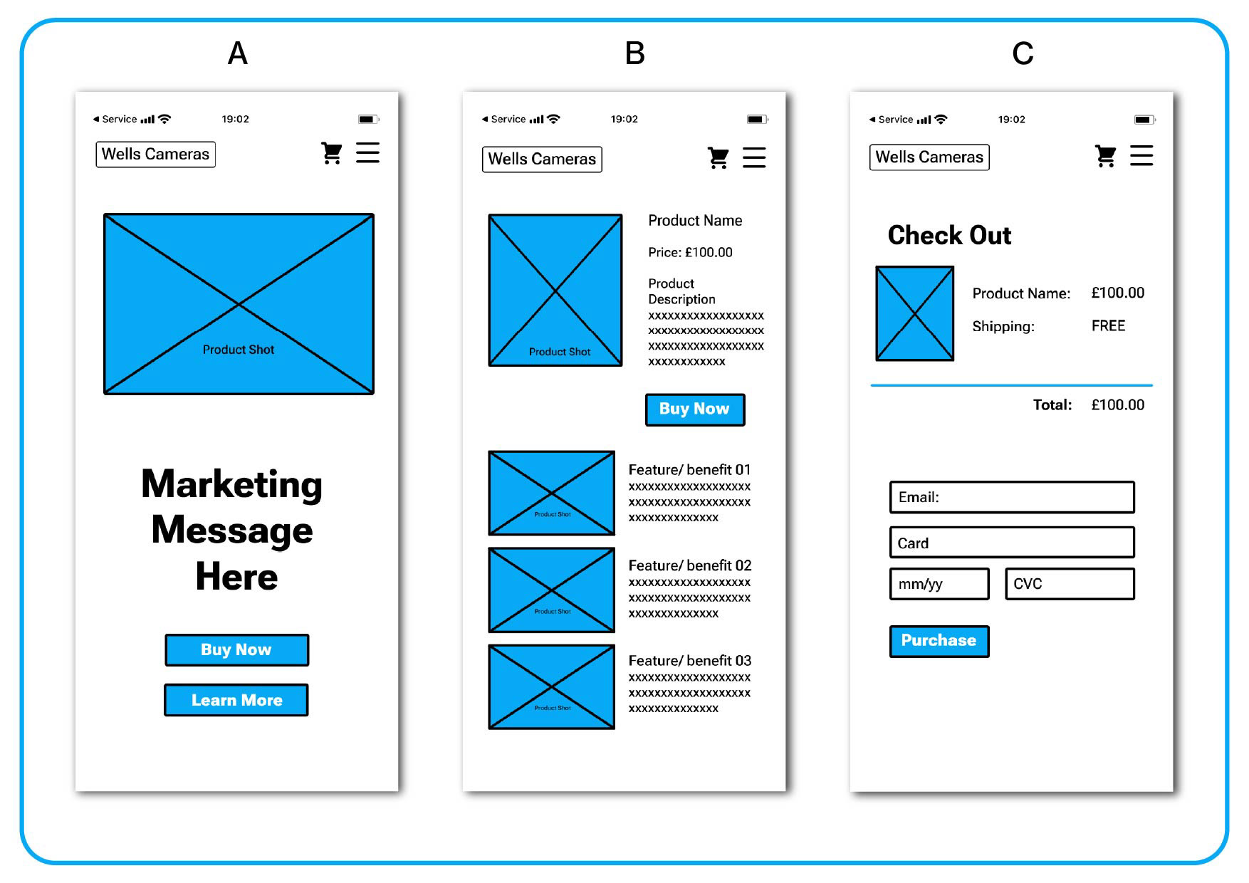
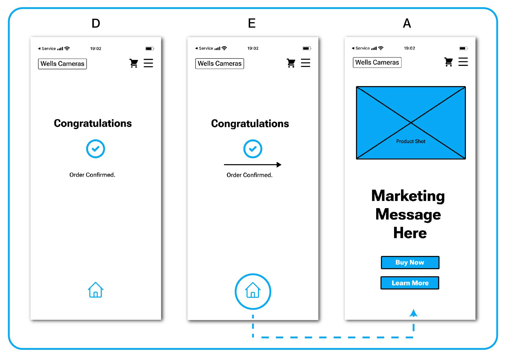
Day 7: E-Commerce Wireframe Prototype.
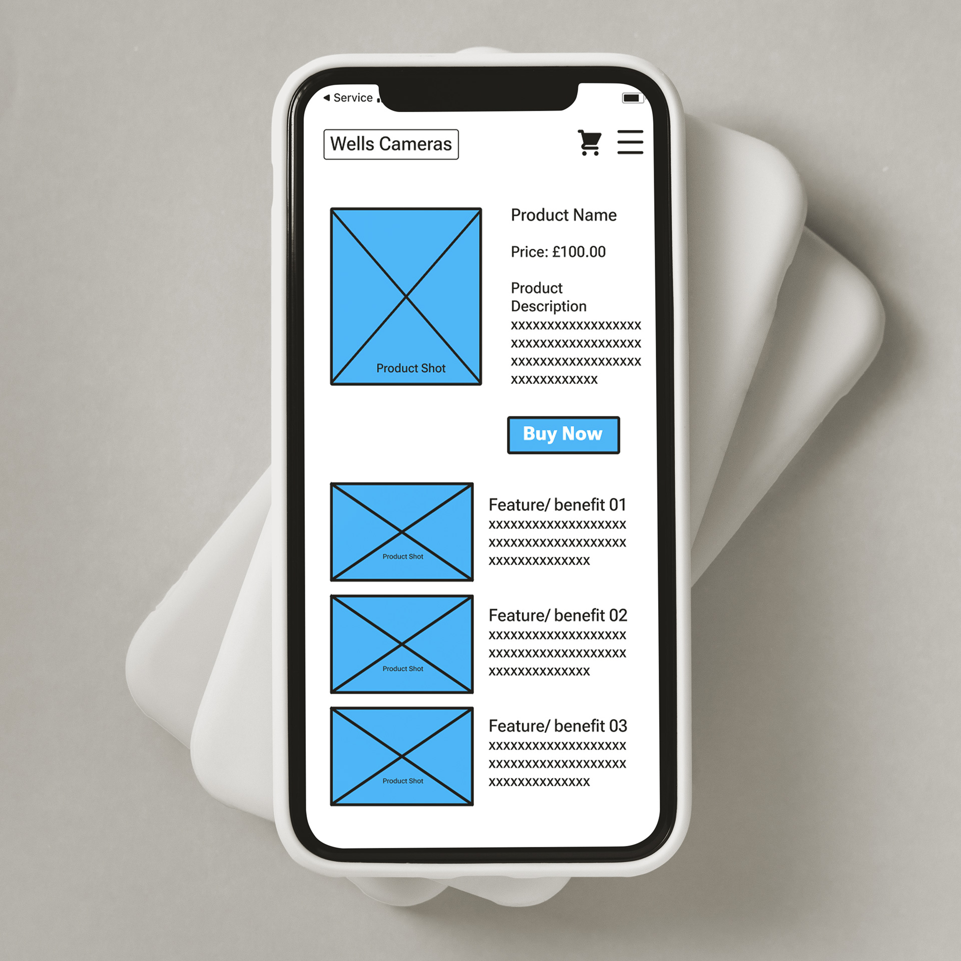
Context: Create a wireframe to demonstrate to a business owner how their customers will navigate their new online platform's sales process.
Task: A clean, low-fidelity design that allows the core user flow to be tested and experienced within user testing and by the client.
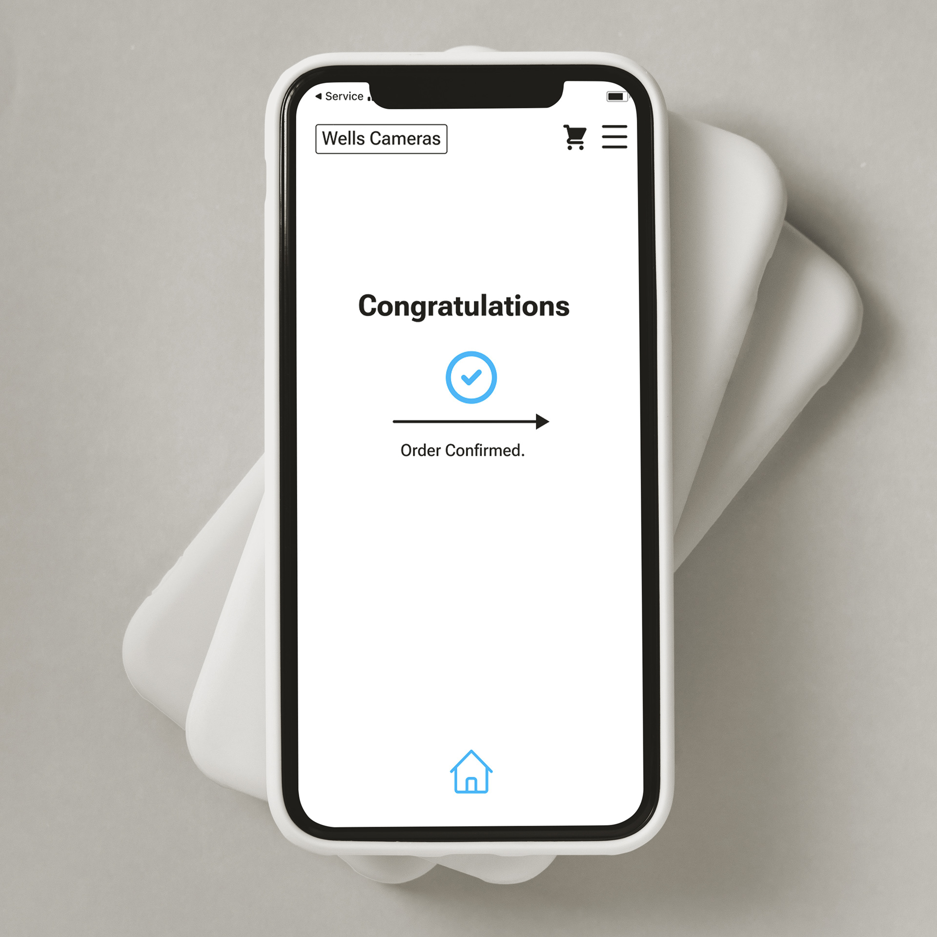
Action: The design focuses on the hierarchy of key design elements and brings together the end-to-end experience without overly fussy design applications, images, or colour. The final animation is simple, but indicates an affordance with the end of the process.
Results: Stripping back the information was harder than expected initially, but allowed me to consider the essence of the design needs, the user flow and gaining client buy in, or opening up conversation earlier in the process. Knowing where to stop on elements was a helpful thinking process in keeping my outcomes concise and on brief. The colour I used could be the main colour of the brand, helping the client associate with the ideas, but not crowding out the wireframe it is sharing.