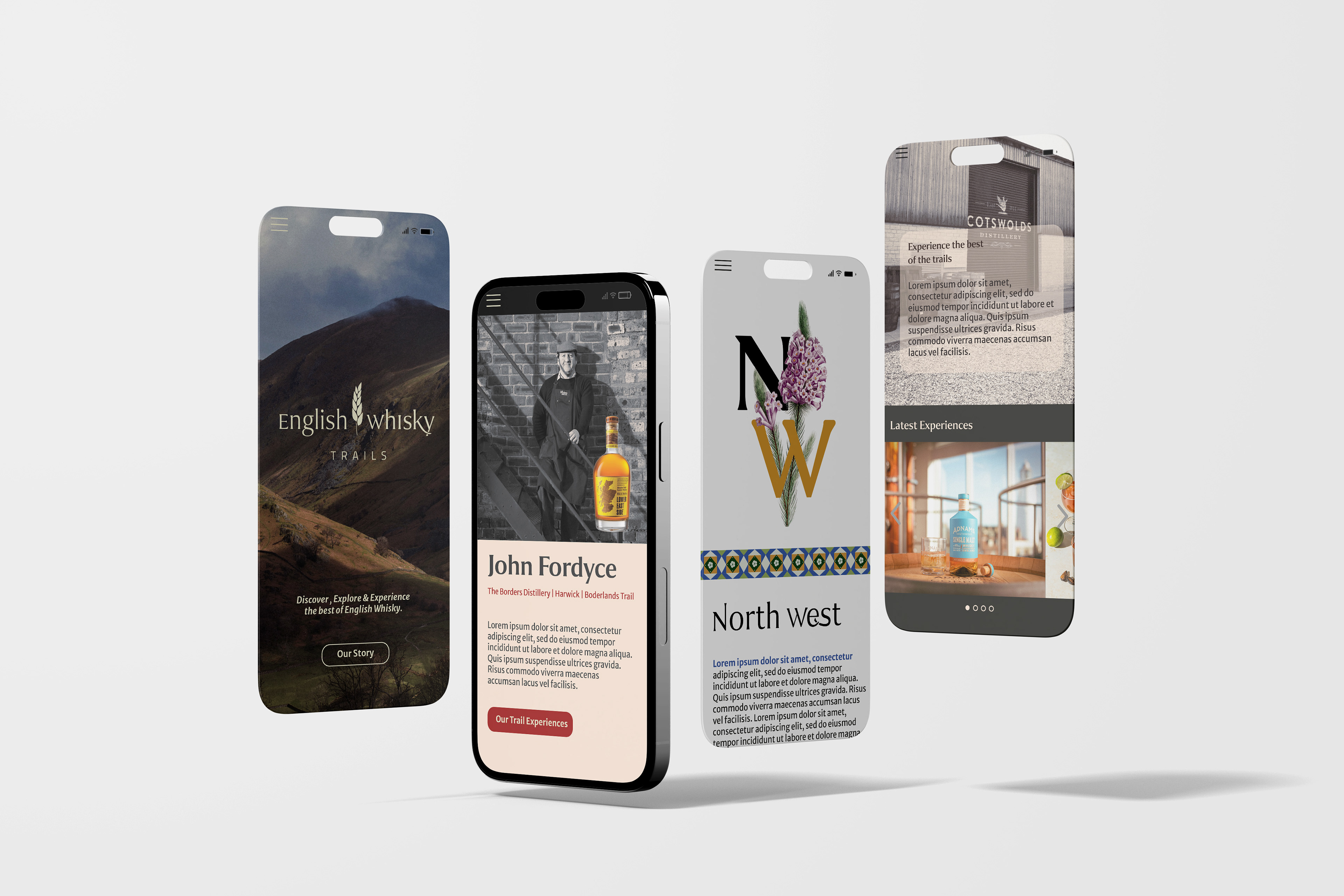
Client: The English Whisky Guild - members' organisation
Client management | Cross industry interviews & research | Userflows | UI/UX Design | Wireframes | High Fidelity Prototypes | User Testing | Animation | Video Editing | Image Editing & Colour Grading | Figma | Lightroom | Photoshop | Premier Pro | After Effects | Illustrator.
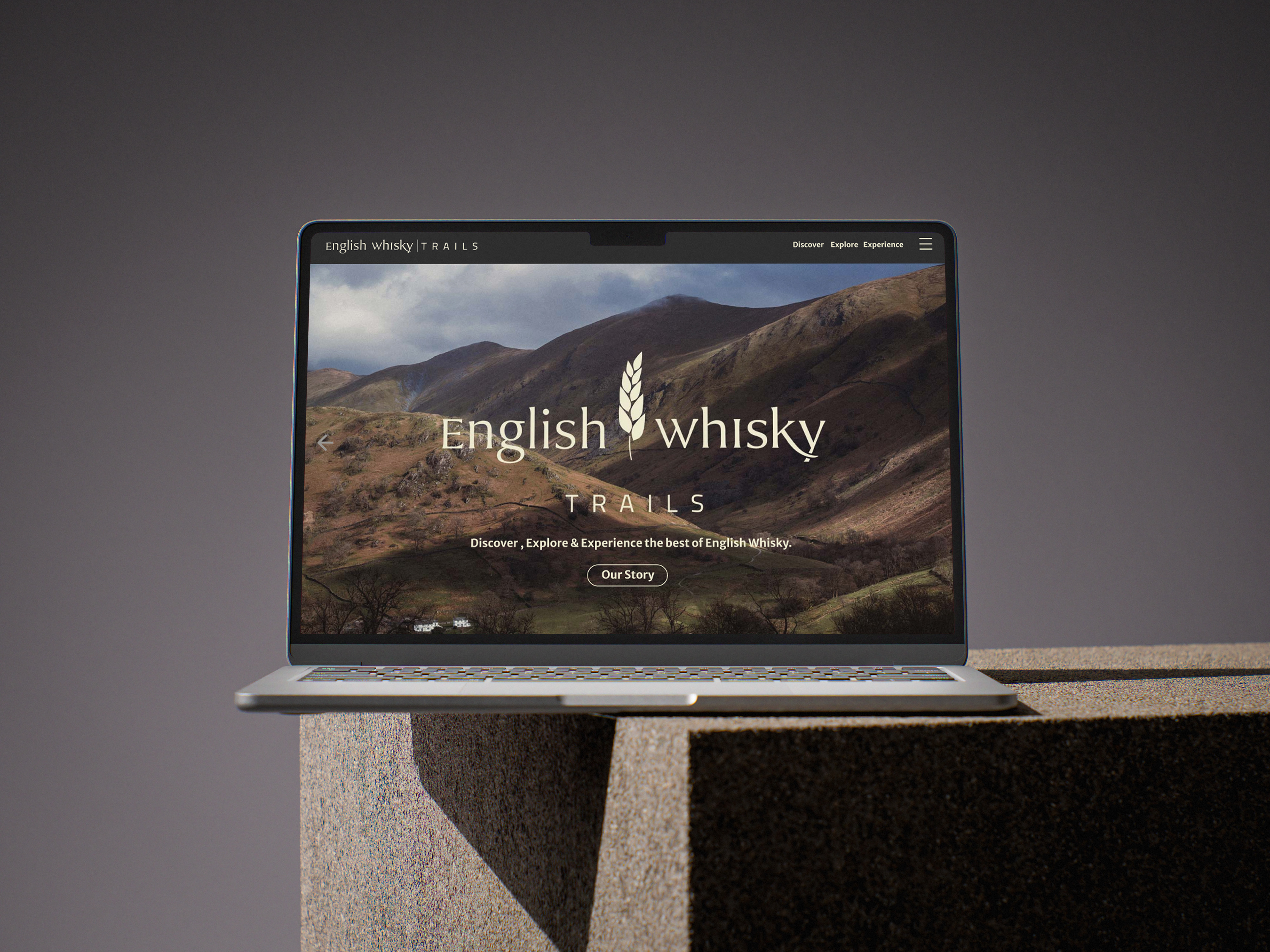
The English Whisky Trails are set to be the leading tourist and customer entry point to the burgeoning yet already highly decorated sector.
The new visual identity, which celebrates English whisky and its regions from the perspective of the pioneering founders, is targeting a commercial launch in spring 2026. The visual identity can also be found within my portfolio, whereas here I will outline the web design for the trail itself.
Design Thinking & Purpose
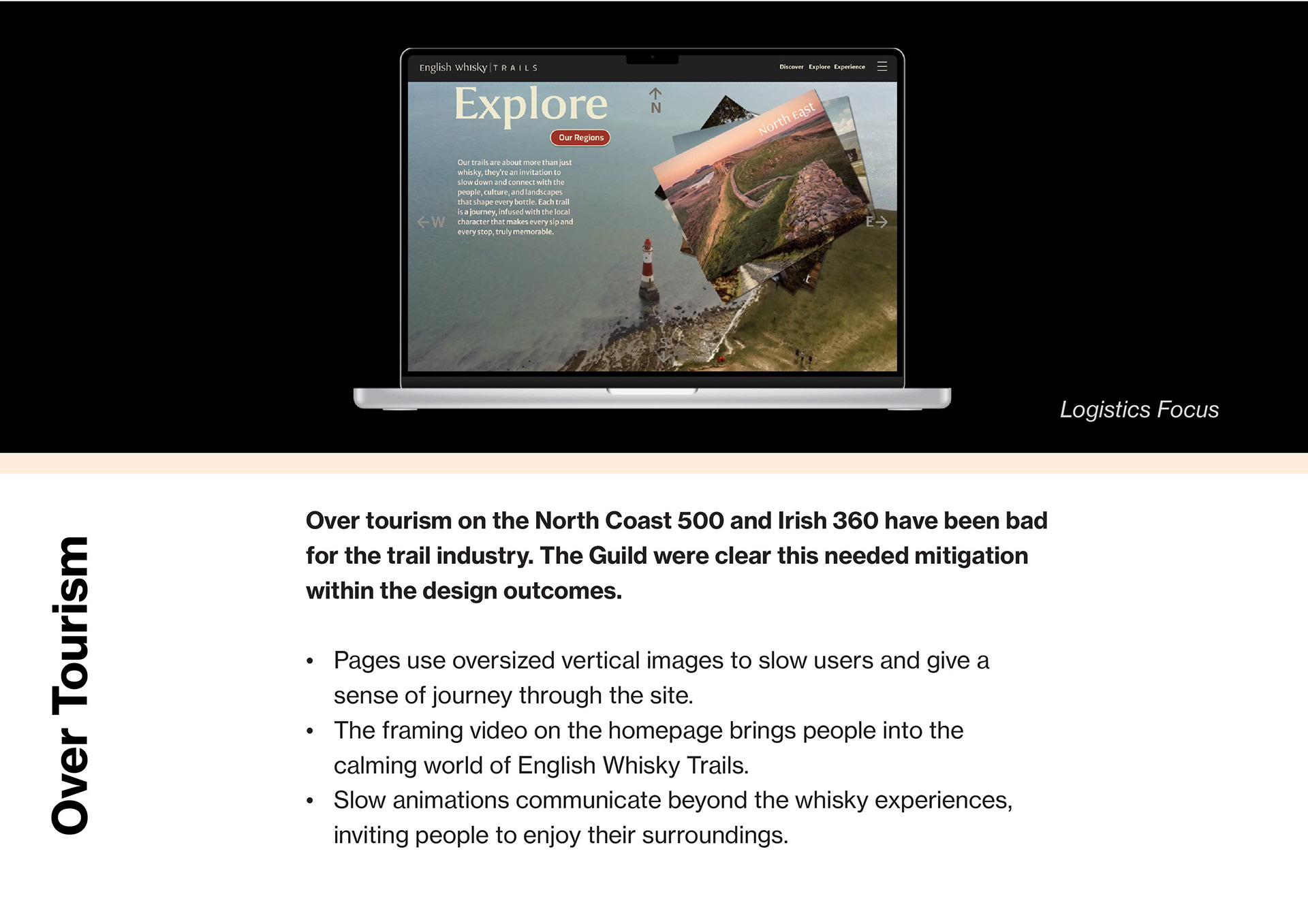
The English Whisky Trails present an interesting paradigm; the trail infrastructure is all online and managed by the English Whisky Guild, while the physical experiences are delivered by the distilleries individually. This is not a separate tour company, but a marketing funnel to move visitors through the website, and connect to whisky experience/s that are then booked directly. The trail needed to increases foot fall to the distilleries alongside revenue, seeking to mimic the success of the North Coast 500 and Irish Whisky 360, which have been successful at generating global interest. For the Guild, the trail will support its members by grow brand recognition, whilst also aiding membership retention and bringing more distillers under the EWG banner.
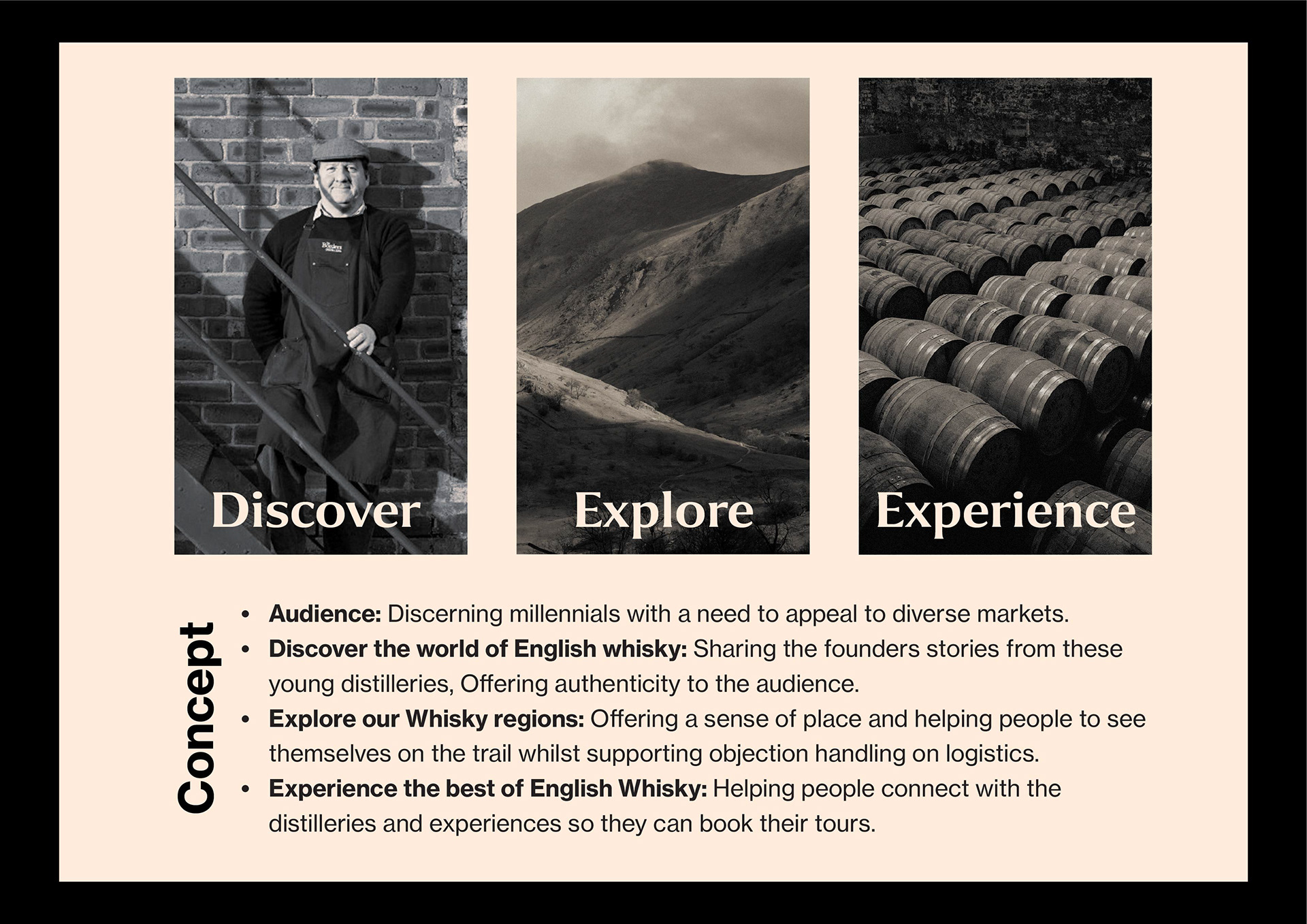
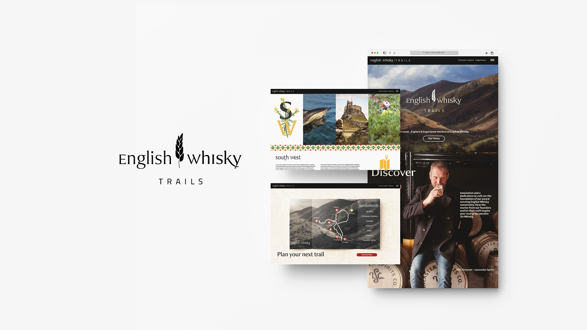
Website Overview
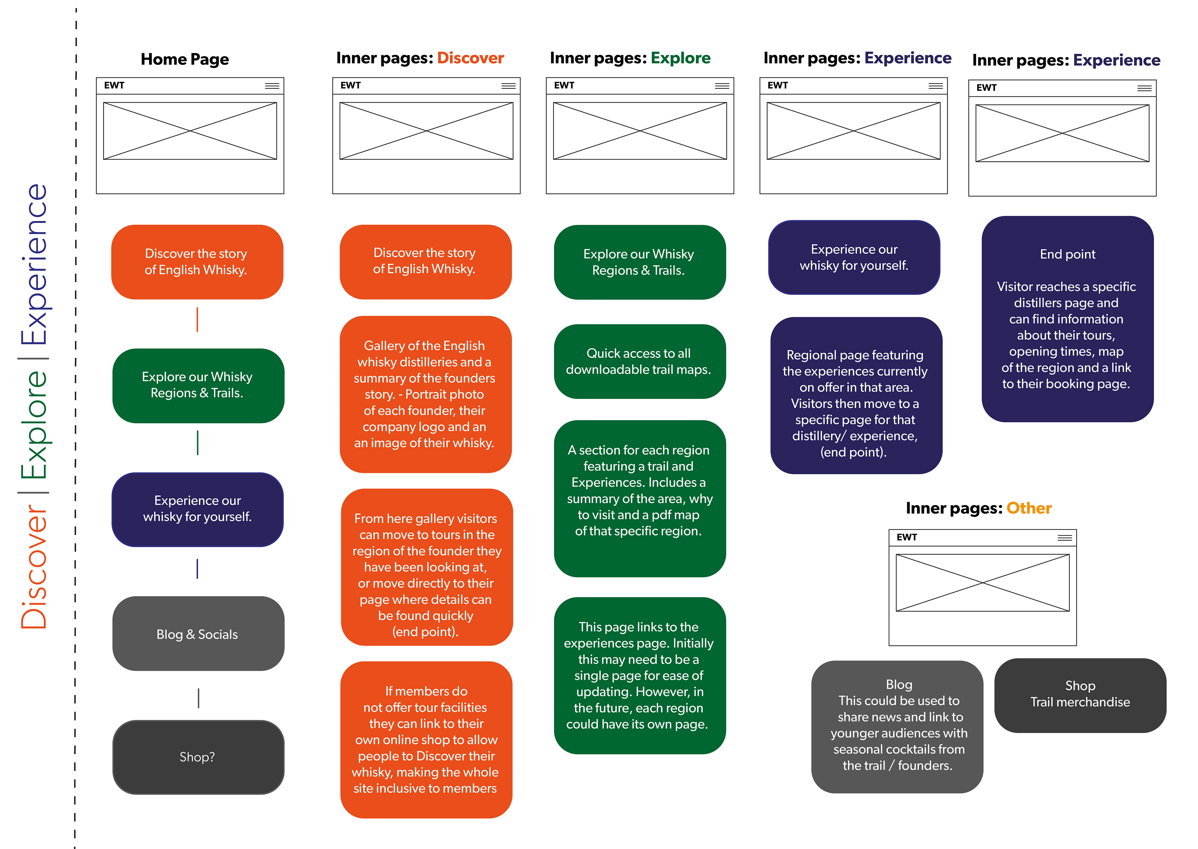
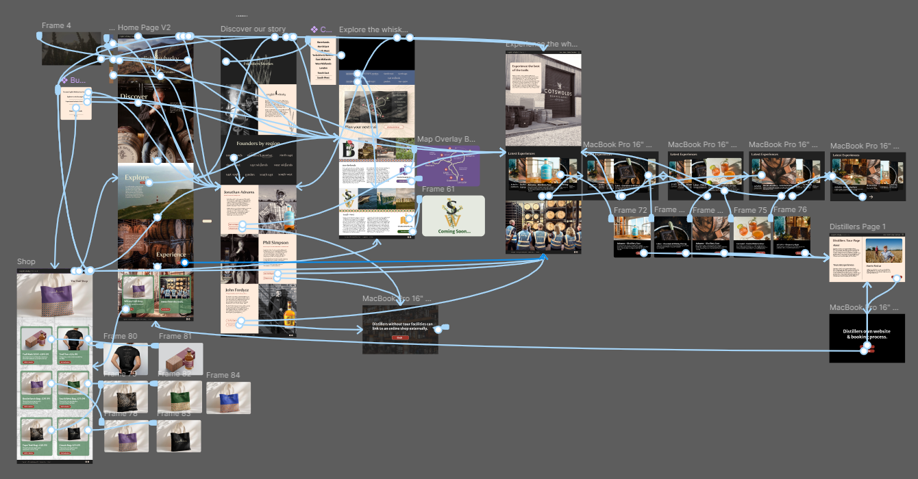
Planning - Wireframe below.
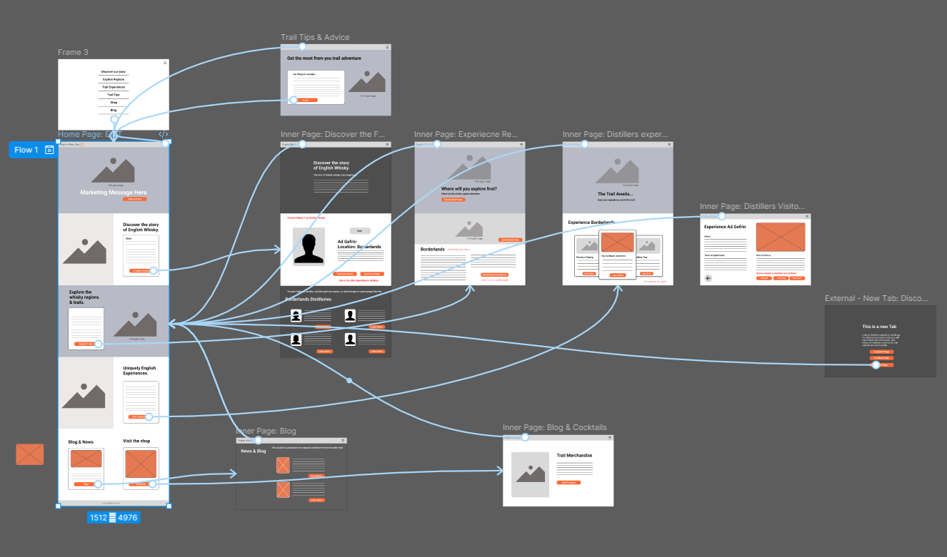
Prototype Wirefames - Figma
Design Concept Sales Funnel & User Experience
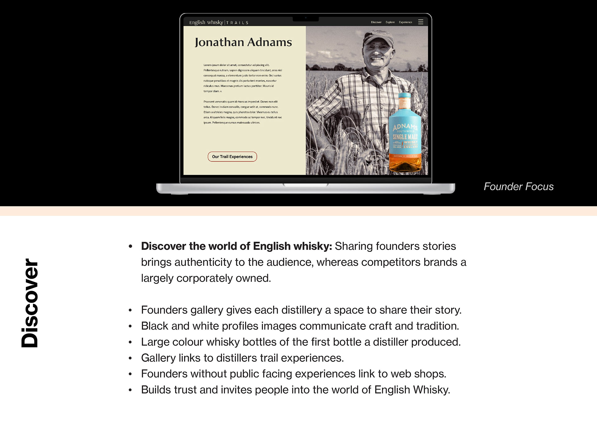
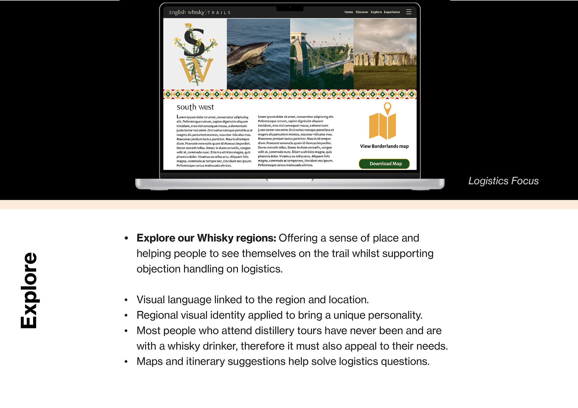
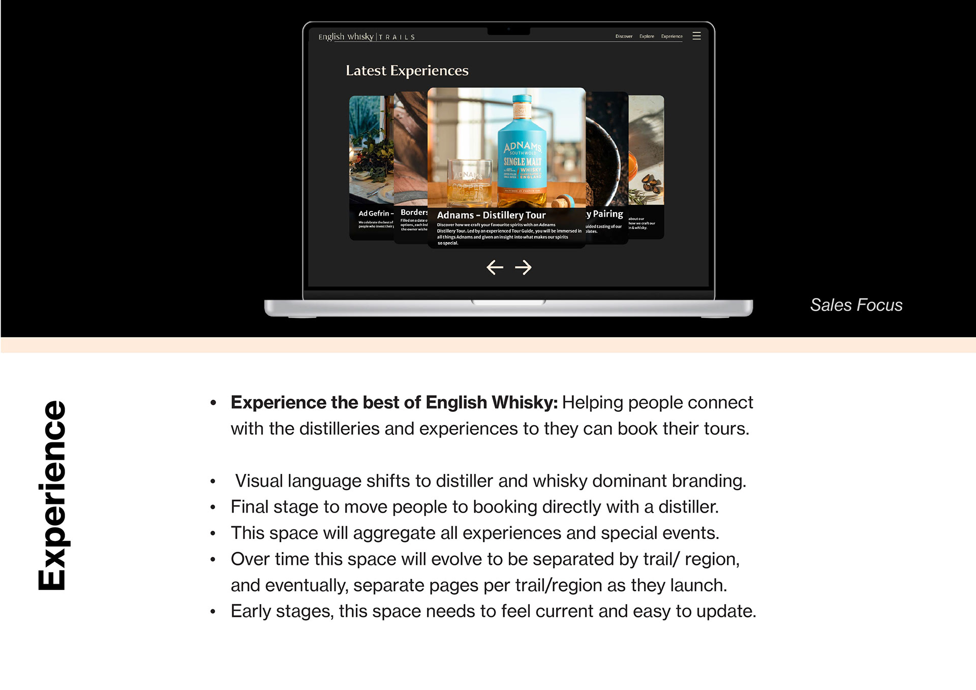
High Fidelity Prototype
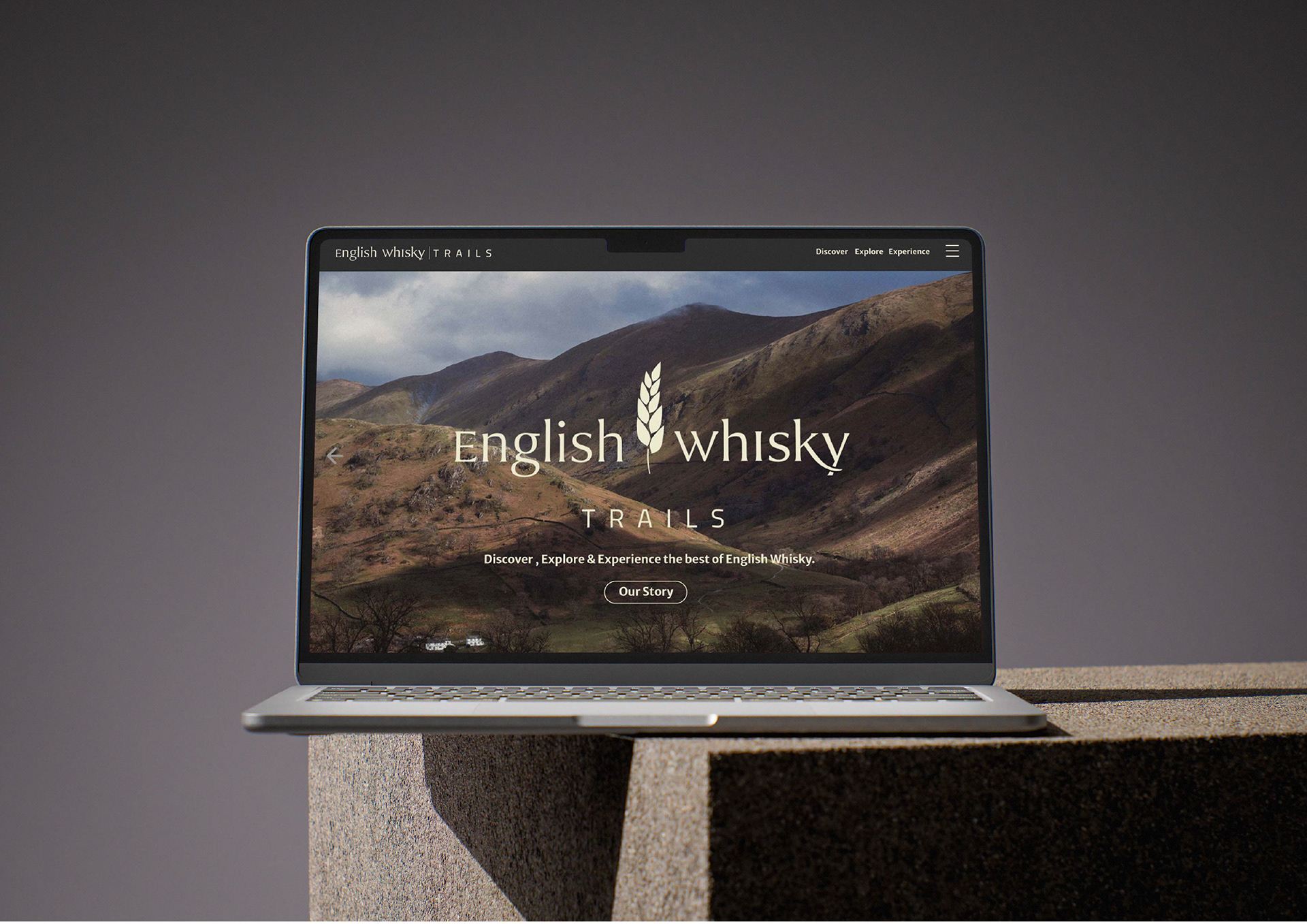
High Fidelity Prototype - Below
The prototype of the website was presented to the members and the Guild to help them better contextualise the application of the visual identity and design concept. This led to my being invited back commercially to conclude the project.
The Figma prototype may take a moment to load, as will animations. The site is fully interactive, but it works best on a desktop. Click the expand in the top right to explore. Please do not use the frame navigation at the bottom, as this removes the correct context and user experience.
Prototype can also be found Here
Outcomes
The client, while representing a large emerging industry, is still a relatively small organisation and, as such, had not worked on a creative project of this scale before. My initial intention had been to complete the visual identity within the University part of the task, but the process proved to be far more exploratory and helped facilitate a shift in how they had viewed the project. I had come to realise this was also more closely associated with a form of product design. This was made more challenging as I had full creative control and no tangible brief to work with. For example, the client was unsure which trails to include and decided to go with all regions, despite this not reflecting their ability to service them. This led me to realise that I needed to help them understand the concept more visually, and I made the decision to create a high-fidelity prototype of the website to apply the design concept. This approach was succesful and I was asked to come back commercially and work on the project as they moved towards a spring launch in 2026.