Launching in 2026.
Client: The English Whisky Guild
Client management | Cross industry interviews & research | Visual Identity | Design Strategy | Art Direction | Web Design | Merchandise | Social Media Design | Adobe Illustrator | InDesign | Photoshop | Figma - wireframes | Figma High Fidelity prototyping | Premier Pro | After Effects | Lightroom | Client presentations.
The English Whisky Trails are set to be the leading tourist and customer entry point to the burgeoning yet already highly decorated sector.
The new visual identity, which celebrates English whisky and its regions from the perspective of the pioneering founders, is targeting a commercial for a Spring 2026 launch.
The evolution of the project, brand and trails will be shared here in due course.

Final Logo Concept
Project Summary Board
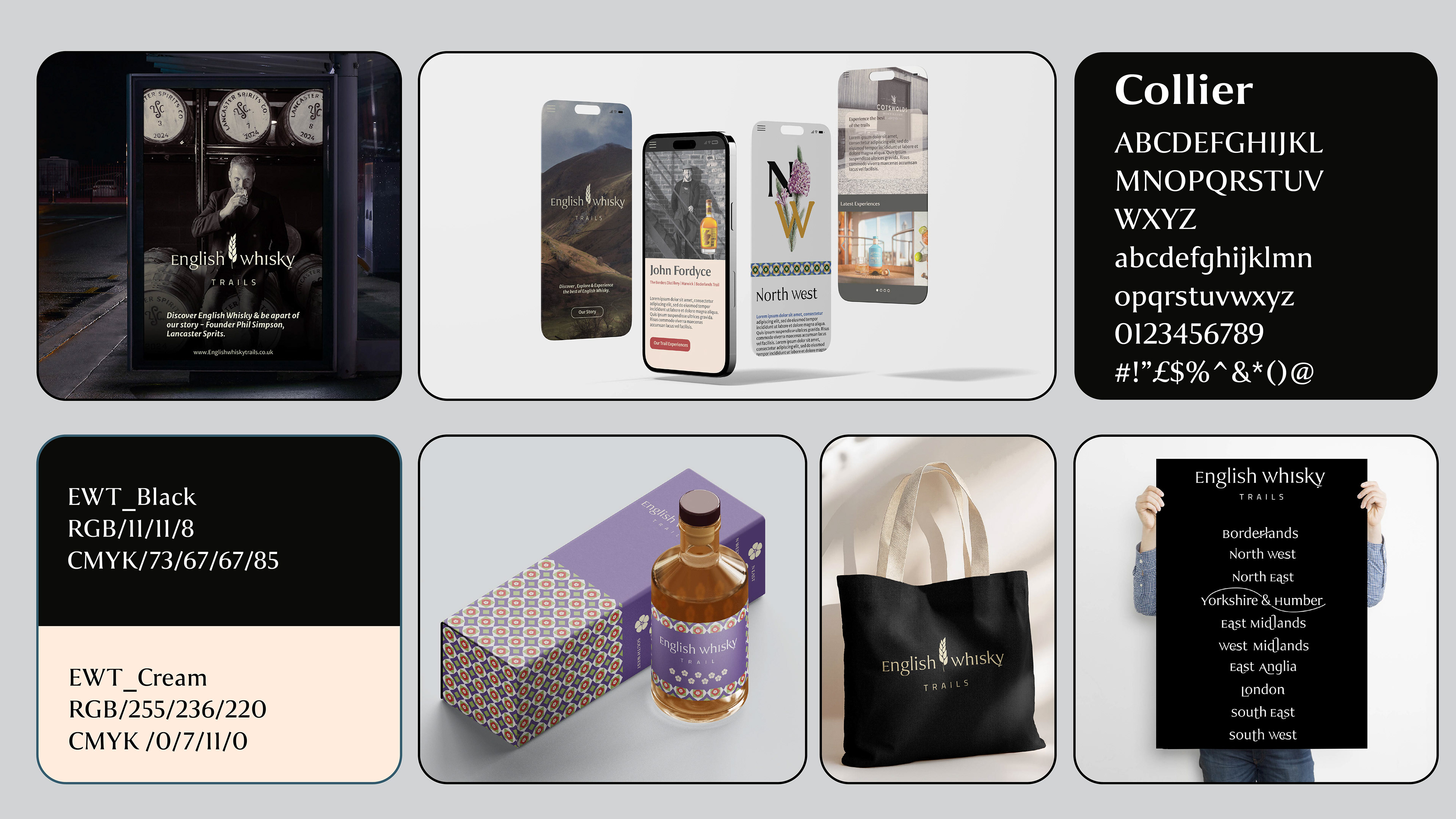
Design Thinking & Purpose
The English Whisky Guild is a membership organisation which represents the emerging sector. They lobby for and promote English Whisky globally, and the Trails are an opportunity to reach their domestic and growing international markets, replicating success in Scotland, Ireland and the U.S.
Launching with the Borderlands and their regional partners of the North of England and South of Scotland, they see this as a natural entryway to bring people into what is sometimes a newer idea and English Whisky. With over a billion pounds of whisky maturing and due to enter the market, they are keen to capitalise on their sector's many awards and connect the public with their members' distilleries. For the members, this is an important revenue stream and exposure opportunity, many of whoms founders still working in the distilleries and have invested over a long period to reach this growth point.
The visual identity needed a clear stratagy to communicate a sense of regionality and Englishness without being cliché, while also offering a recognisable brand that would not stand heavily atop the many diverse visual styles of the members' own brand identities.
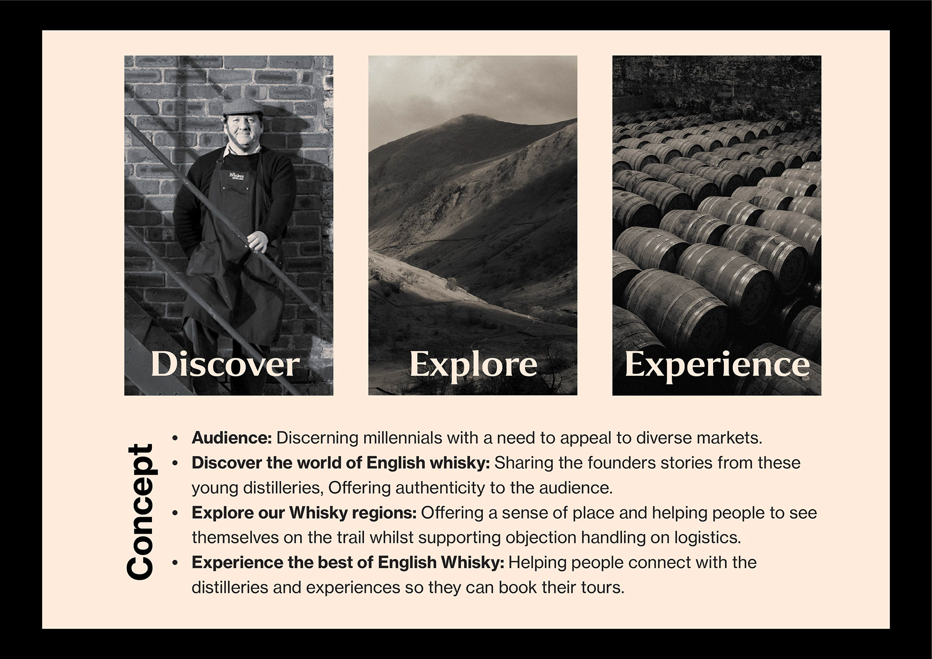
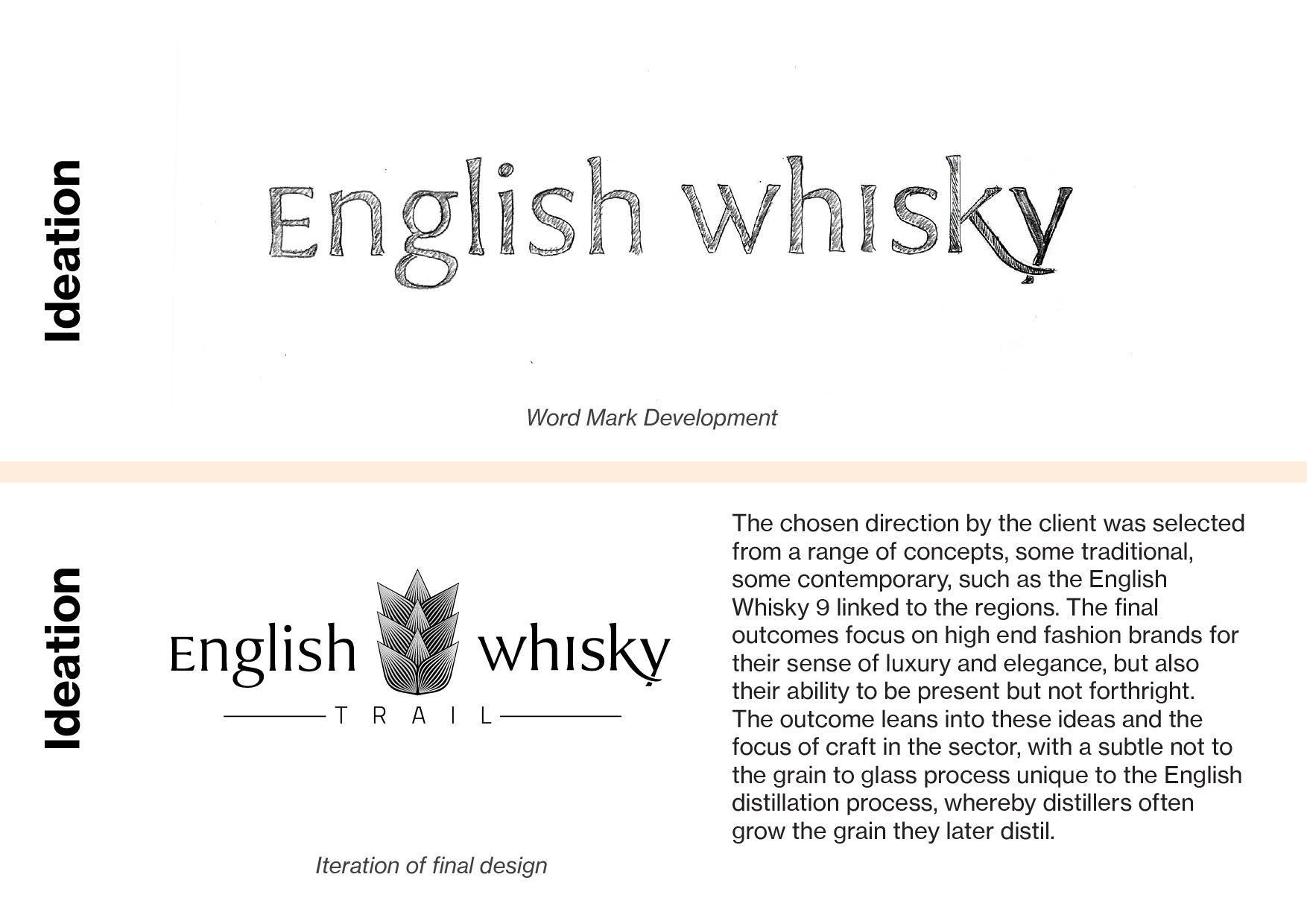

Selection of Logo designs concepts
Final two concepts.
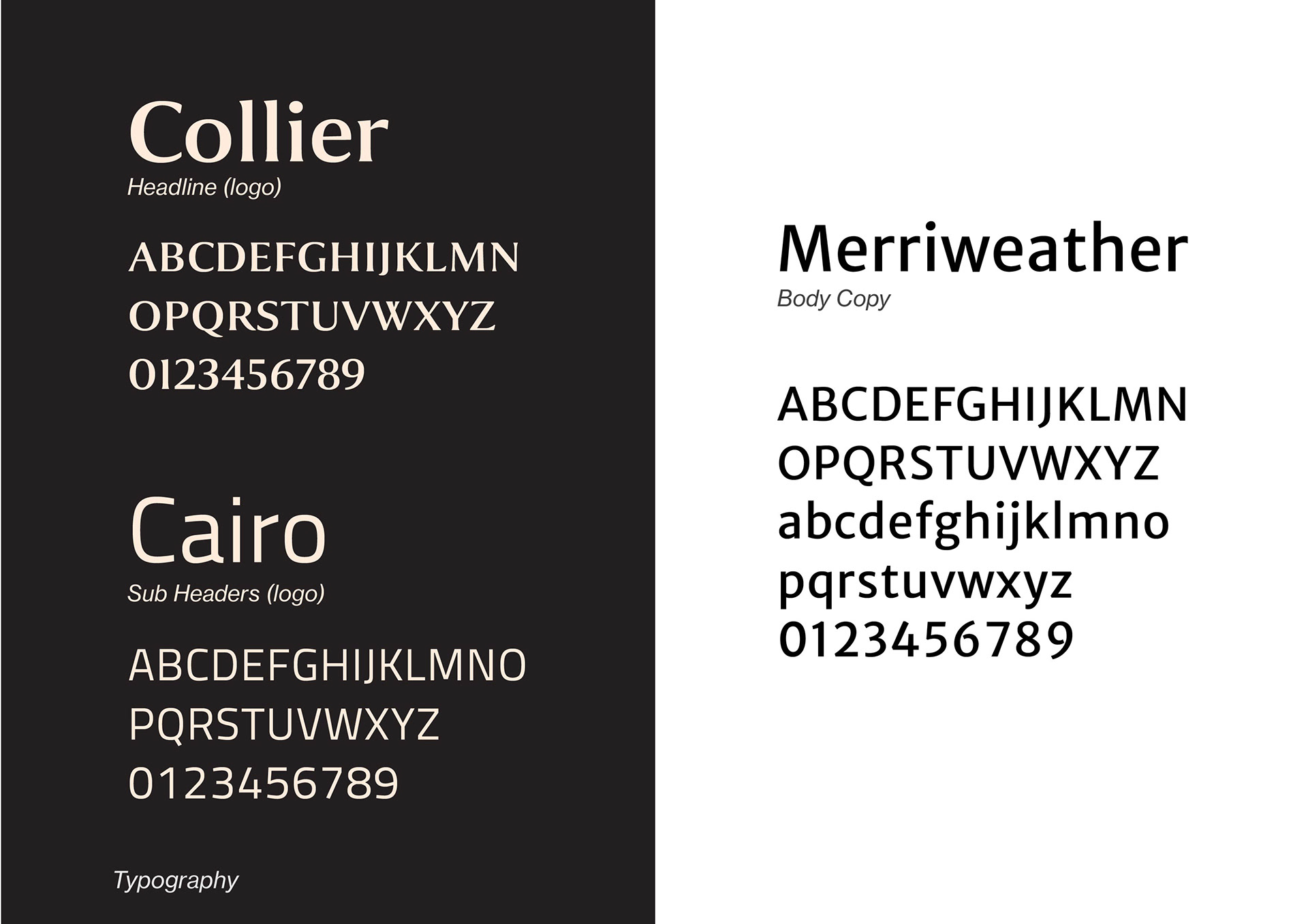
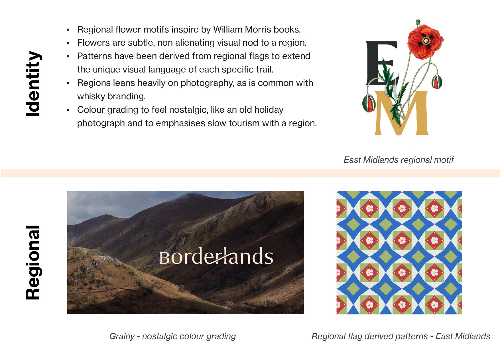
Outcomes
The client represents a large emerging industry, and fulfils many complex role in supporting the sector and its members, but these are not typically focused on creative work. My initial intention had been to develop a more complete visual identity within the time. However, I pivoted to deliver a working prototype in Figma to help the Guild and their wide ranging stakeholders to better experience the design concept, positioning and potential for the trails and their own businesses.
This is now under review with the client, with the intention of a commercial launch in Spring 2026 once they have secured funding.
English Whisky Trails Visual Identity
Final Logo
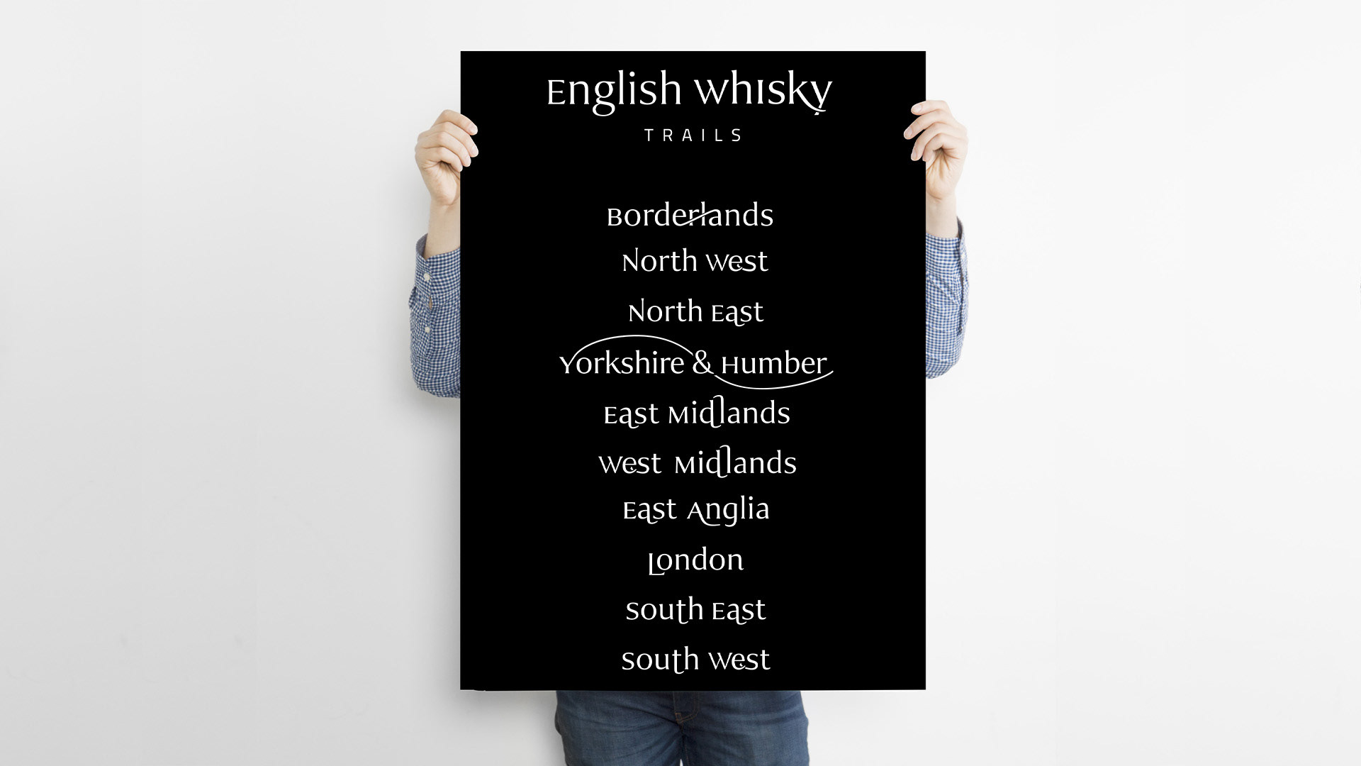
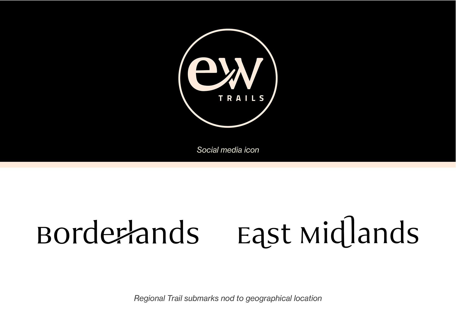
Regional sub marks offer a subtle sense of place geographically.
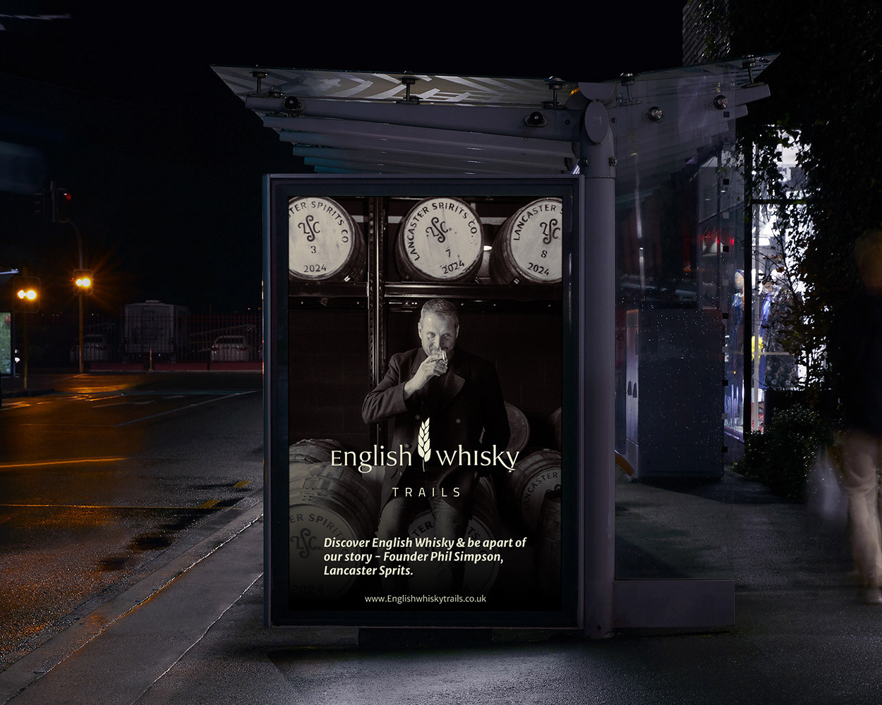
Advertising - Founder Led
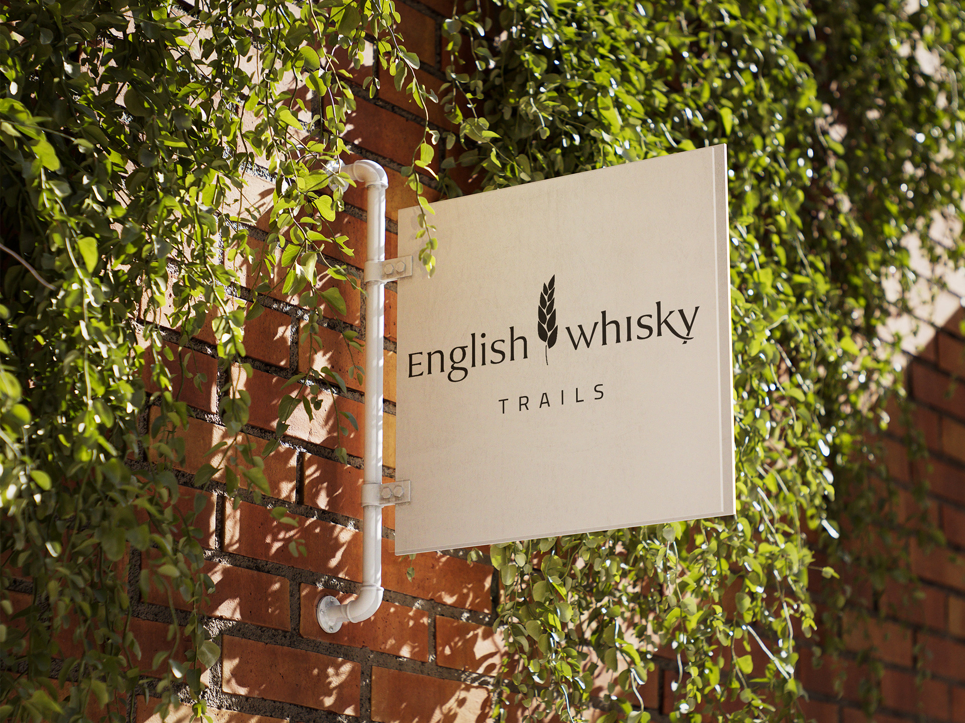
Trail identity used within distilleries
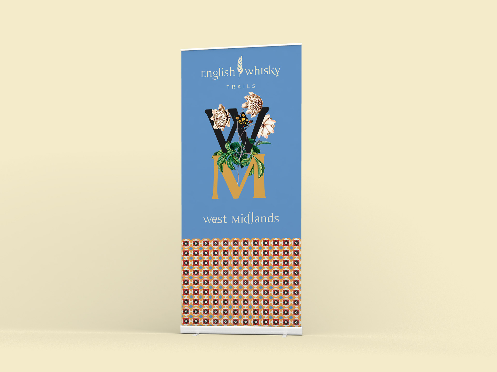
Regional Identites
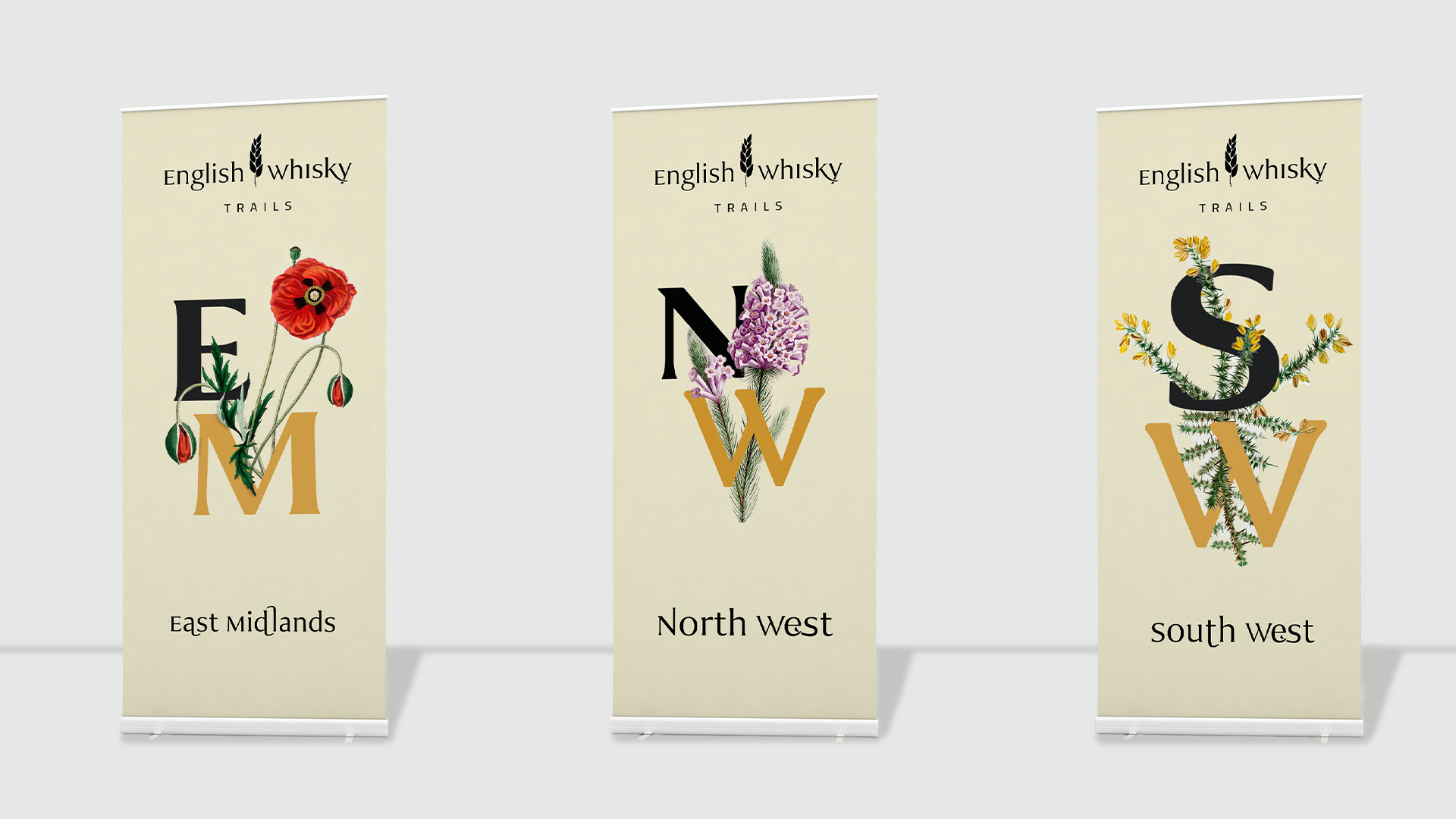
Regional Identities
Web Design
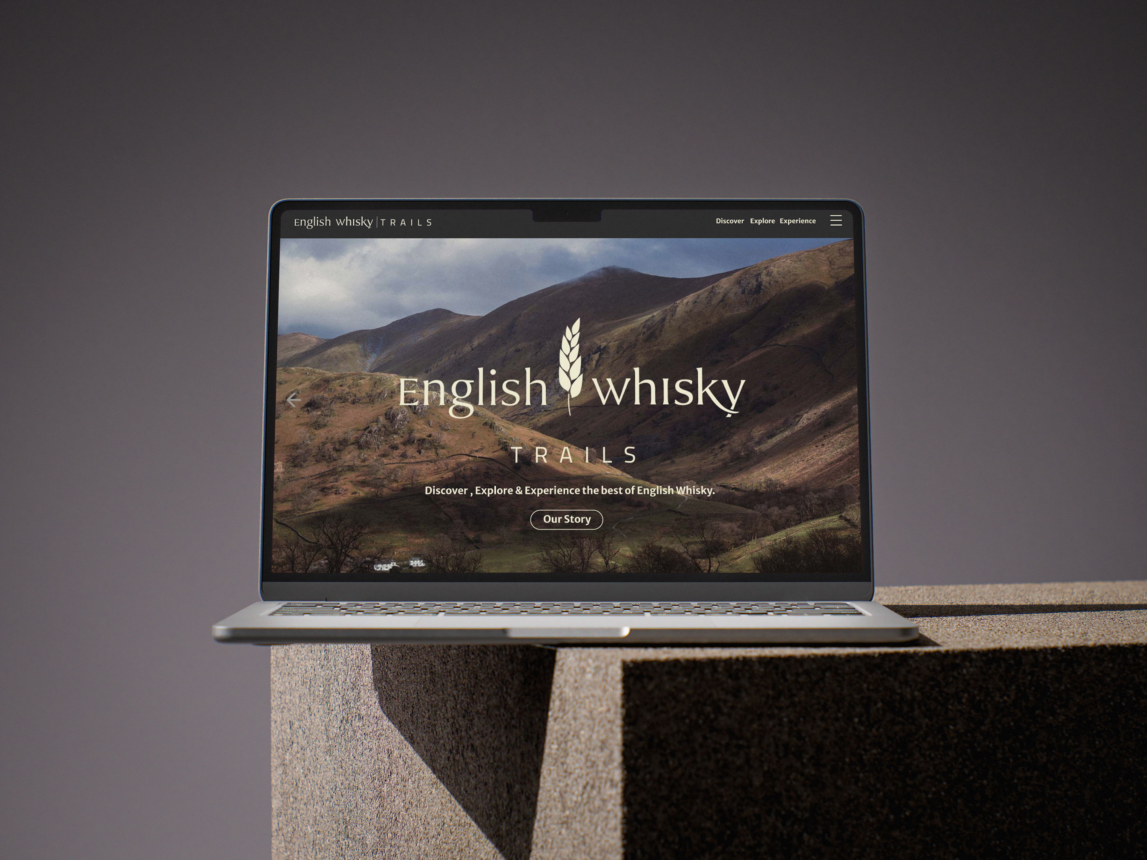
The English Whisky Trails - A sesne of place, not just whisky invites all people to the trails.
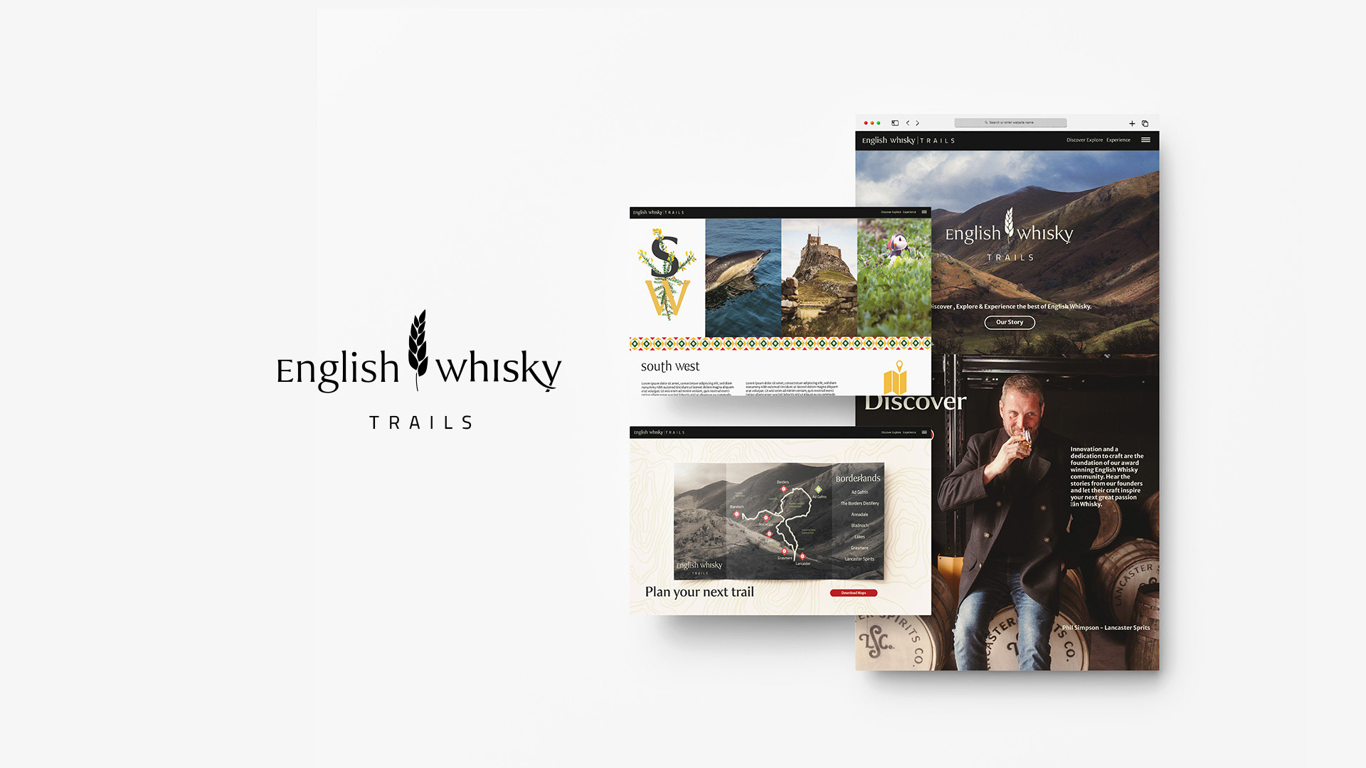
Visual identity for web.
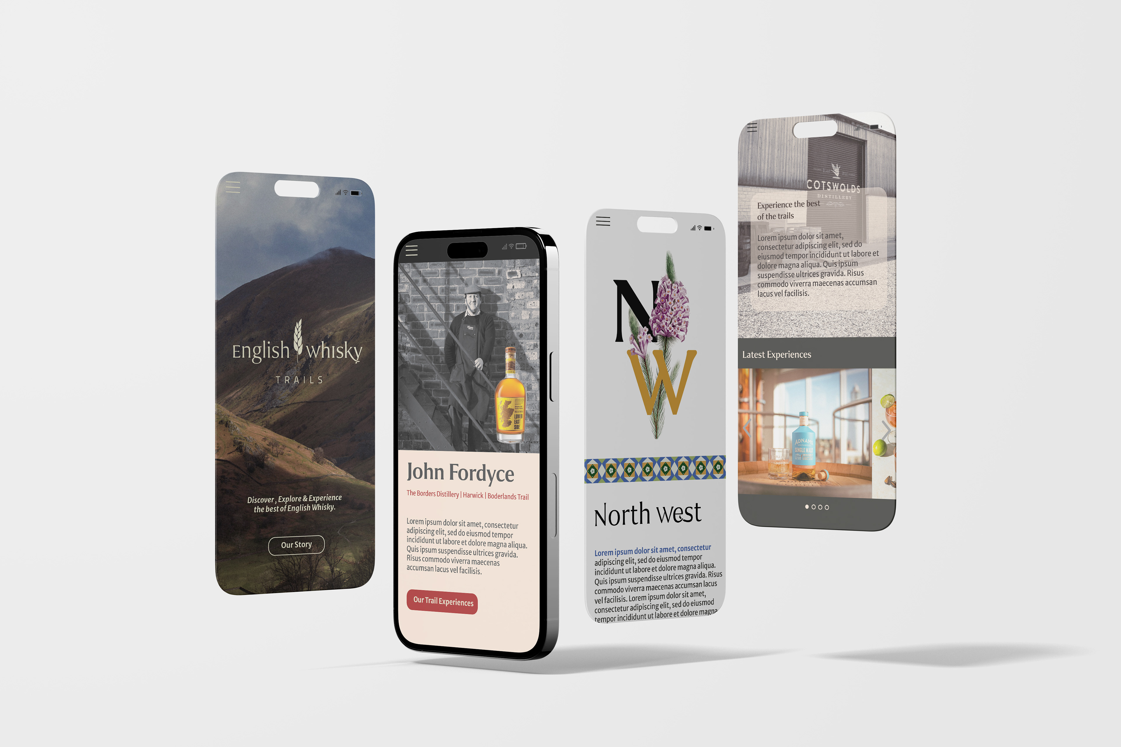
Web for mobile
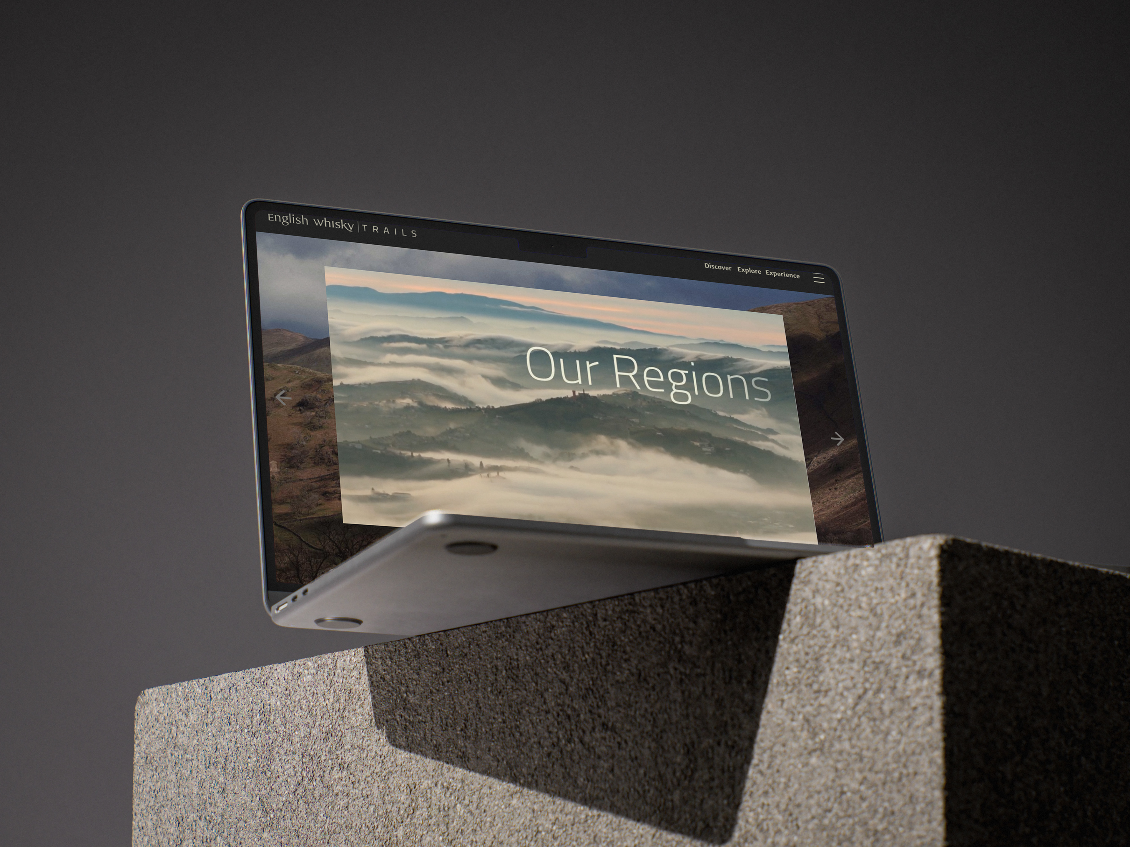
Web Prototype
The web design prototyping and contexts have been explored separately in this portfolio; however, you can also see the high-fidelity Figma design below.
Please note that Figma prototypes work best on desktop and will take a moment to load fully. Expand (top right button) to explore as a traditional website, not the navigation bar (bottom). This is a highly interactive prototype. Please enjoy.
The prototype can also be found Here
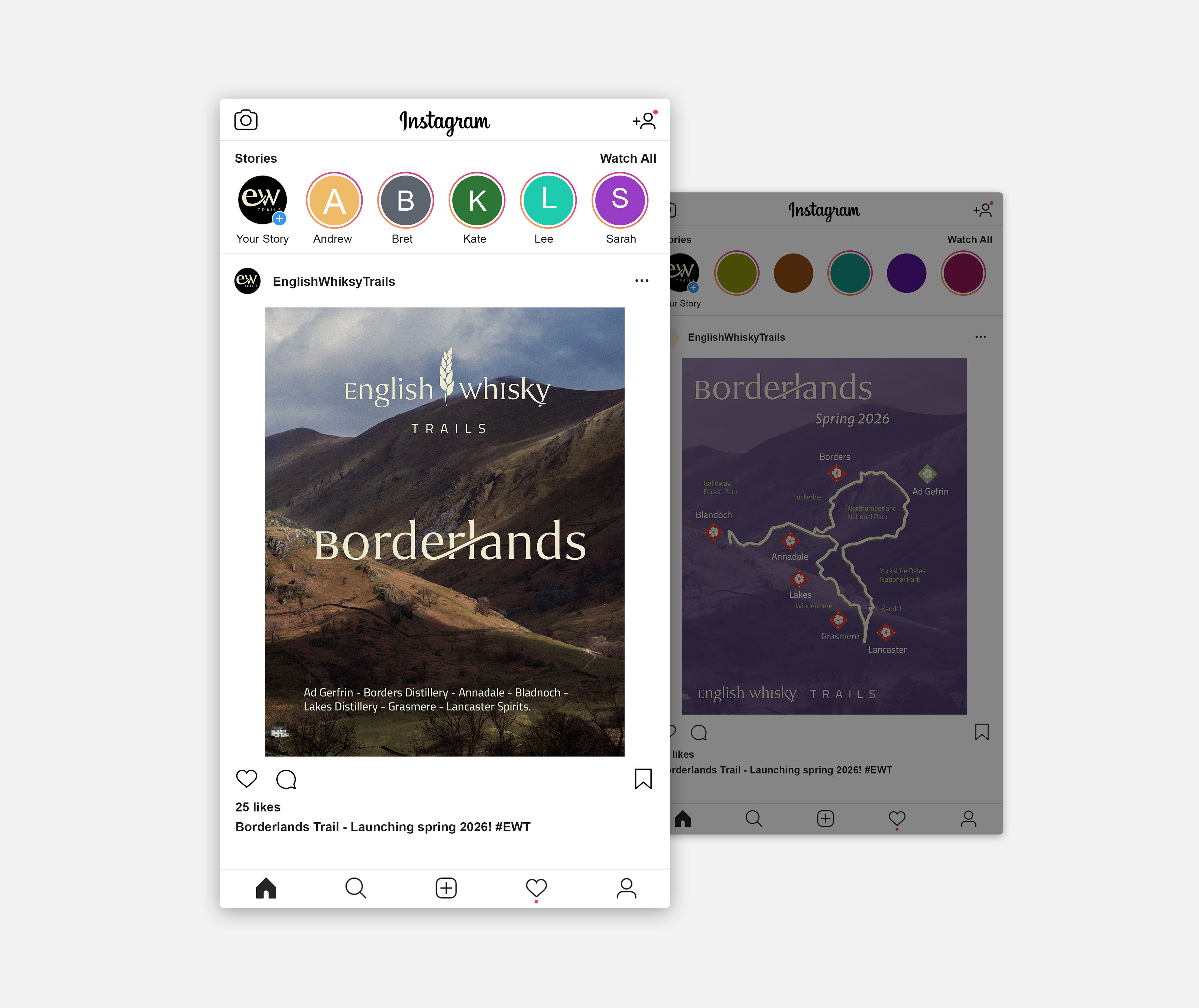
Social Media
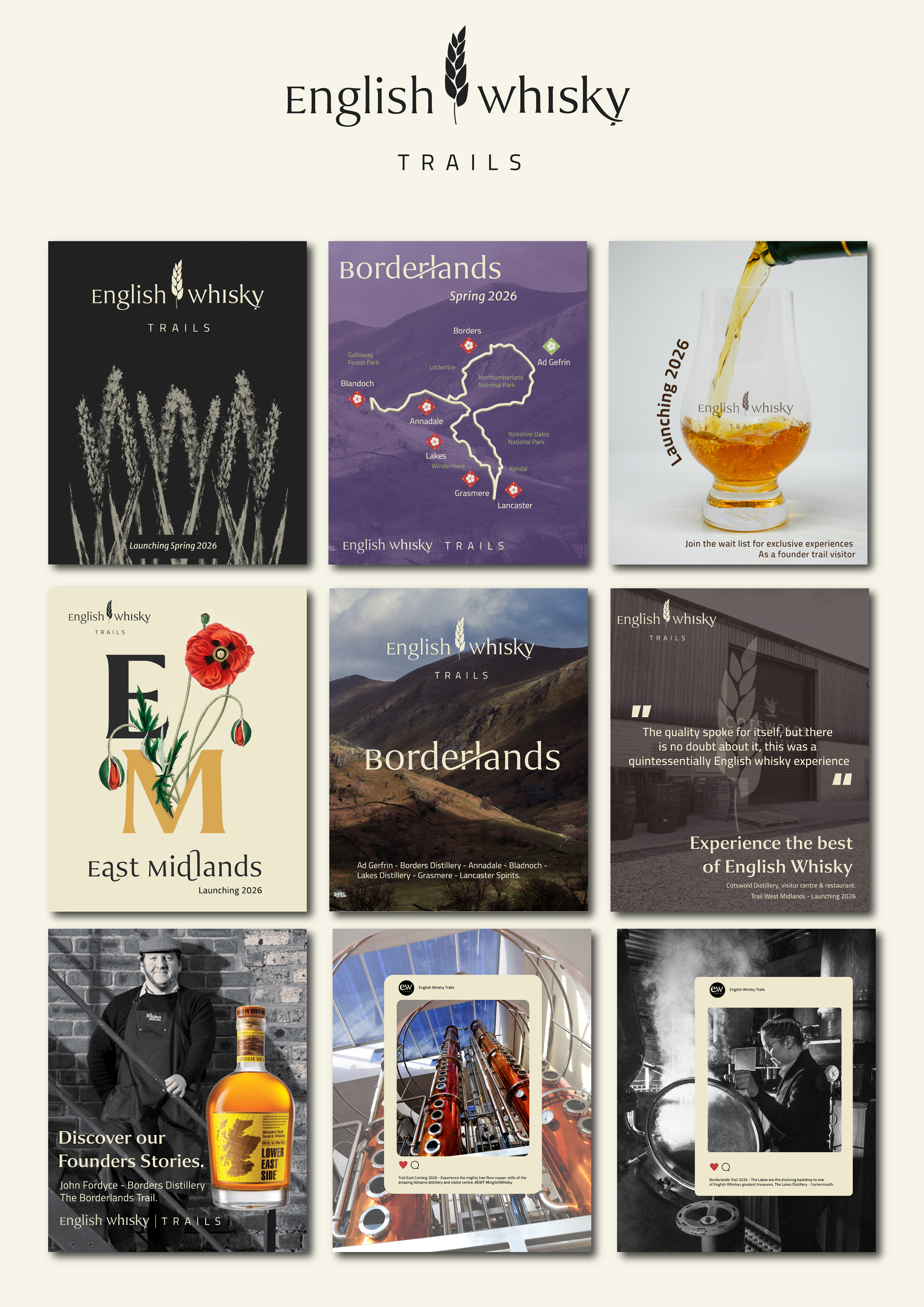
Instagram grid
Trail Merchandise
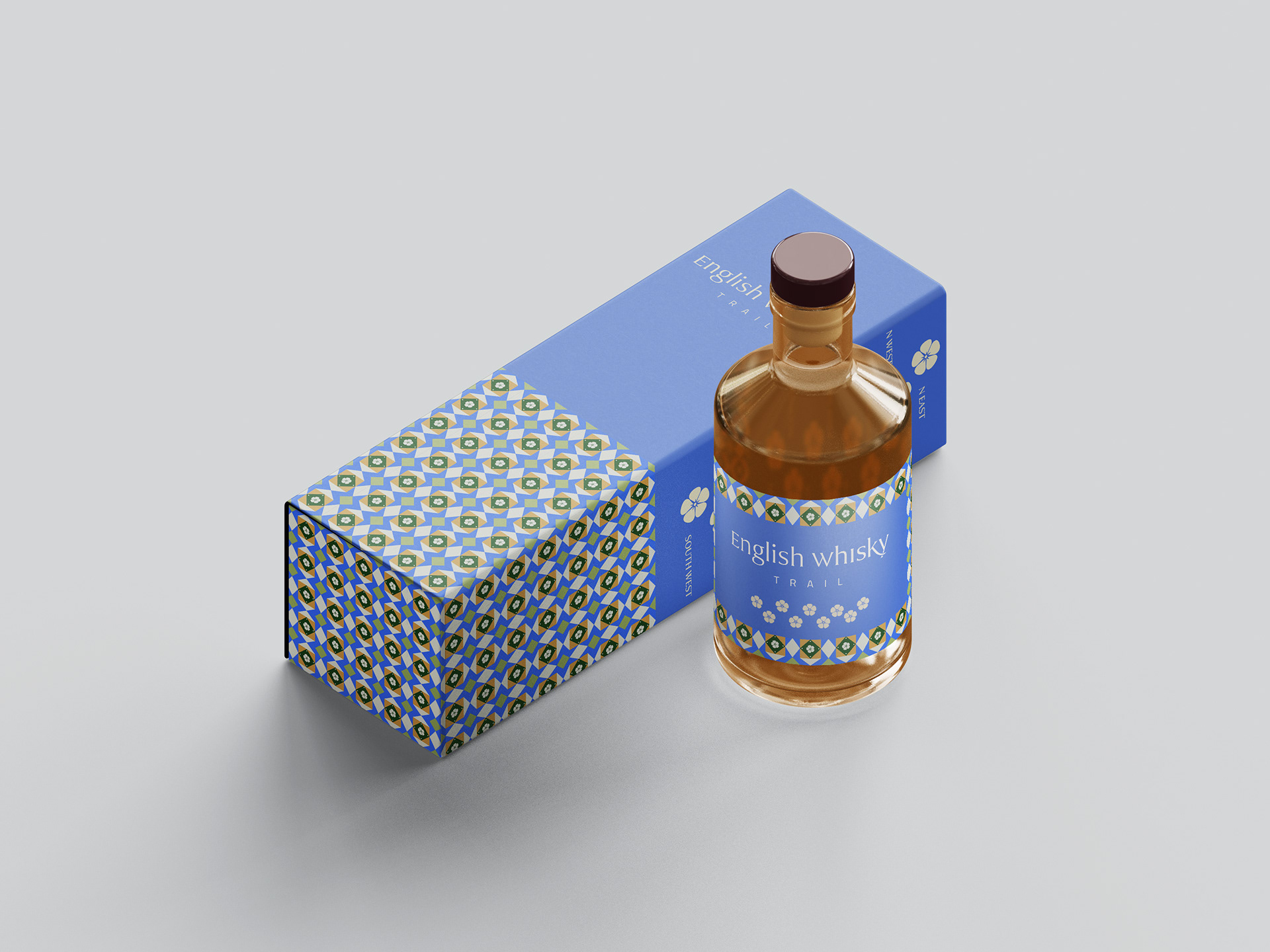
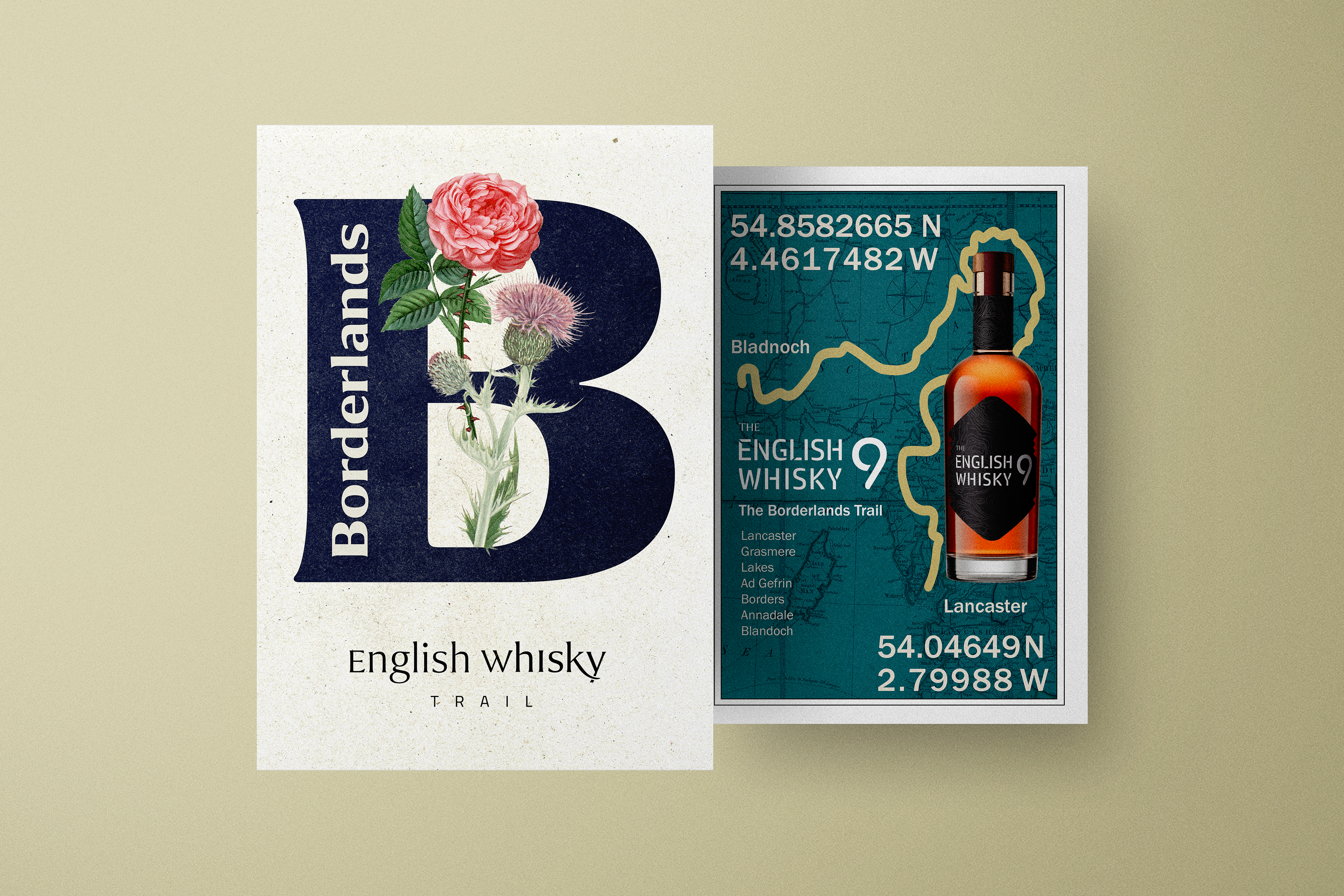
Regional identity - Each flower is common to the trails region while the workdmark offerns a sense of location.
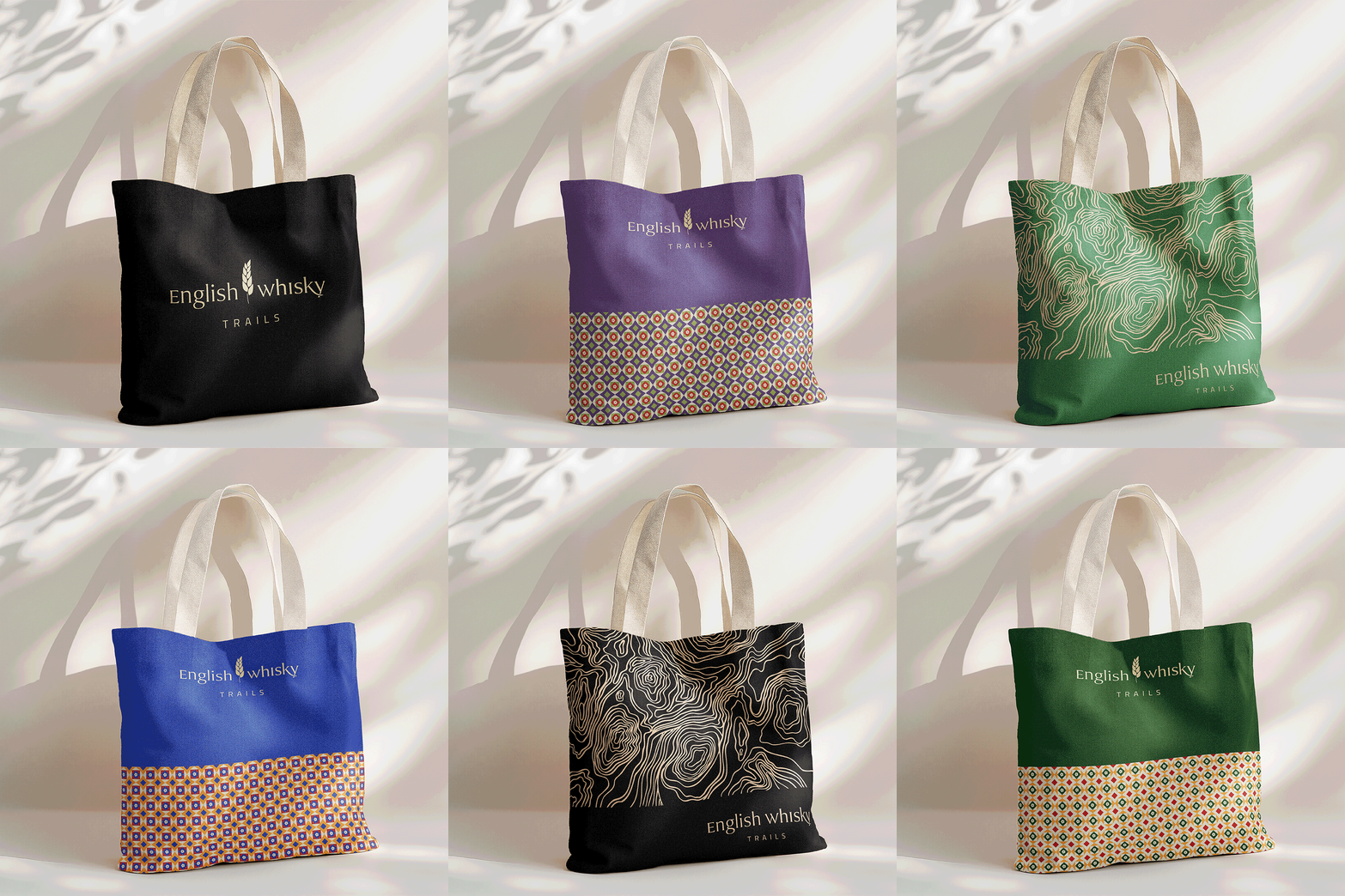
Brand application on trail merchanise