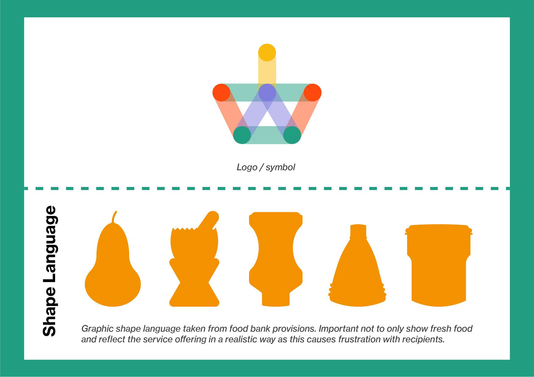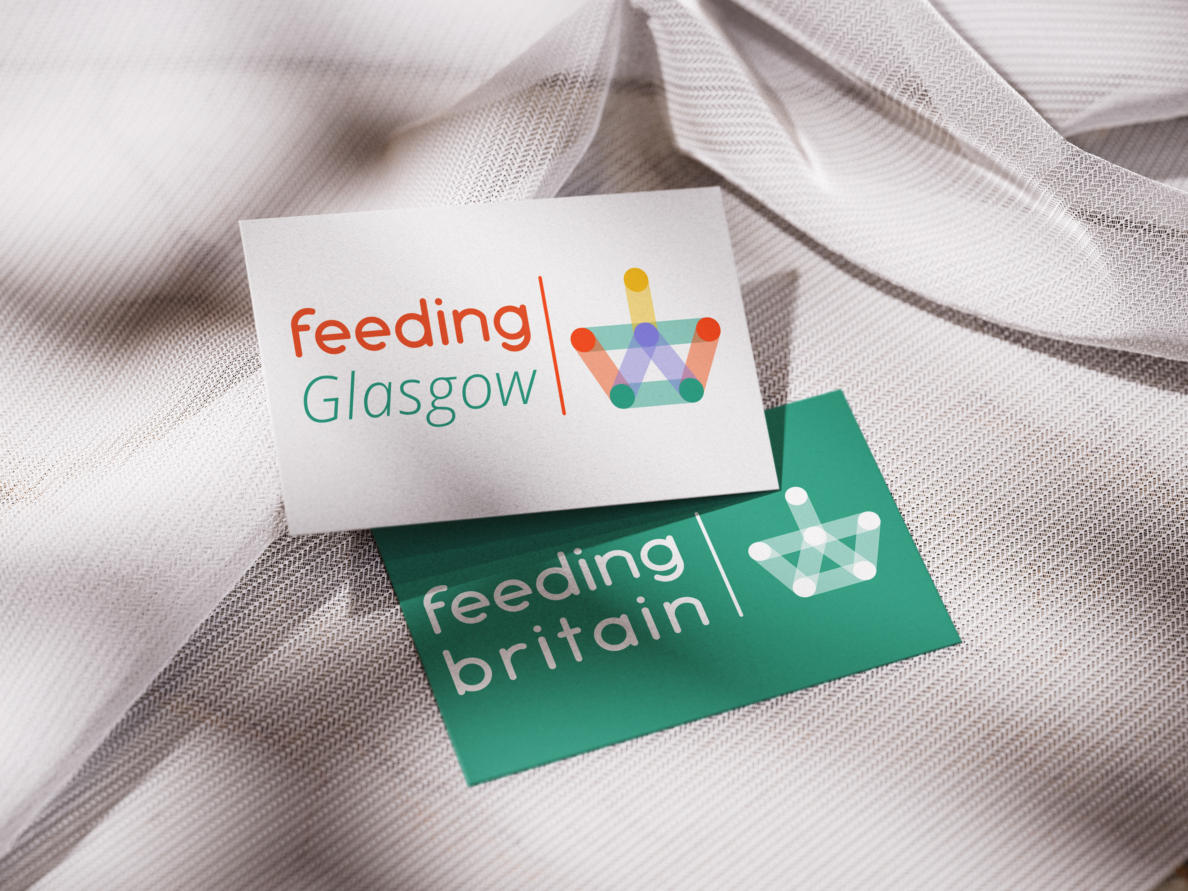
New Logo. Representing agency, coming together and strength in unity. 
Project: UK Charity Rebrand
Visual Identity | Typeface Design | Social Media | Infographics | Client presentation | Adobe Illustrator | Photoshop | Indesign | Industry interviews.
Forming part of a live brief within my final year at Falmouth University, Feeding Britain was seeking a new visual identity that helped them communicate in a more visual way. The organisation consists of 141 regional partners, forming a network of frontline services that help alleviate food poverty and support people in crisis. Feeding Britain also works to lobby central Government to elicit social change. 
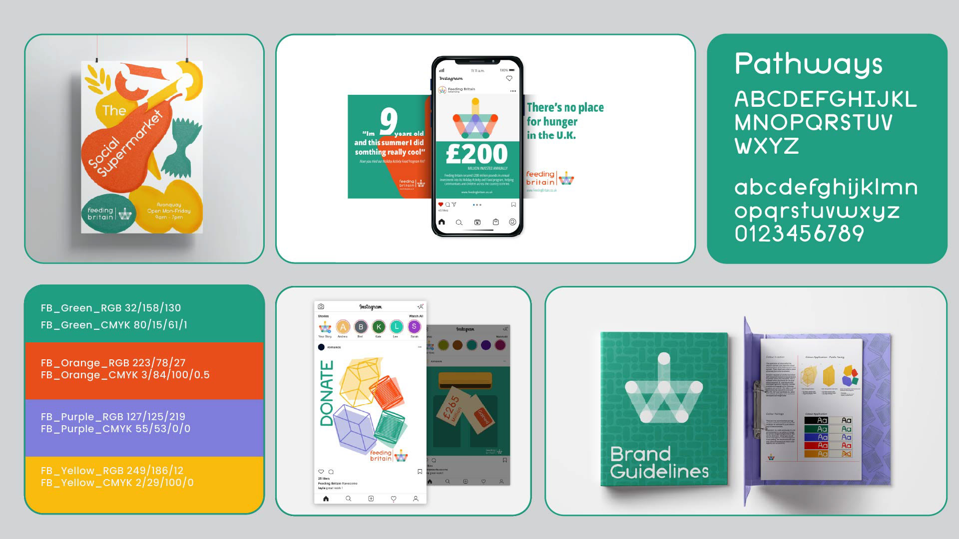
Project Summary Board 
Design Thinking & Purpose 
The project with Feeding Britain consisted of a working brief, two design reviews and a final presentation, with the potential that the project would be adopted by the charity. The brief asked for help in how they were reaching people through their visual communications, seeking a new brand identity with visual representations of their statistics and outcomes to showcase on their website.  
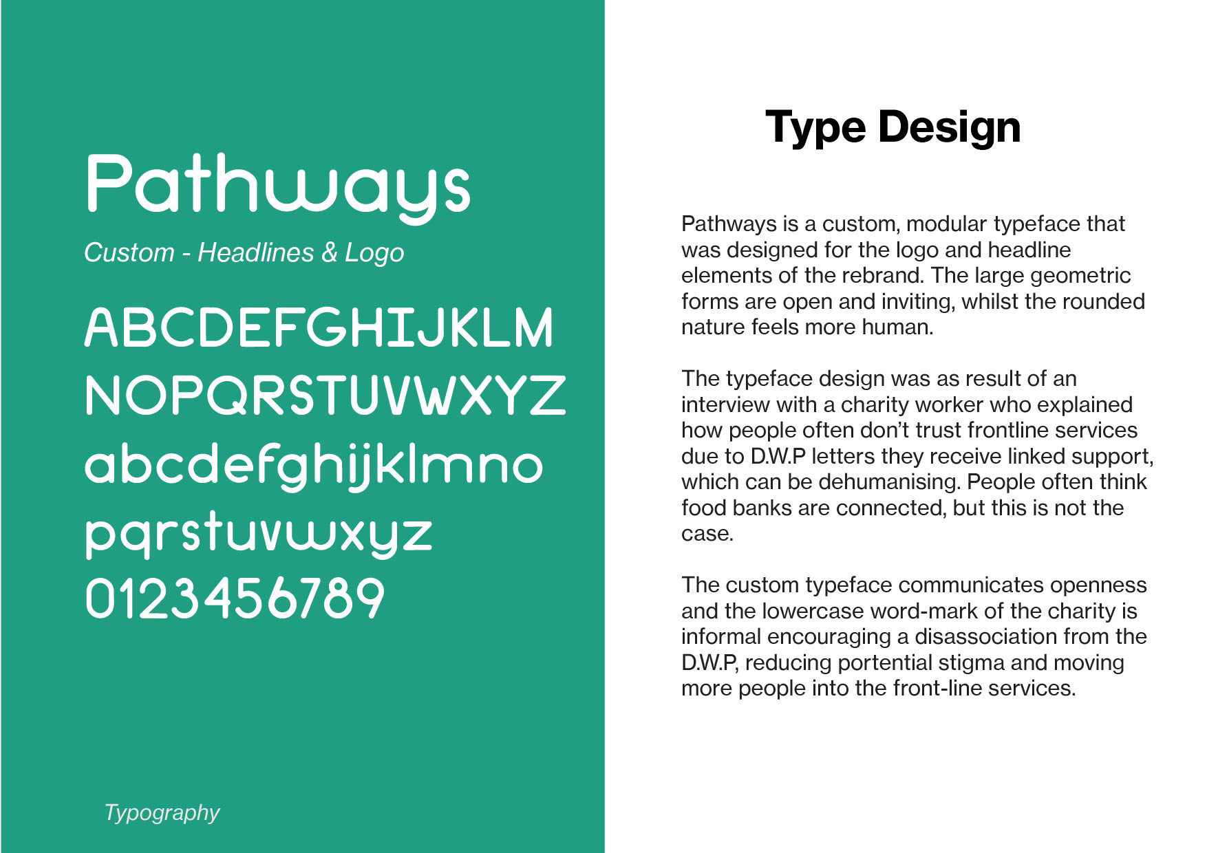
The project required a visual language that would reduce stigma associated with food banks and serve as a funnel to their Pathways from Poverty program. Due to access restrictions on frontline staff, I utilised empirical studies on poverty in the U.K and interviewed charity workers from other organisations. Communicating unity and openness were my goals, while also recognising the charity needed better internal communications across its network members.   

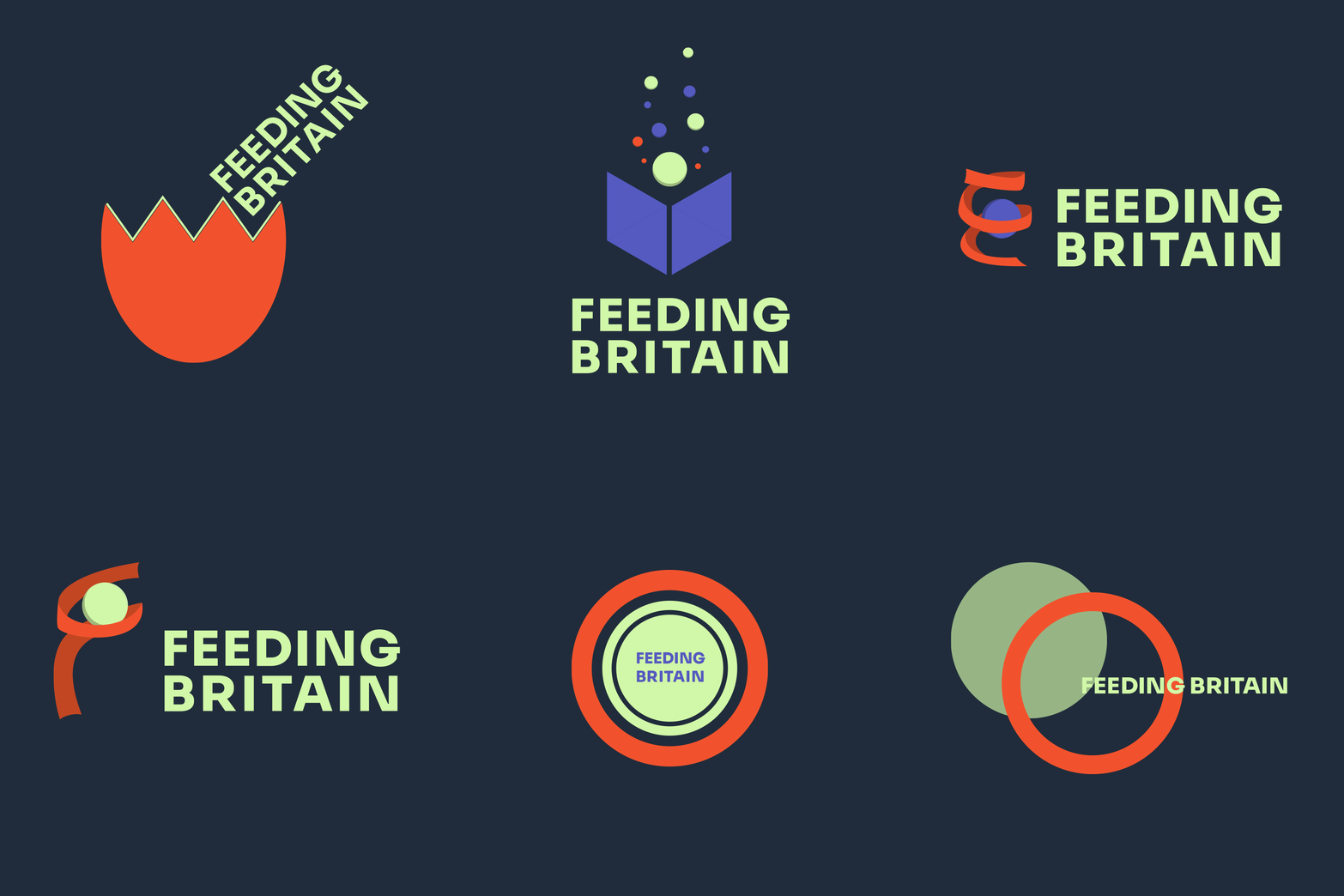
Logo Development Round 1 

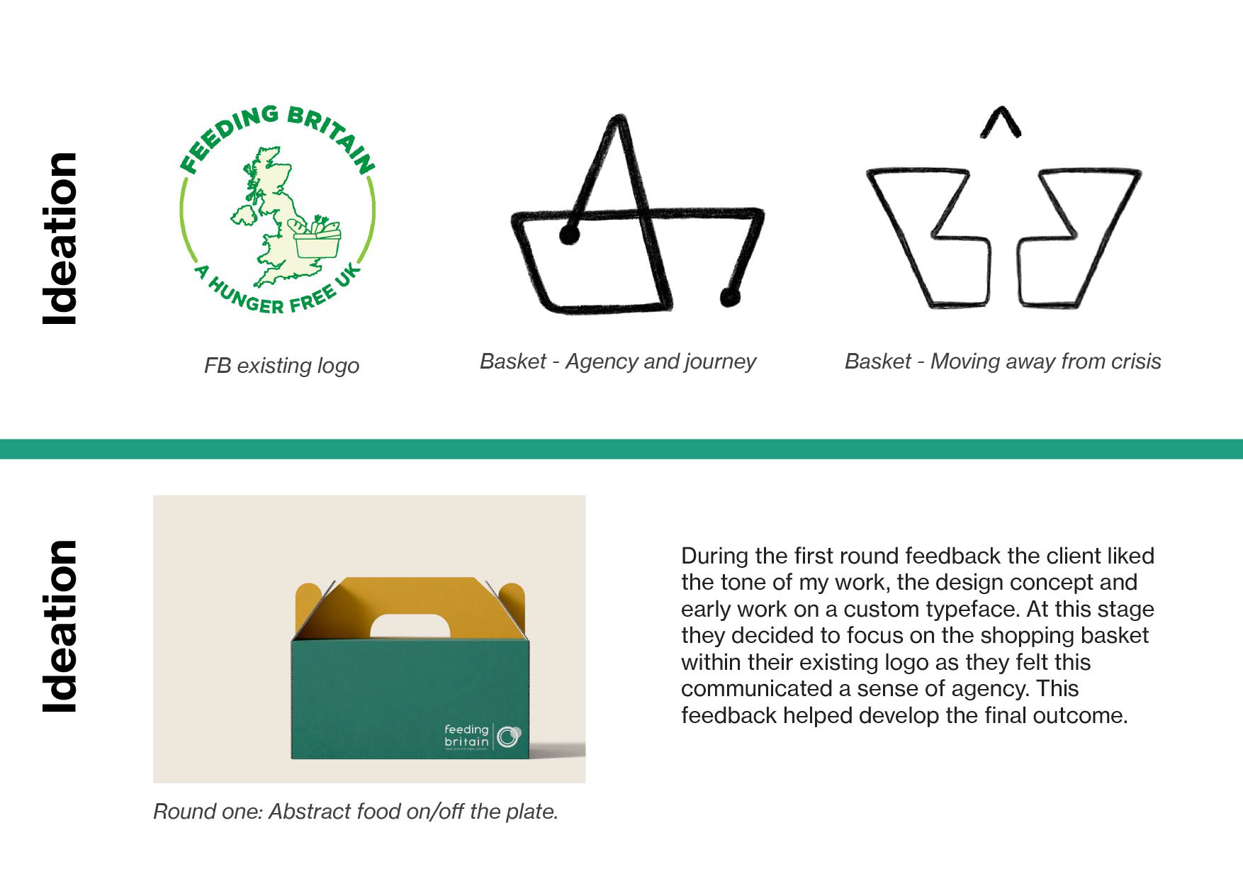
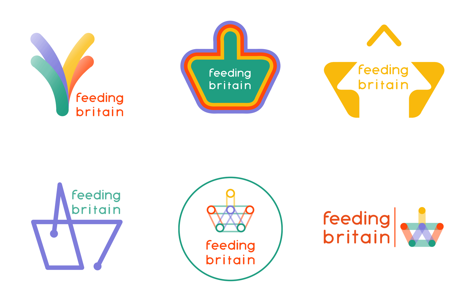
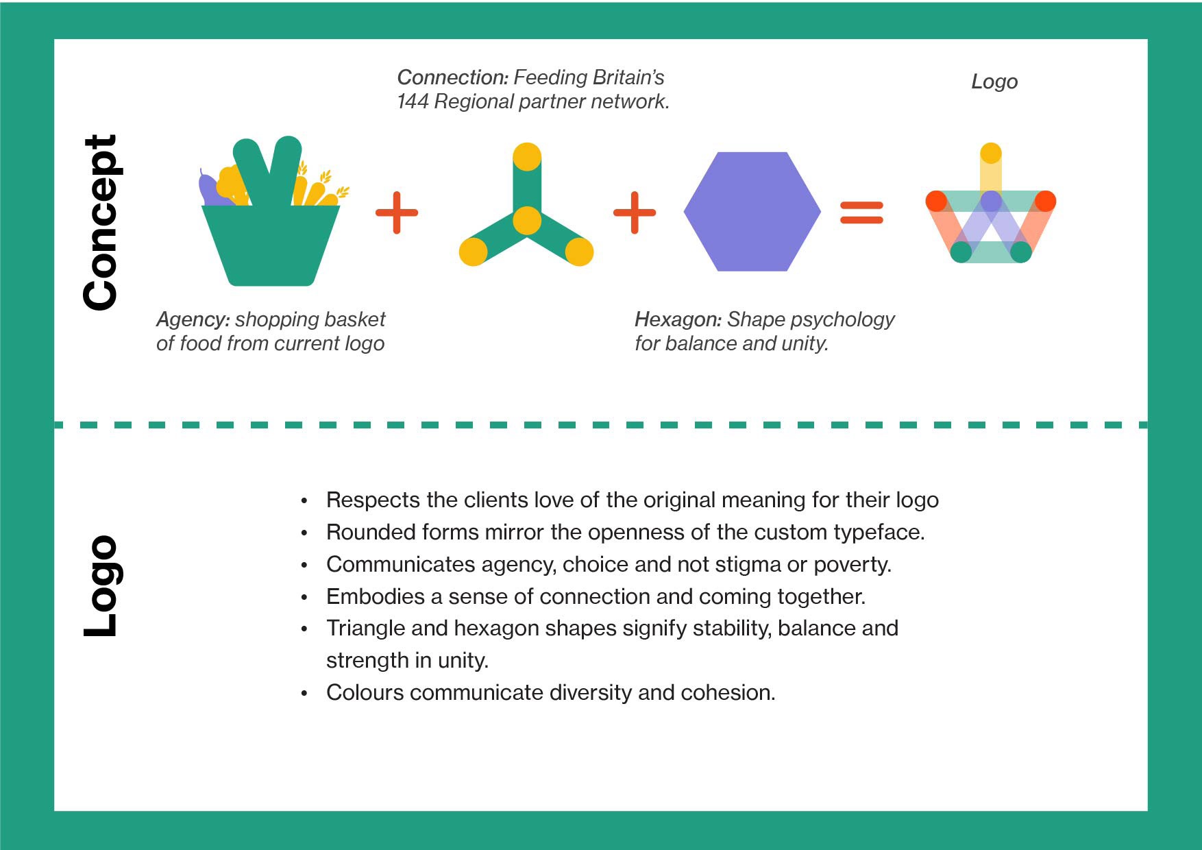
Feedback based Logo development - Basket & Agency
Outcomes 
This was a unique opportunity to work with a major organisation within my studies, and I learnt a lot about the process of designing for a large cross-section of stakeholders and diverse audiences. This came through in how I needed to pare back my messaging and keep ideas succinct. The interview that led to the creation of the Pathways typeface was the connecting point in the project where I saw how to make the outcomes more open and reduce stigma, while my research showed me that stigma is best reduced within those frontline services by staff, and therfore my role was to help get people into those services by making Feeding Britain feel as welcoming and open as possible.
The feedback from the client in round one also helped me narrow in on the logo outcome that felt both right for the brand, but also worked more harmoniously with the typeface design. 
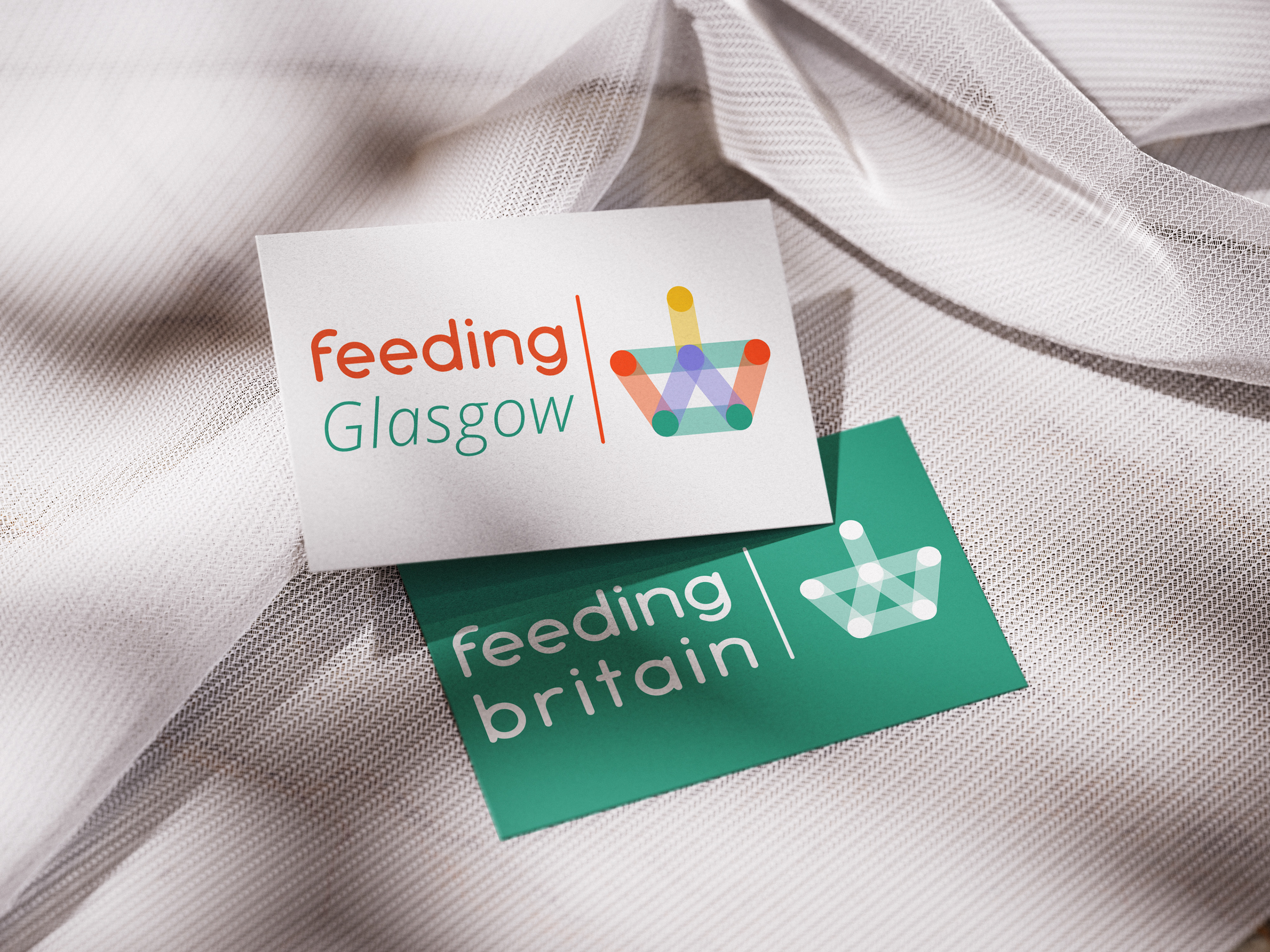
The charity approved the final outcome, saying it aligned very closely with their values and that I had represented how they wished to be seen, and while I had hoped they might adopt it, they did invite me back to complete their biannual report in my graphic style and utilising my infographics. While I was unavailable on short notice, this is a good measure of success for me. 
Feeding Birtain Visual Identity 

Adaptable identity for Feeding Britains 141 regional partners 
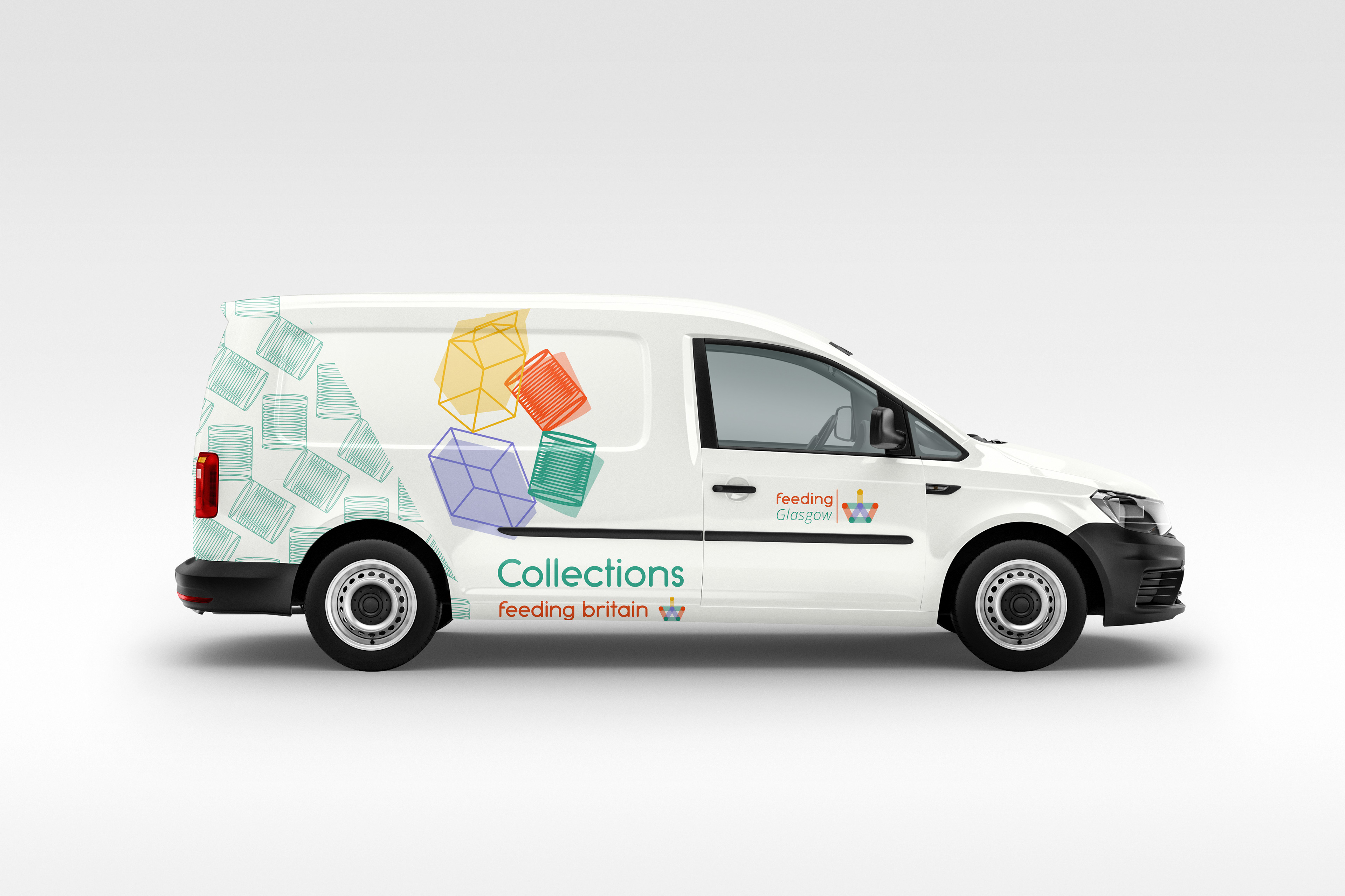
A Stronger public brand recognition through enhancing the regional partners' identity within the FB framework.
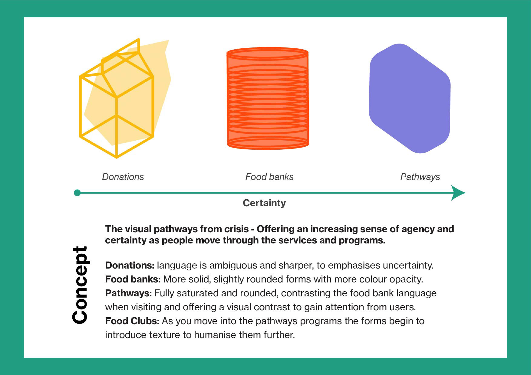
The donation visual language here prompts tension and uncertainty. 
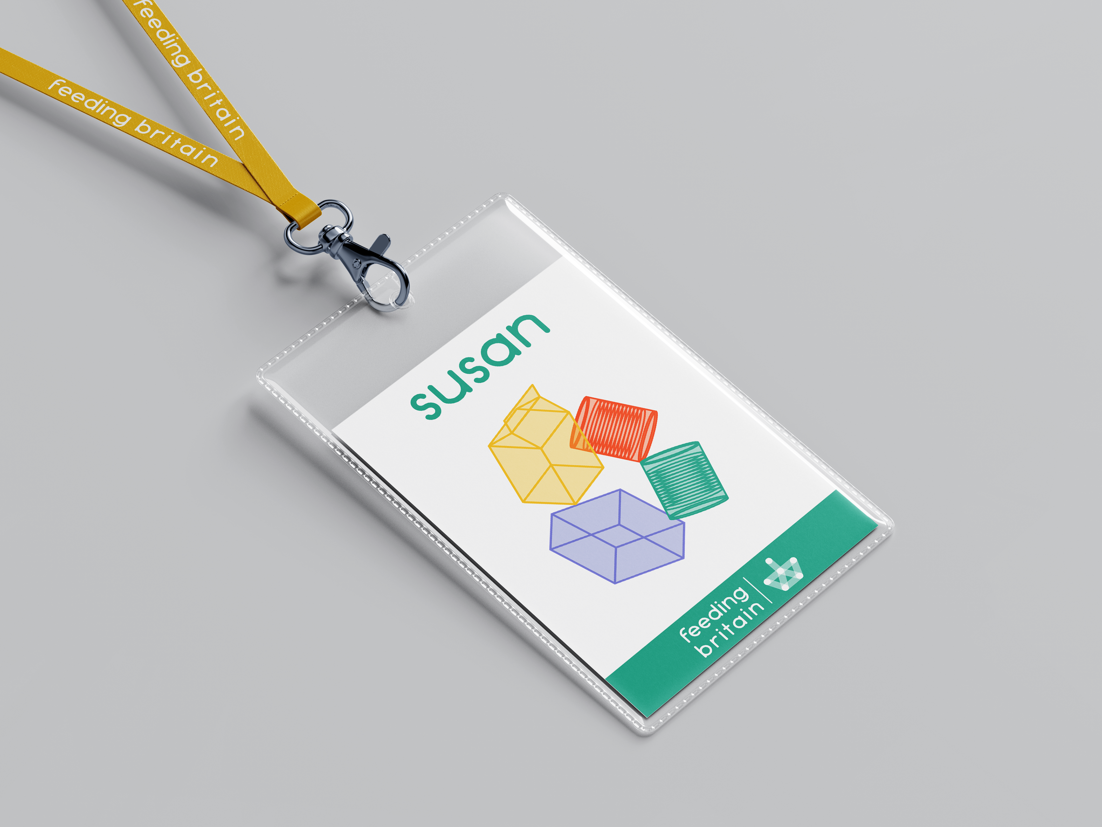
The Increasing certainty withing food banks and front line services reduced tension and uncertainty. 
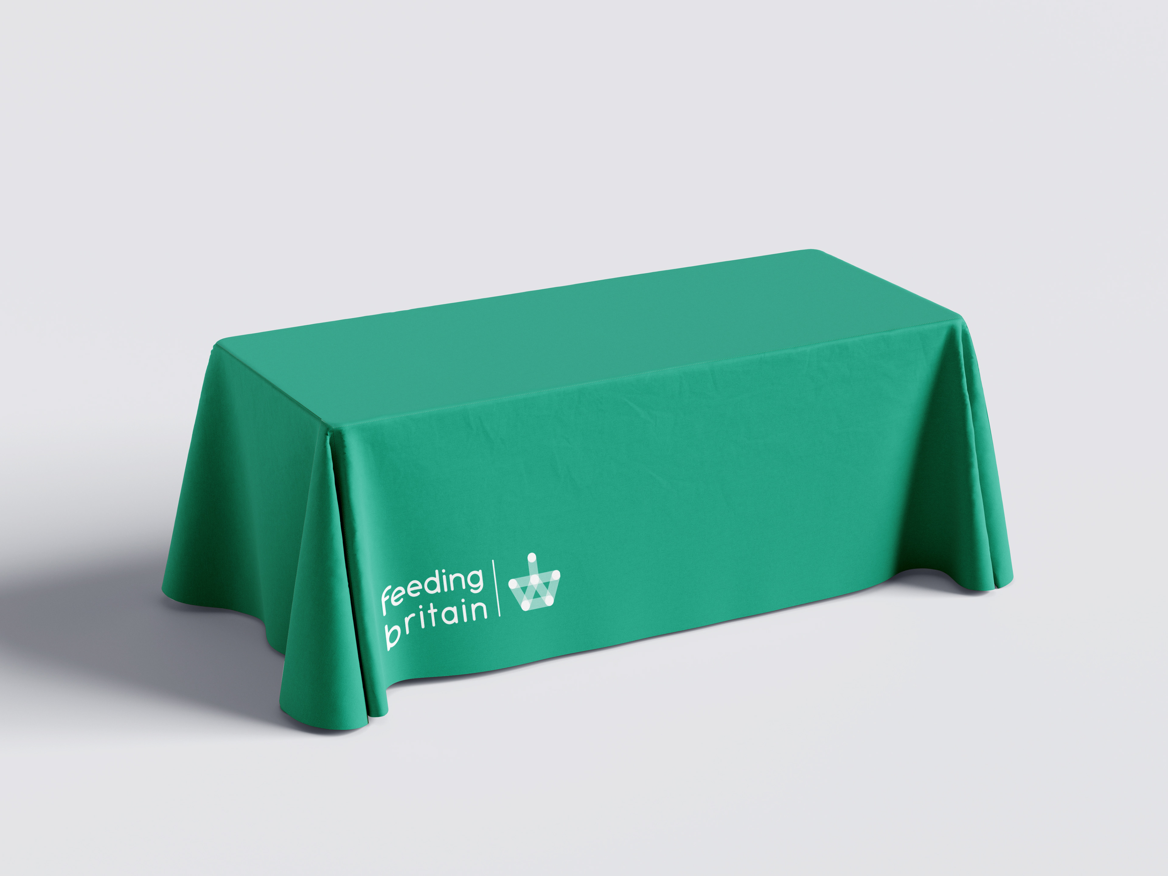
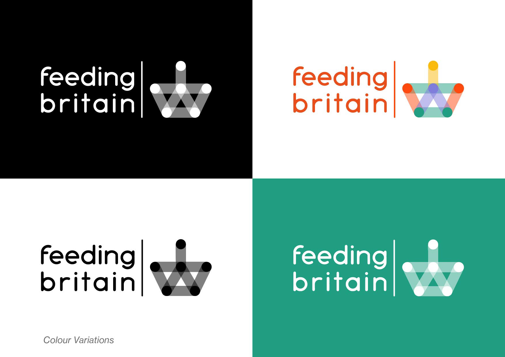
Brand mark is strong in full colour and single colour. Food bank table cloth. 
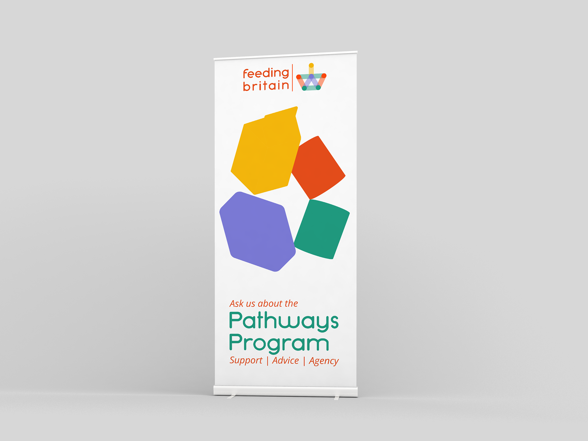
Softer full colour visual language signposts to wrap around services within foodbanks. 
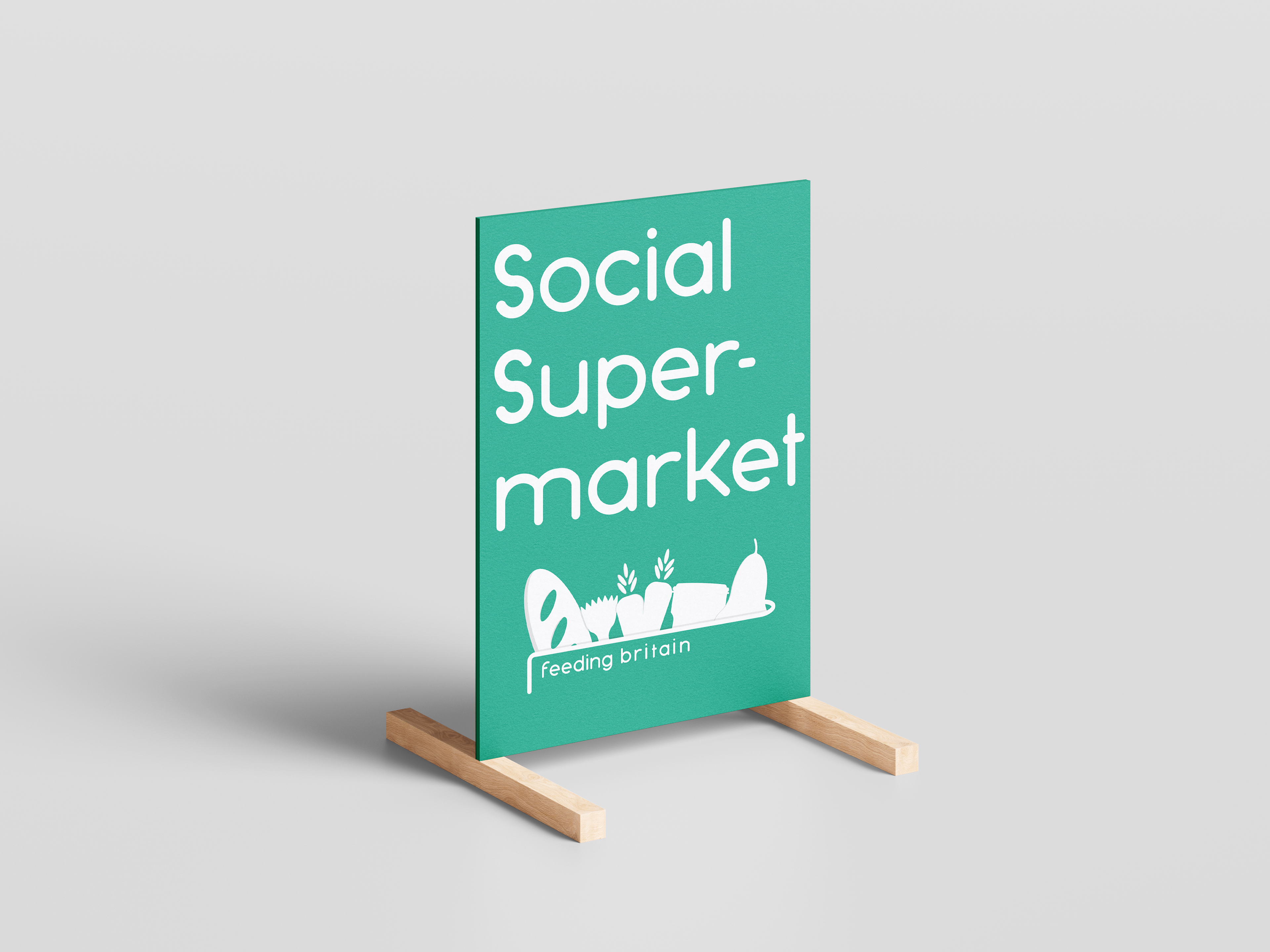
Visual identity can adapt to feel modern and approachable beyond its food bank roots and  gateway servcies. 
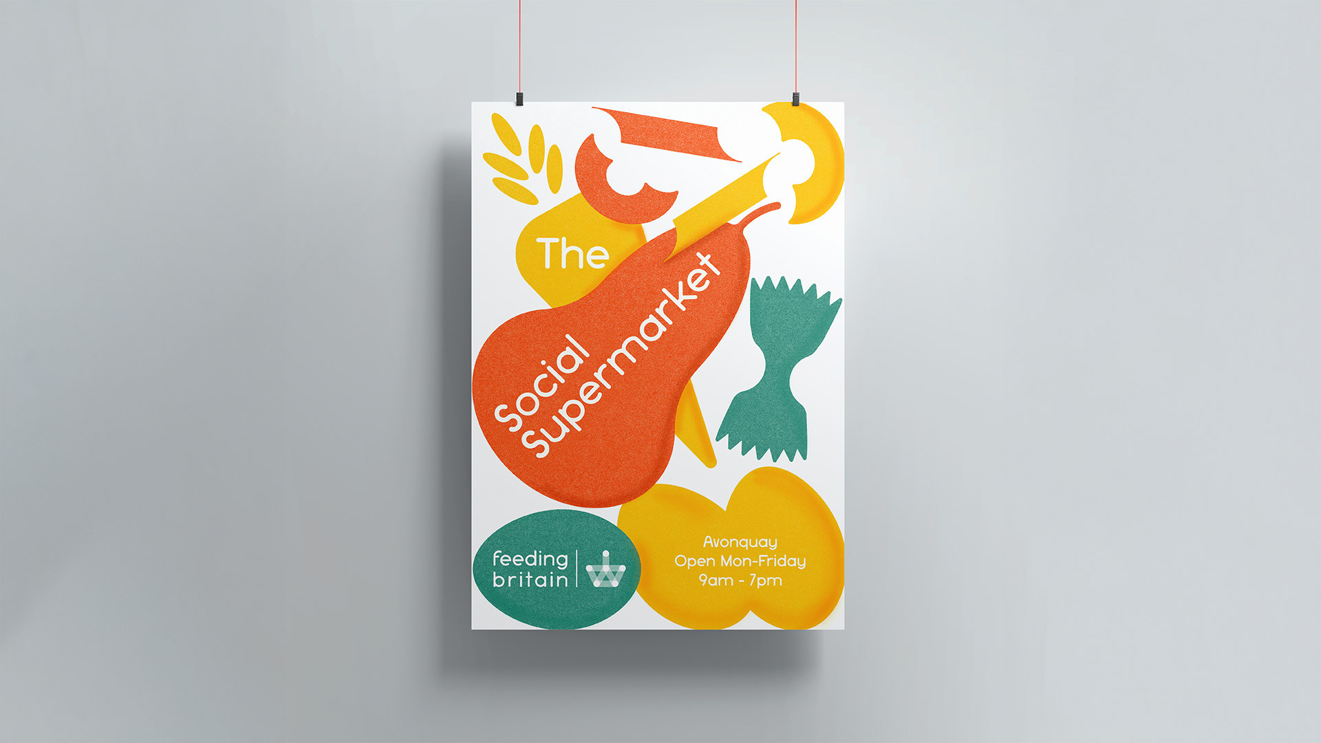
Shape language refined further within the pathways program to include texture. 
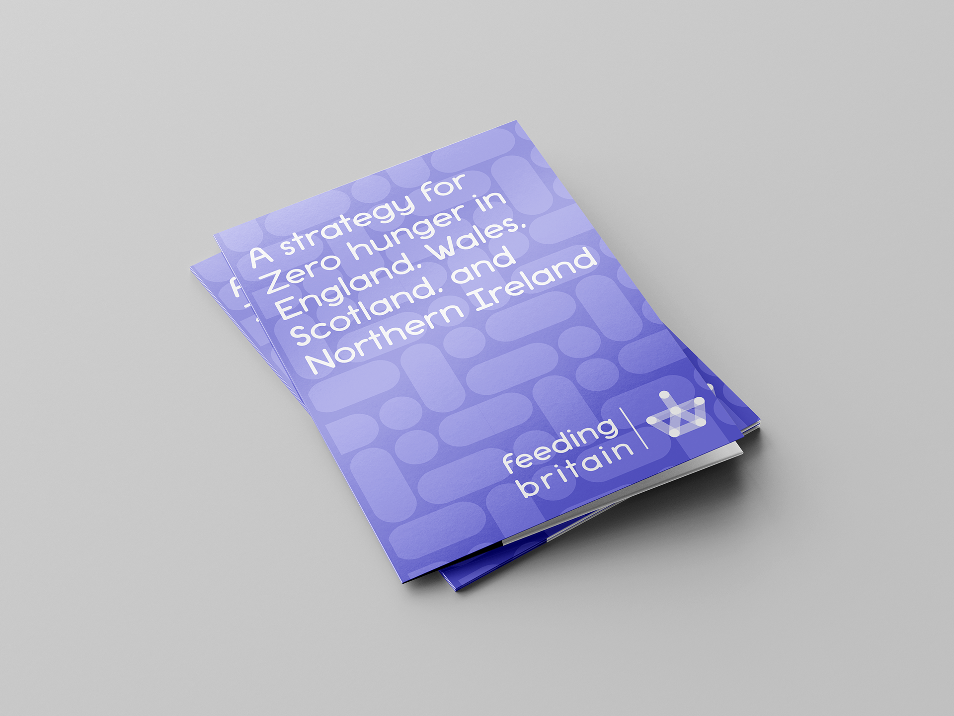
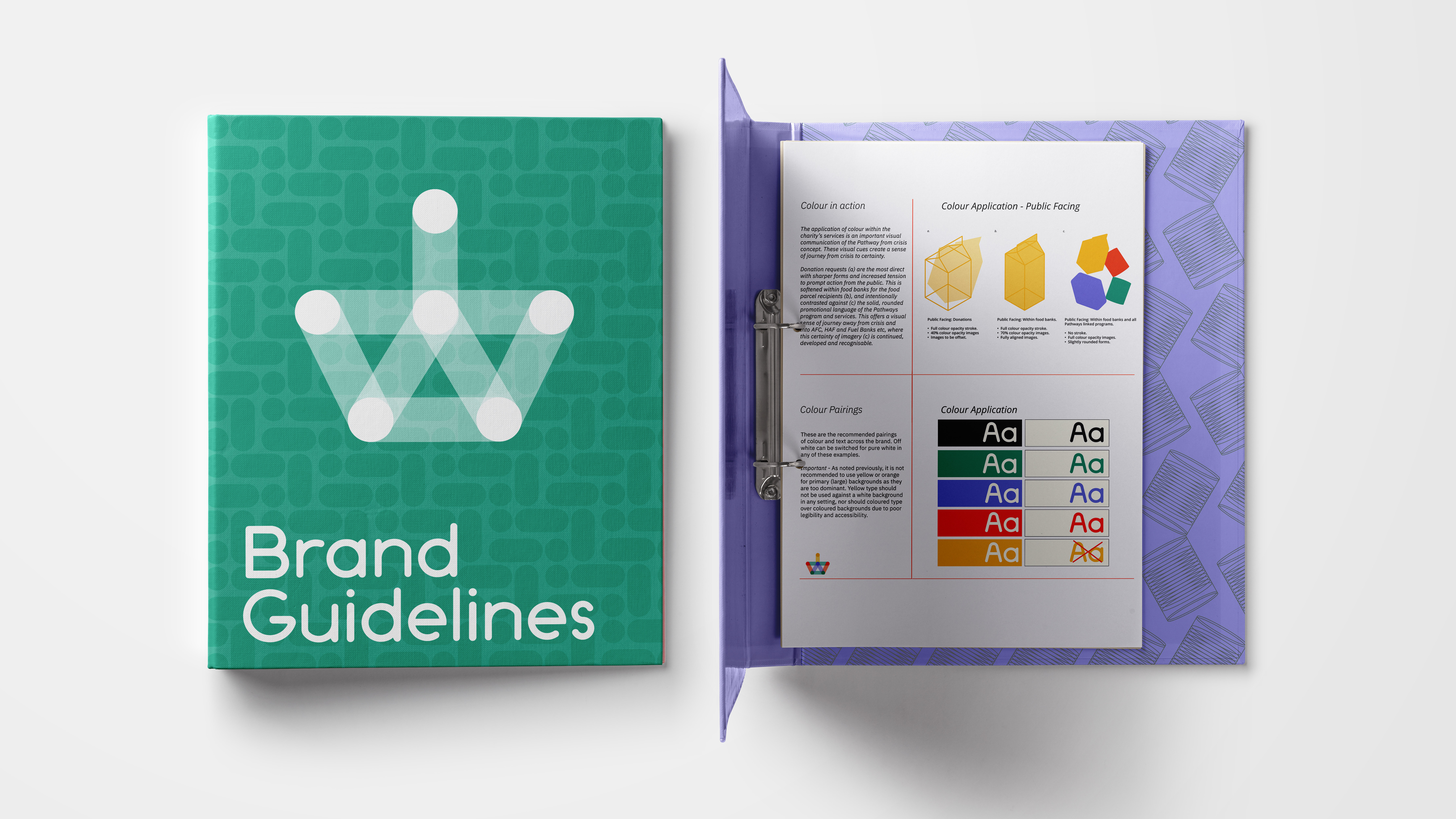
Internal communications set in a single colour, offering a clear differentiation from the front-line services. The pattern is derived from the sections of the logo with green and purple used on alternating years. 
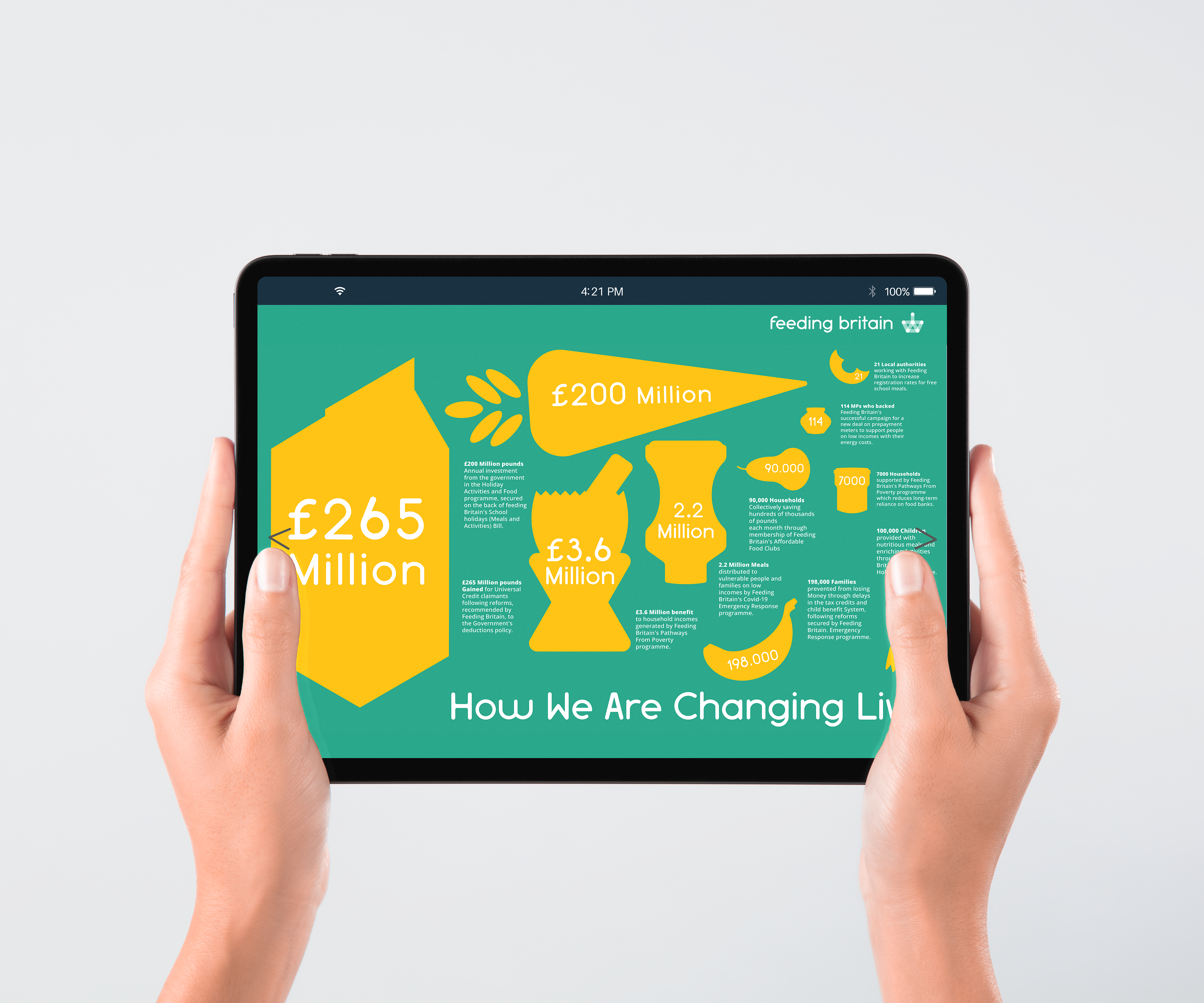
Infographics - Web & Social Media

Food bank shape language adapted for web applications and educating on the charities success and story. 
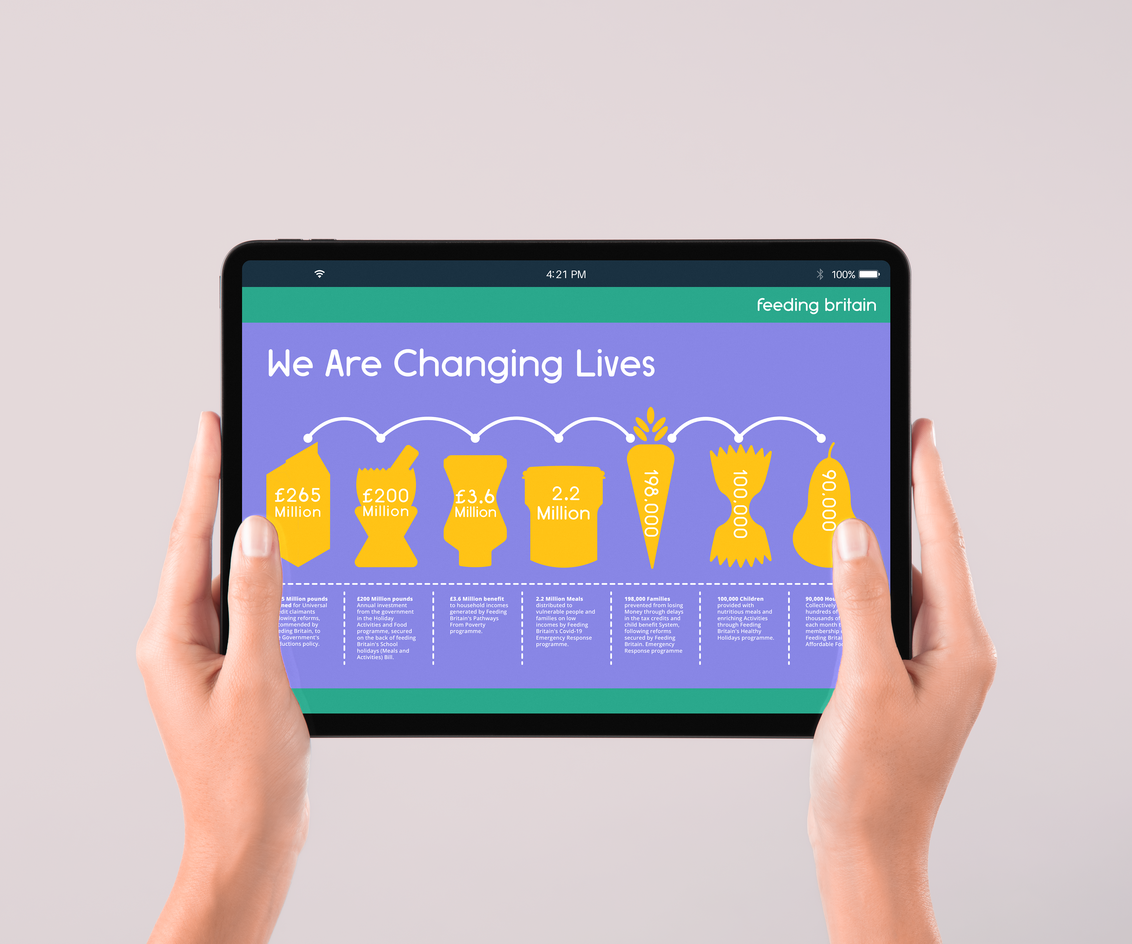
Food bank shape language adapted for web applications and educating on the charities success and story. 
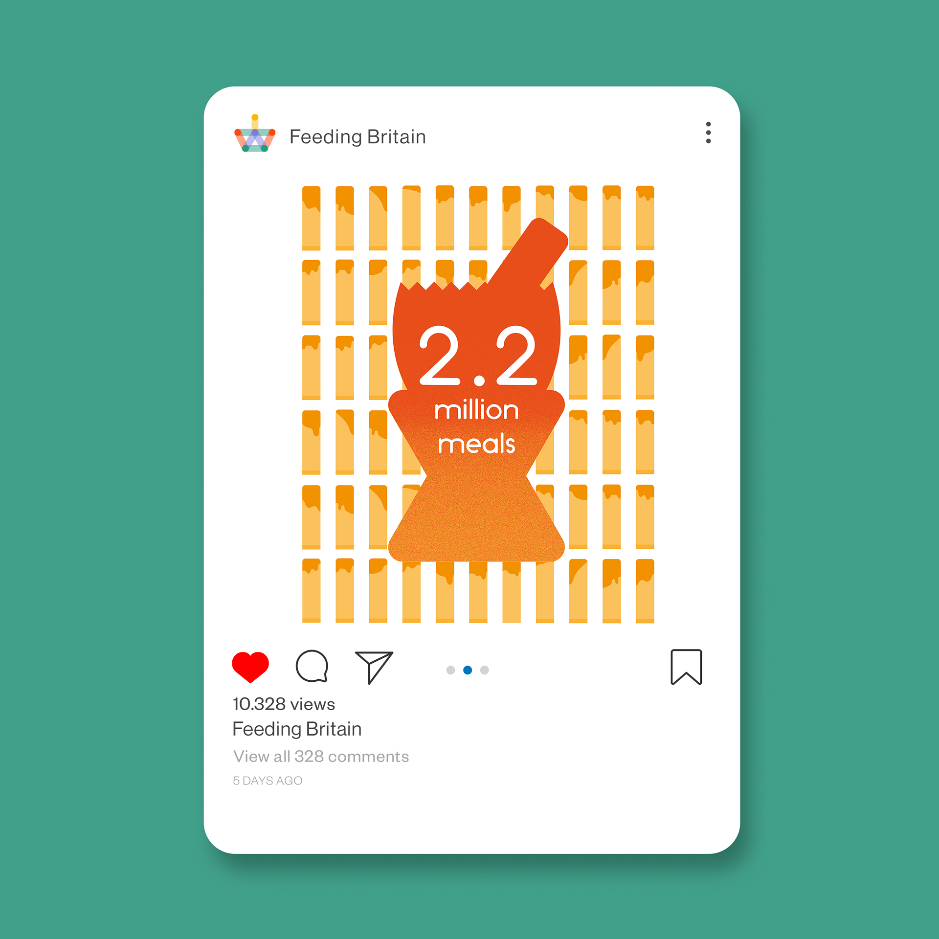
Visualisation of Charity outcomes and successes. 
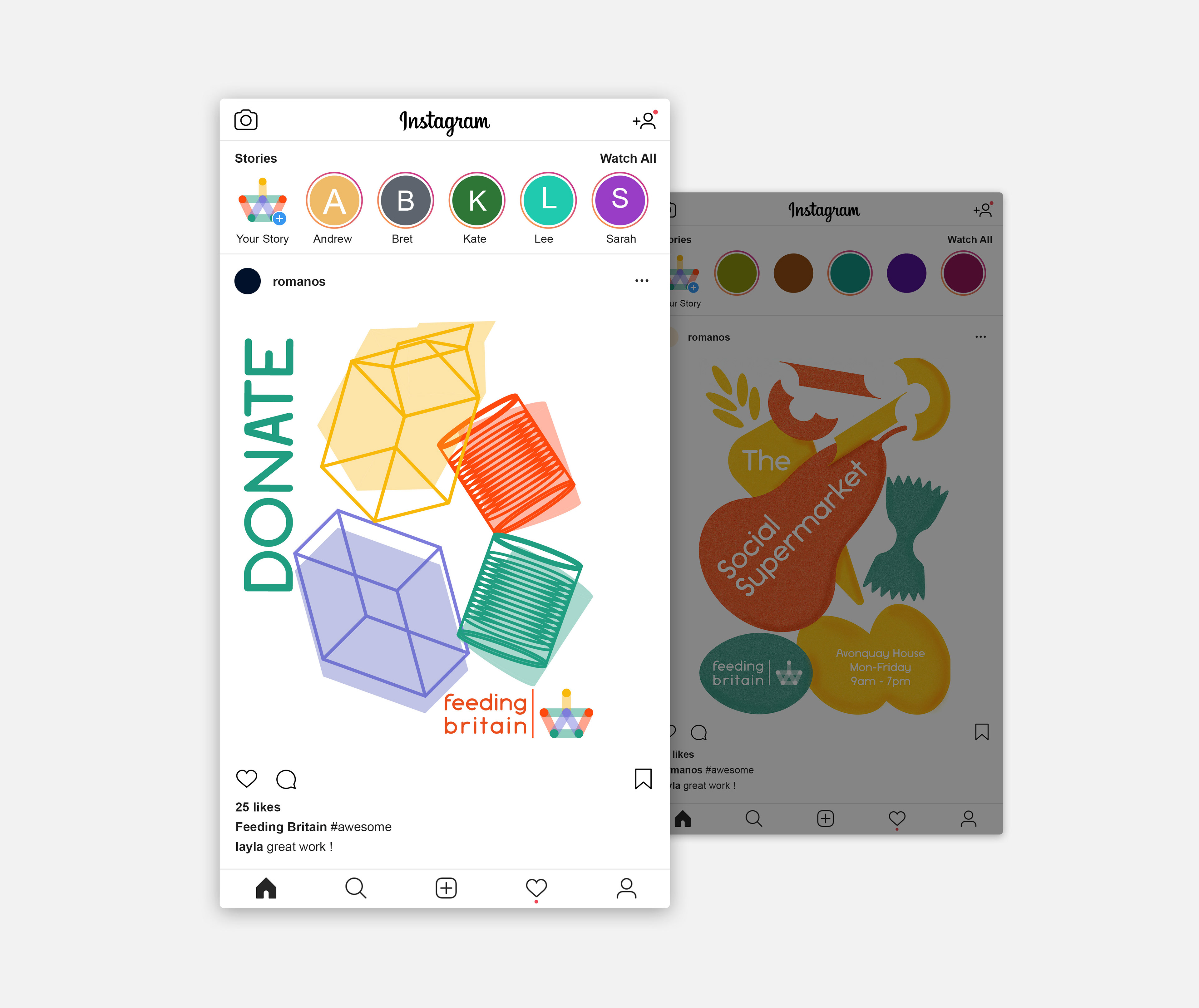
Socials: Clearer calls to cation for netwrok members seeking support, or those seeking help. 
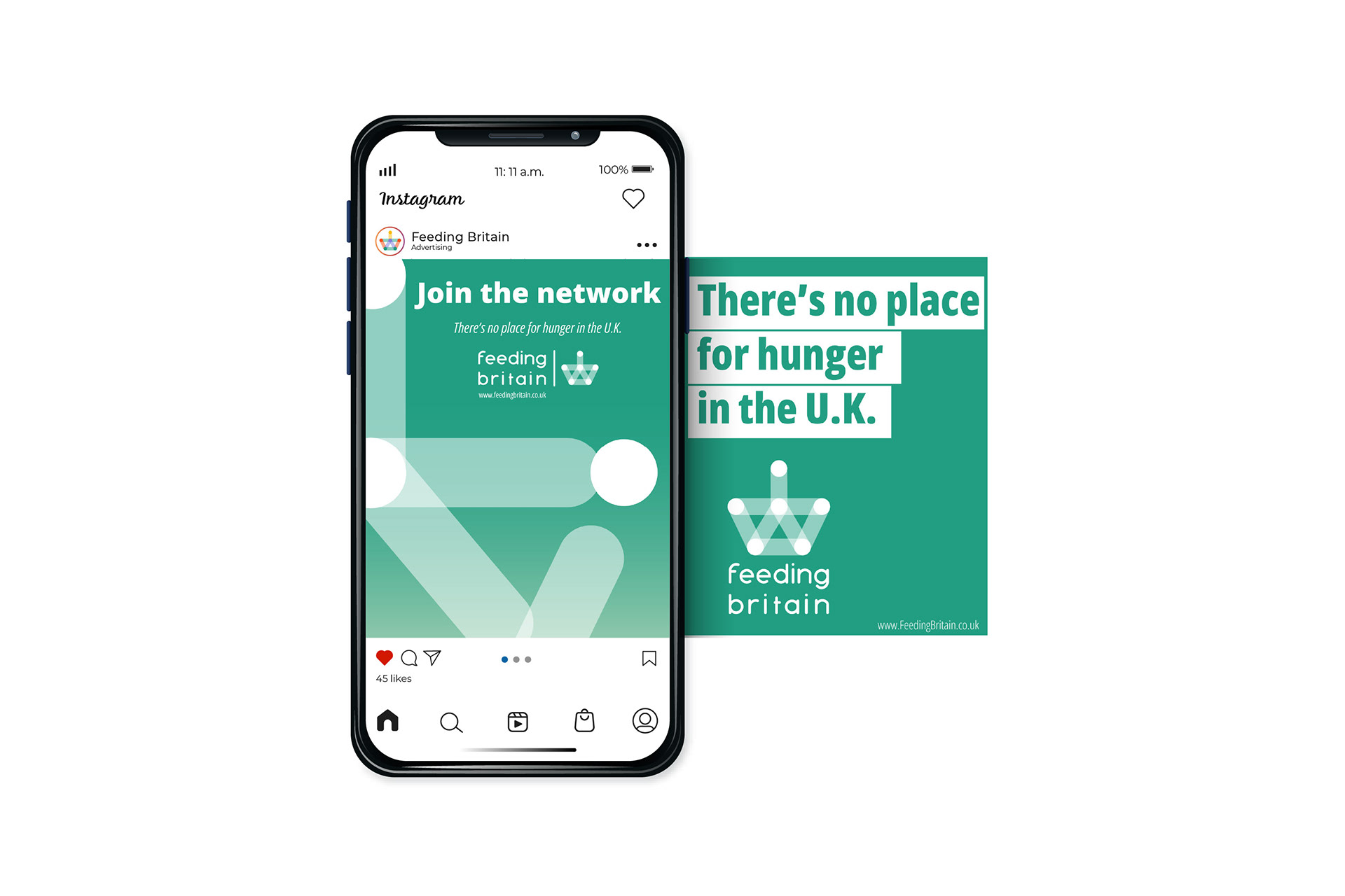
Socials: Clearer calls to action for netwrok partner growth.  
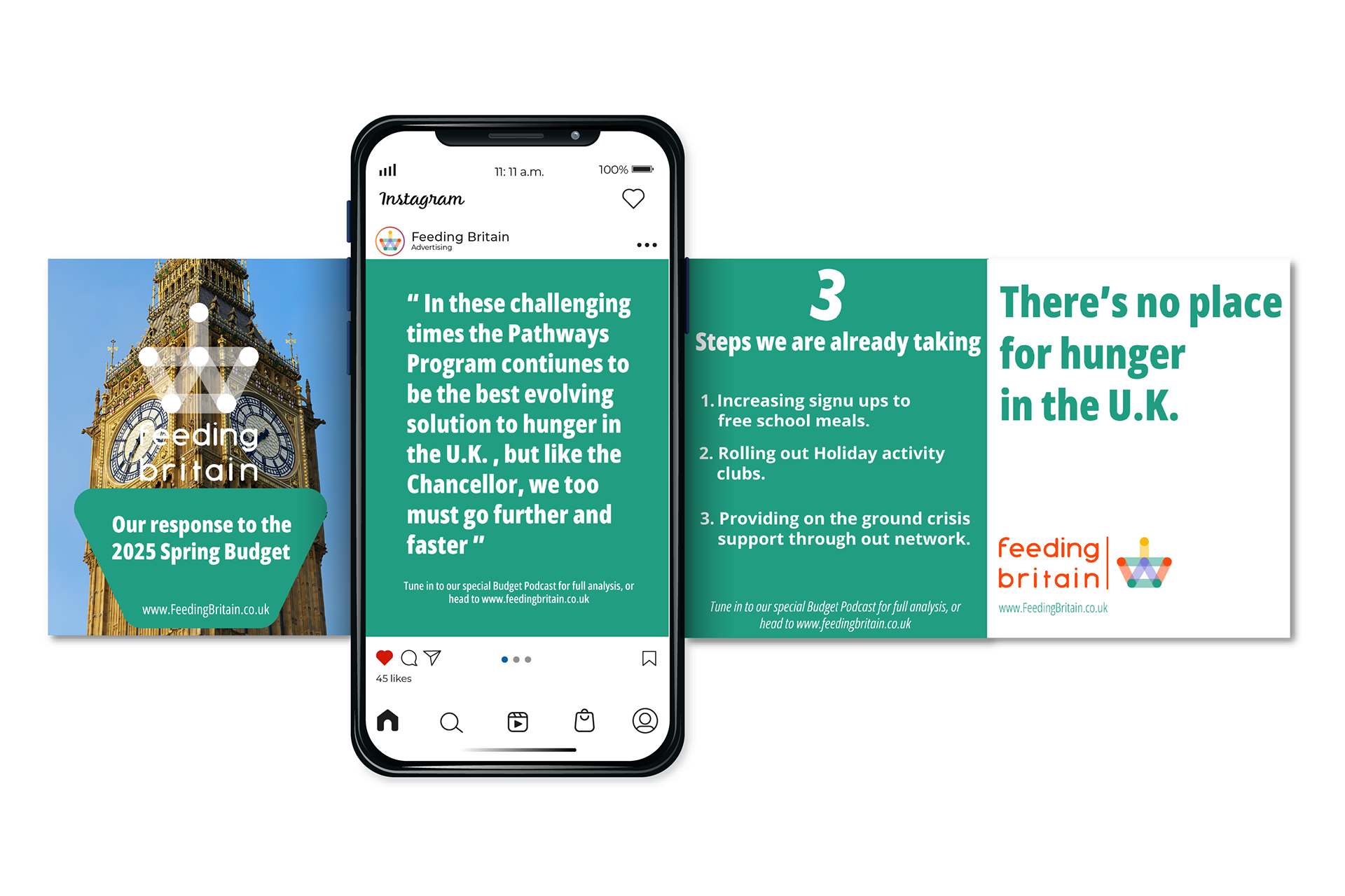
Socials: Clarity of message and tone of voice when communicating lobbying efforts. 
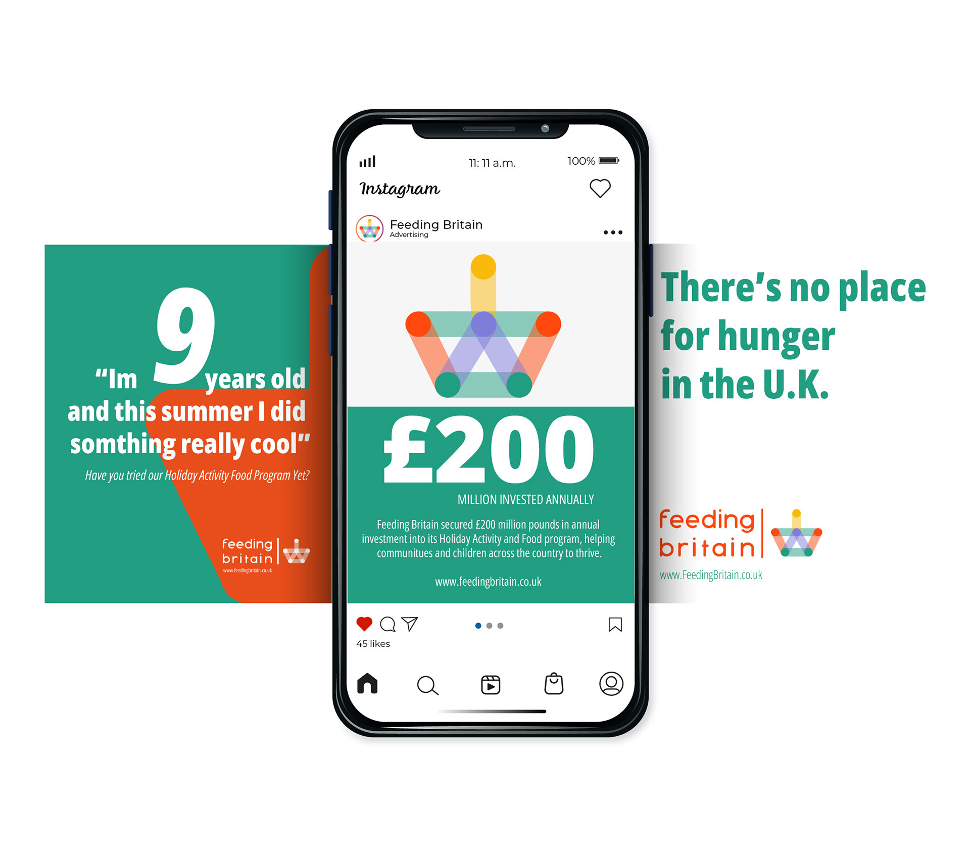
Socials: Clearer communication and education on the charities work and succes stories. 
You may also like

Back to Top