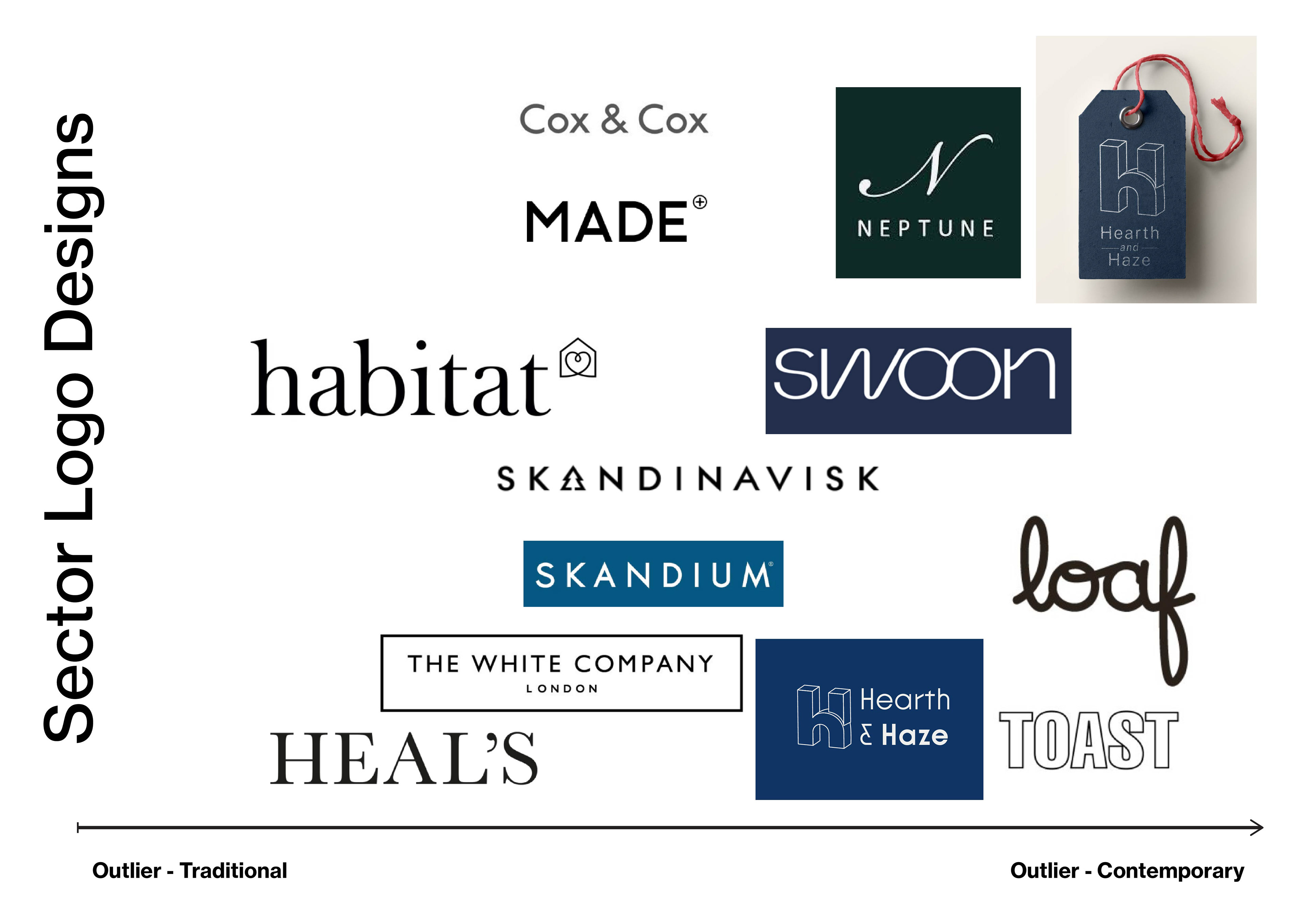
Branding comparisons - *Example shows my outcomes here*.
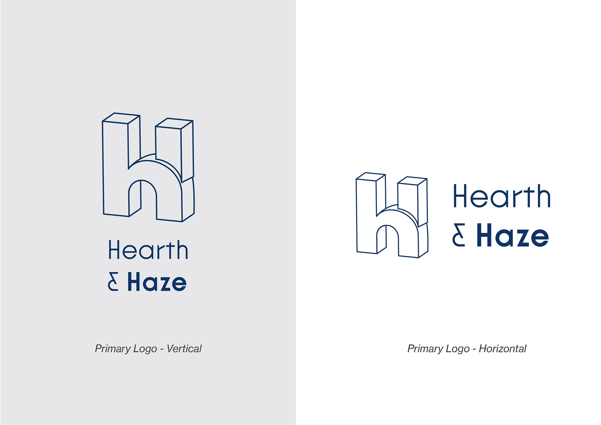
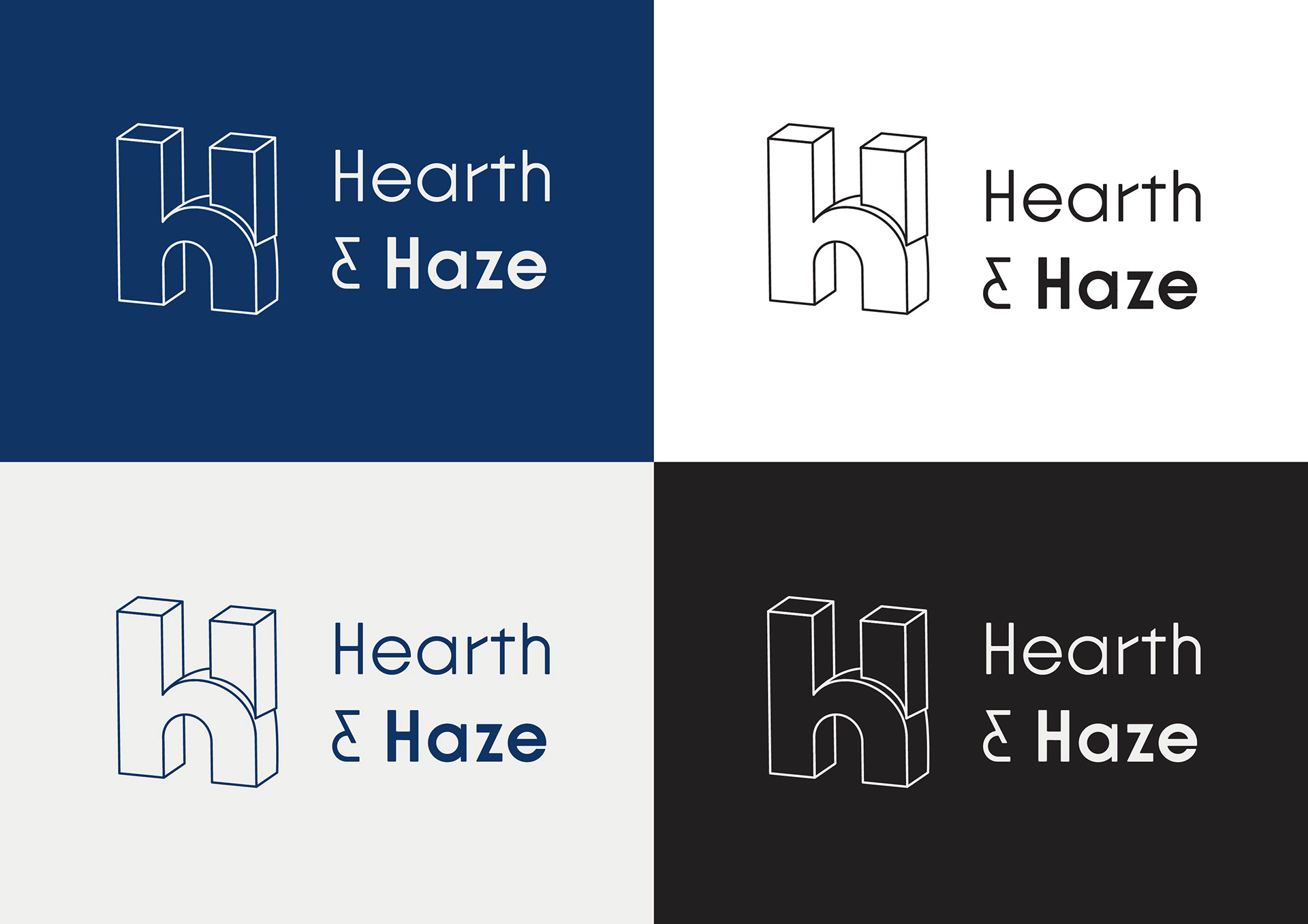
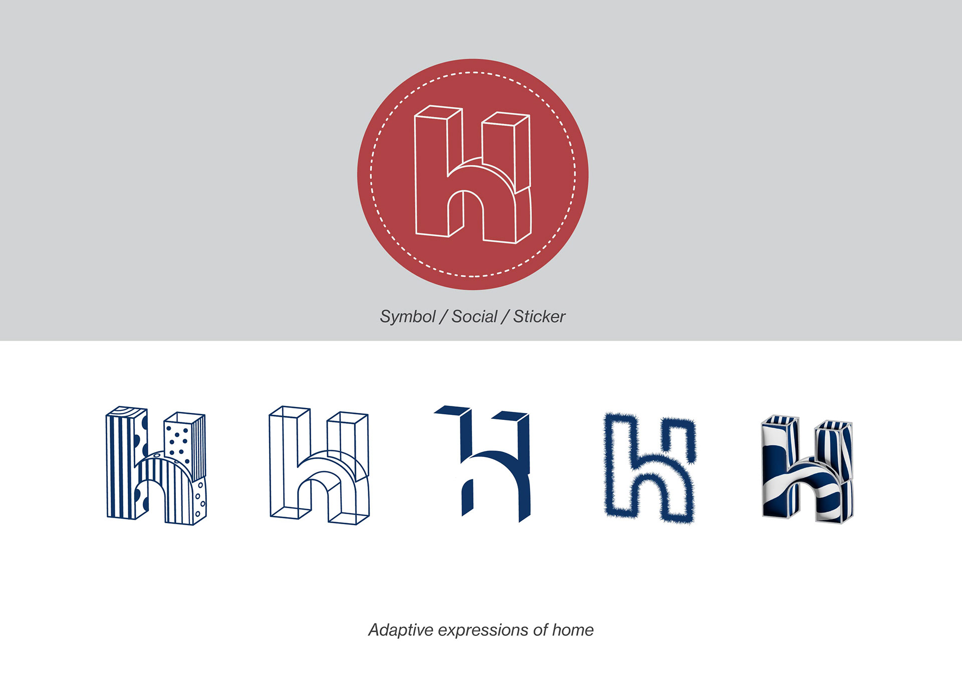
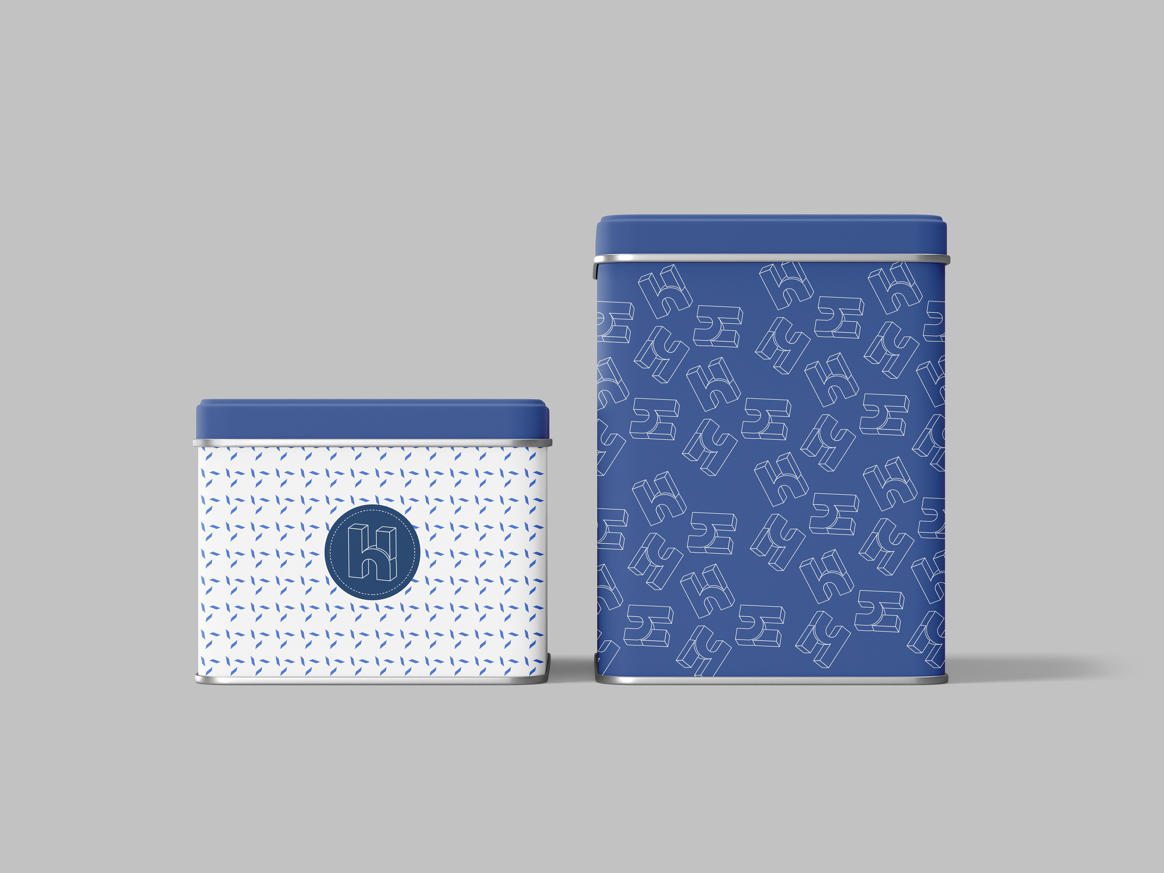
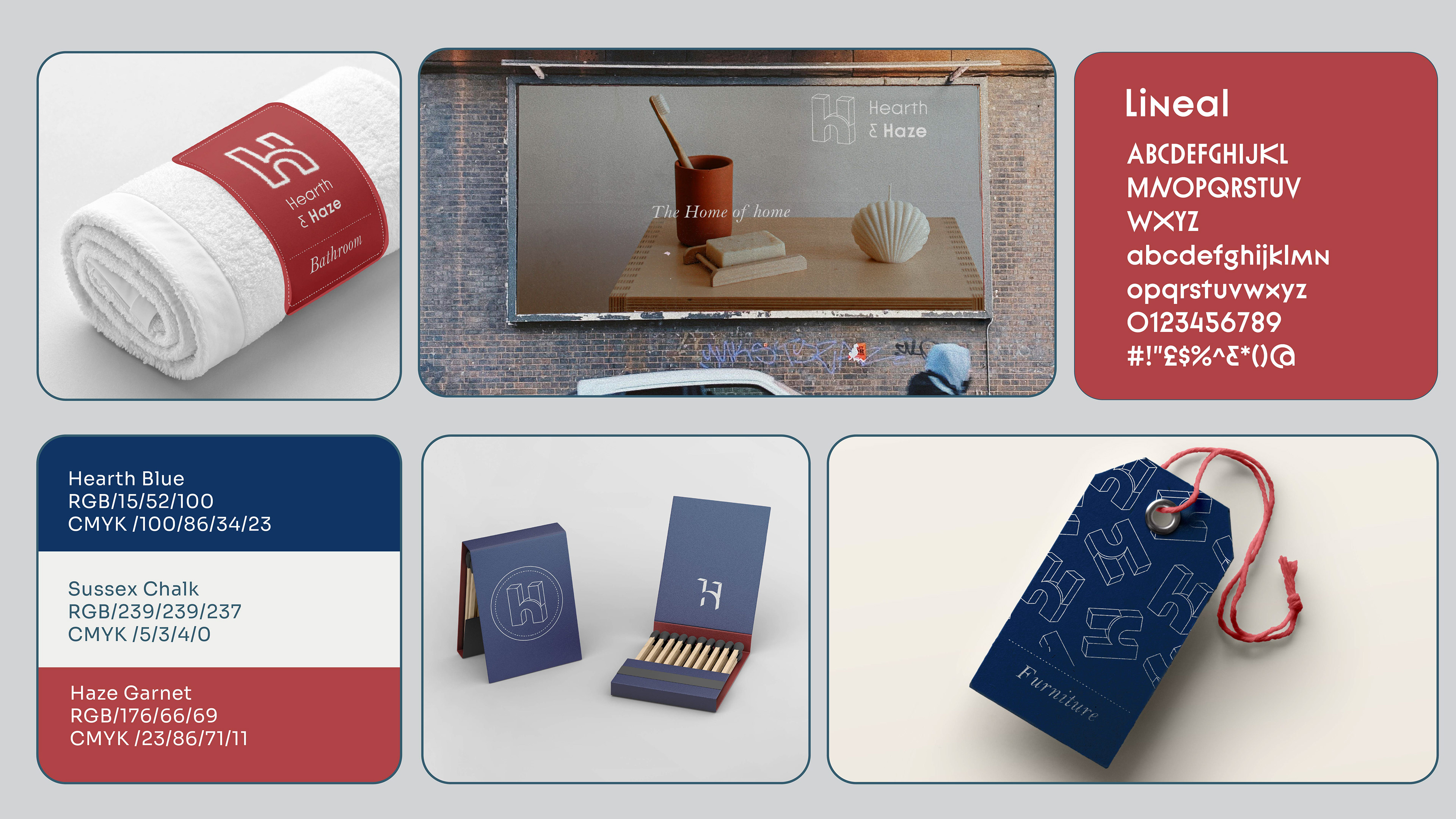
Flexible logo variations for promotions and instore departments
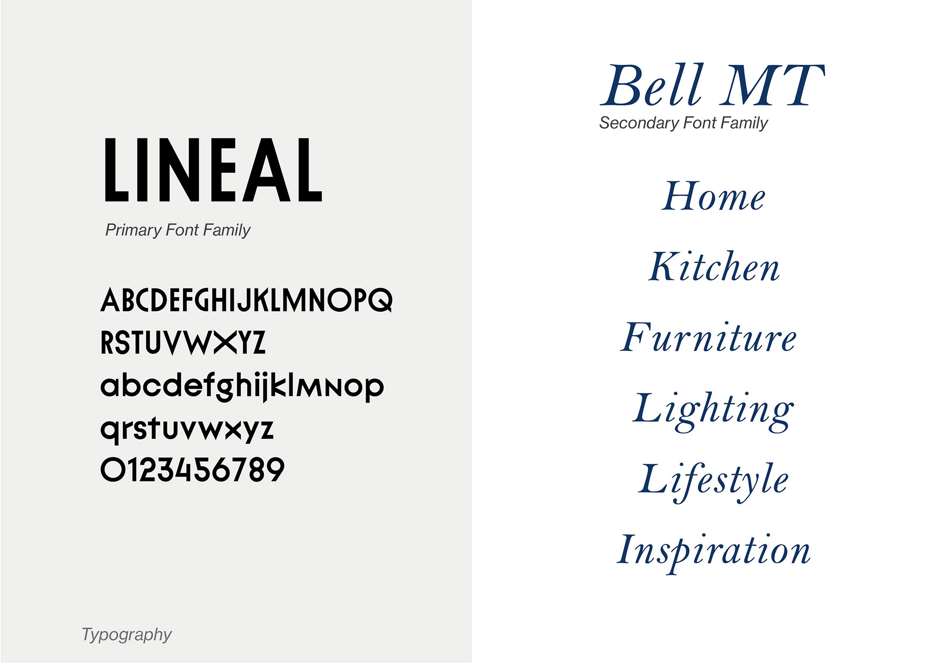
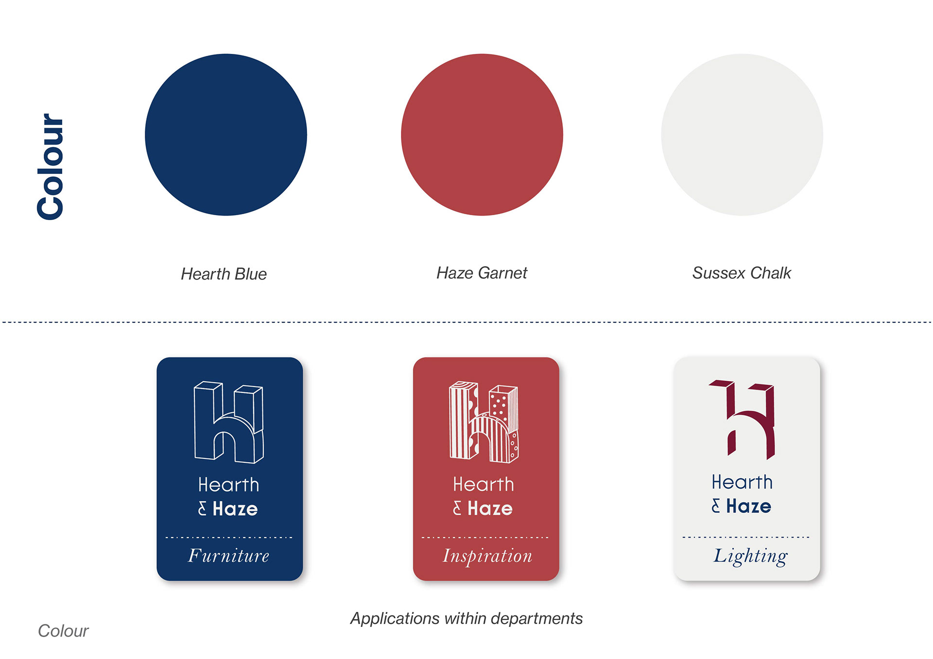
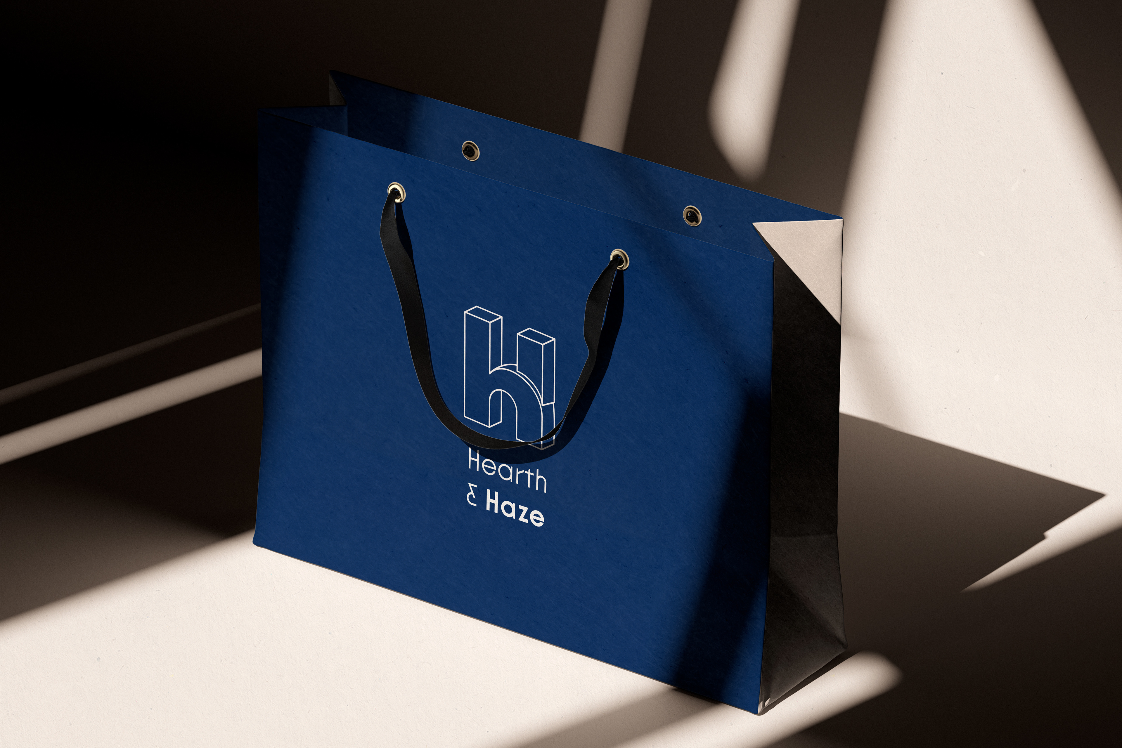
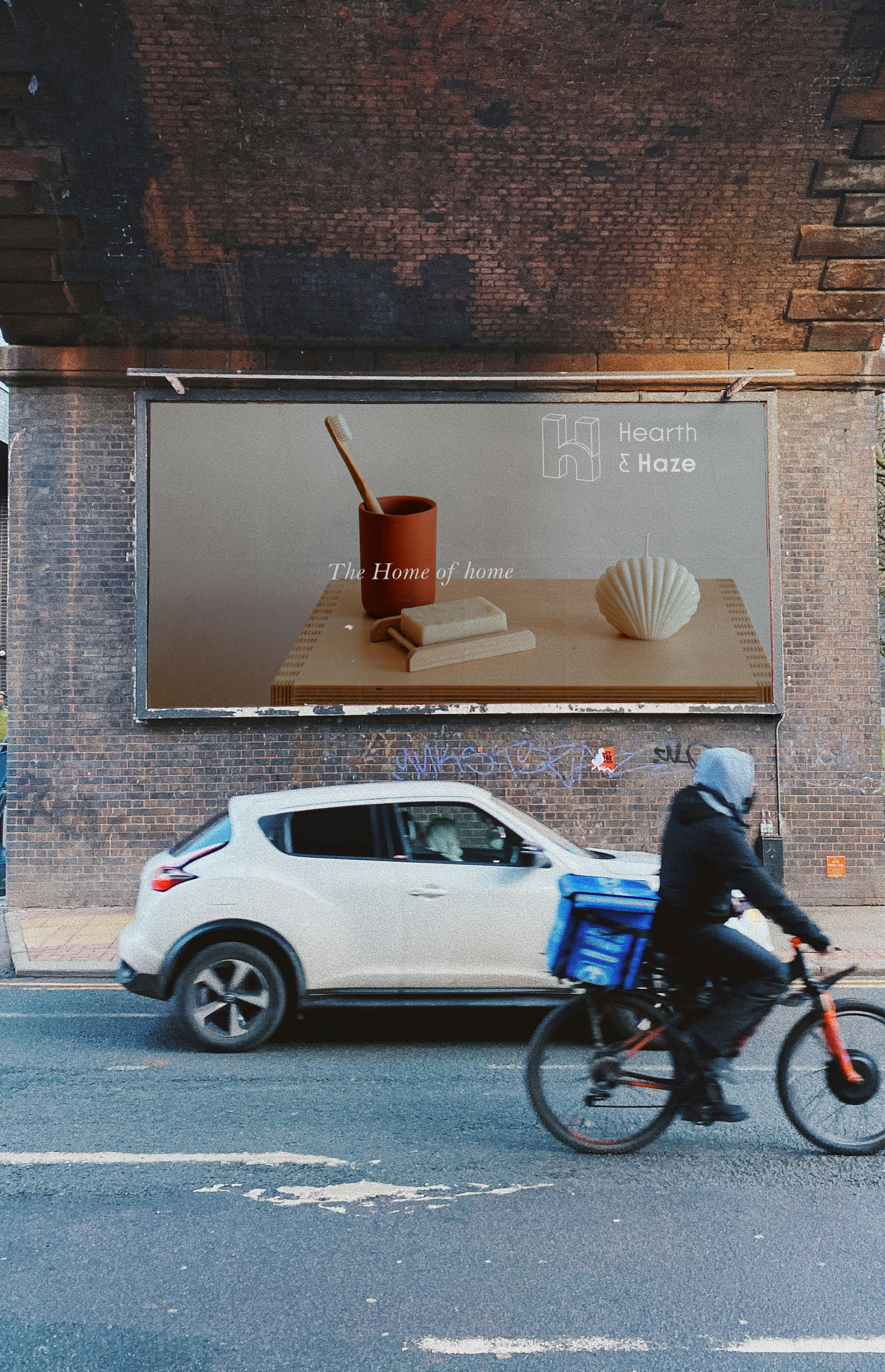
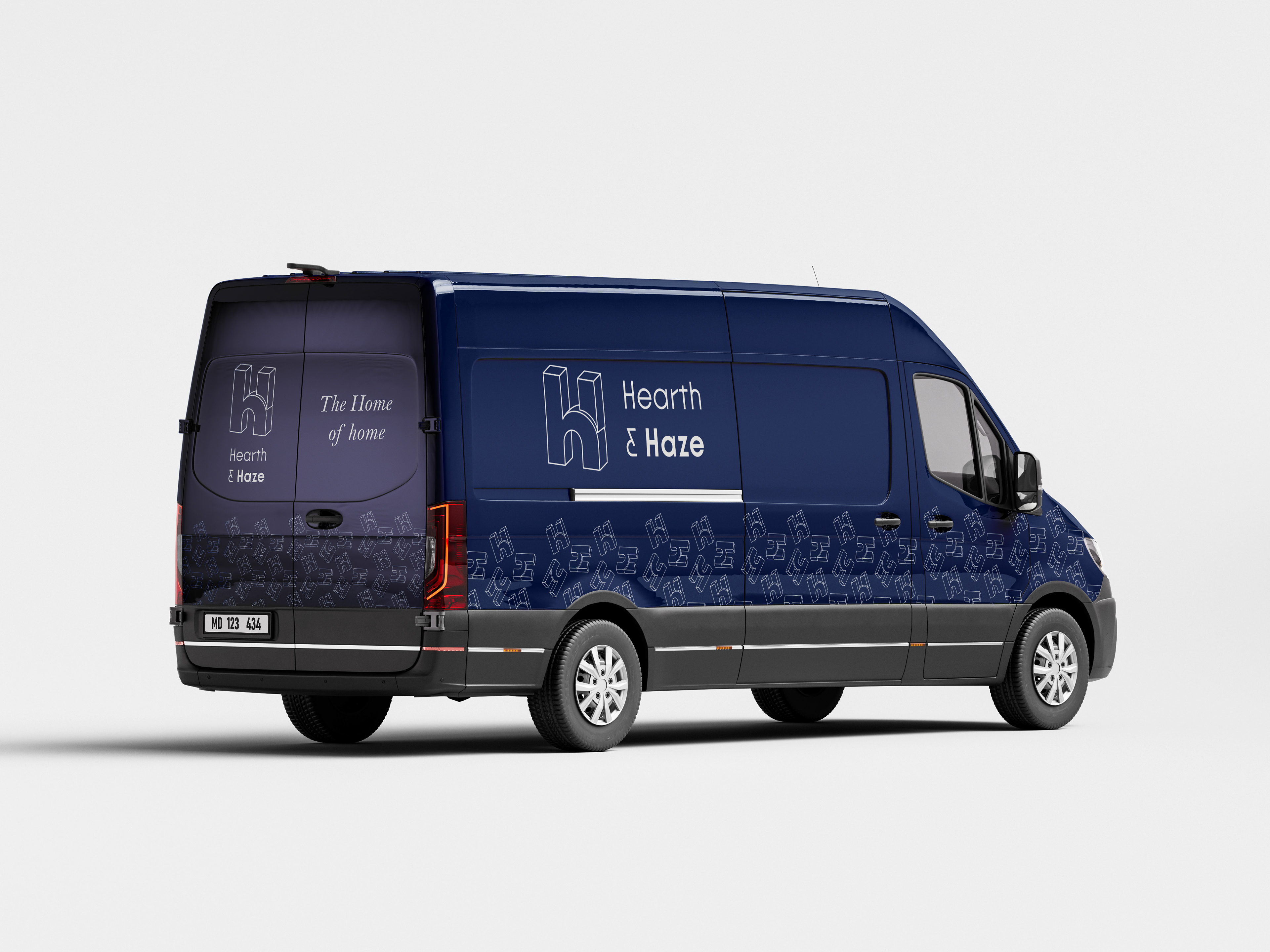
The logo stands up to, and stands out within the urban environment, while still communicating dynamically. Here it is clean, airy and offering a sense of calmness, while not losing its strengths as a design centric brand.
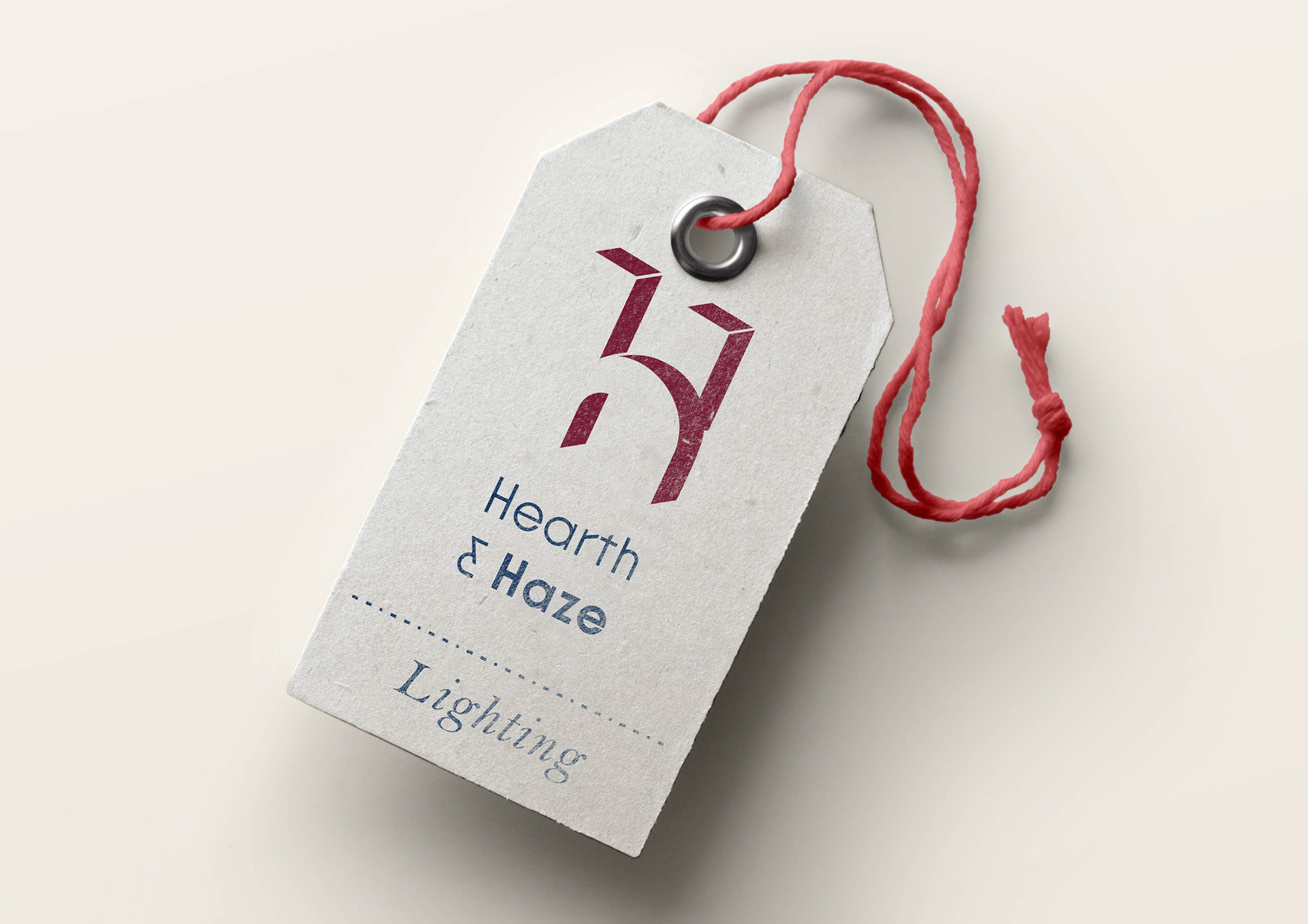
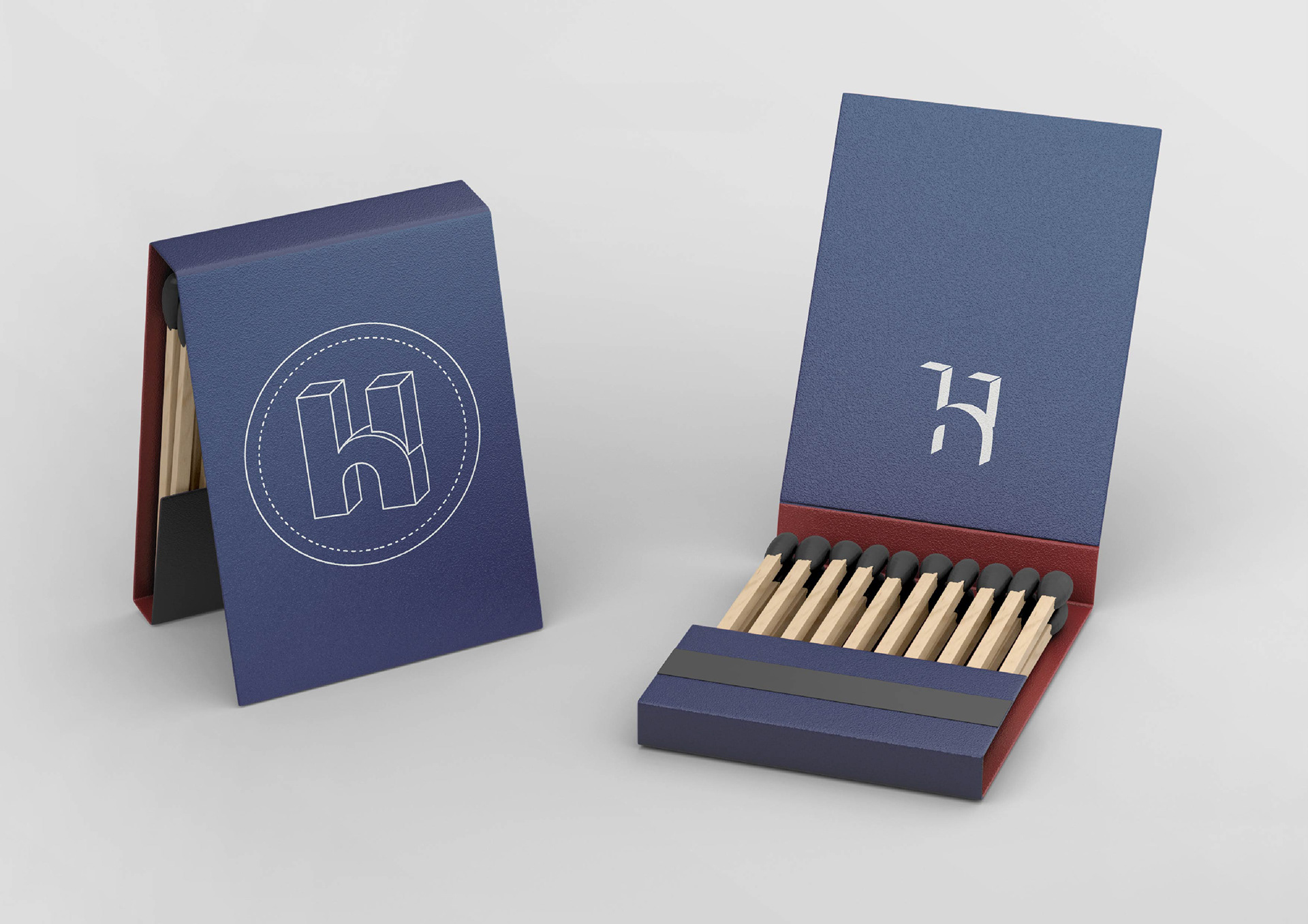
Coupled with the monogram for light, the design concept of formal and informal is pushed further through the use of materials and the idea of wear and "lived in" while also communicating quality and longevity.
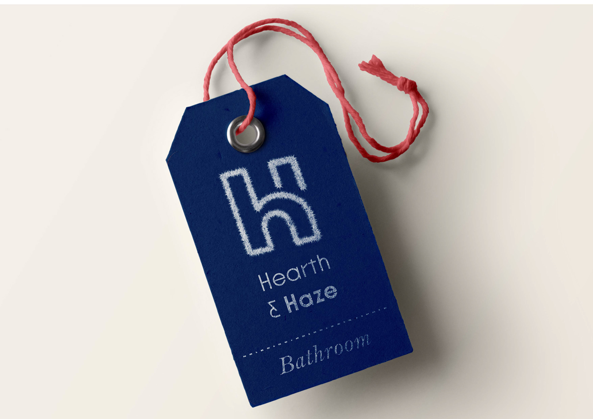
A further series of 2D marks lean into the essence of a specific space, such as warmth, softness and touch.
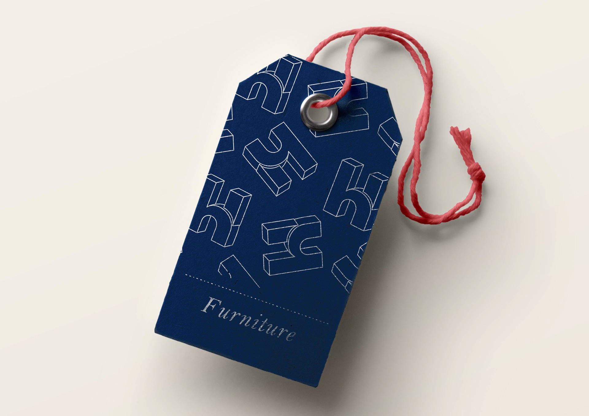
Playfulness here counters any sense of seriousness or over-formality, offering agency in curating
your Home of home.
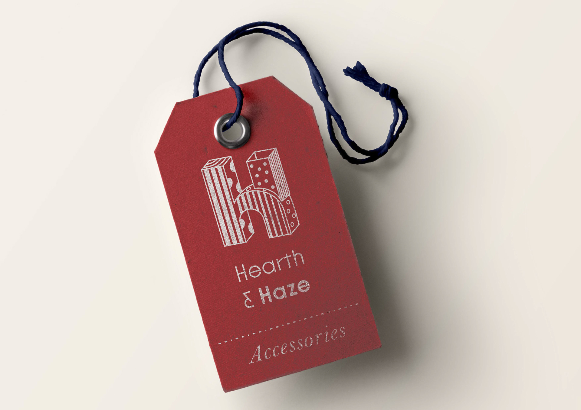
Here, permission is encouraged over ownership of your space. The formal structure of the mark, however, ensures that the essence of fromal and infromal is maintined and the brand identity is both strong and flexible.