Project: Aurora Coffee - Leith Harbour
Branding & Logo Design | Packaging Design | Art Direction
This is a self-directed project with a brief generated using ChatGPT. While Ai was not used in the remainder of the project, this was an opportunity to develop my portfolio and work to a structured brief, pushing my design skils.
Brief: Aurora Coffee is a coffee shop targeted at those who value the craft of speciality coffee brewing and the sourcing of quality beans. We are for the coffee lovers and the local community we serve; we want to be a place where people in our community come together. Brand Heroes: Patagonia, Inteligencia and Blue Bottle coffee.
The brand should have a nod to the outdoors or the aurora borealis theme in some way. The logo should be clean and elegant, but no script fonts. The brand also needs a symbol that can be used across our social platforms.
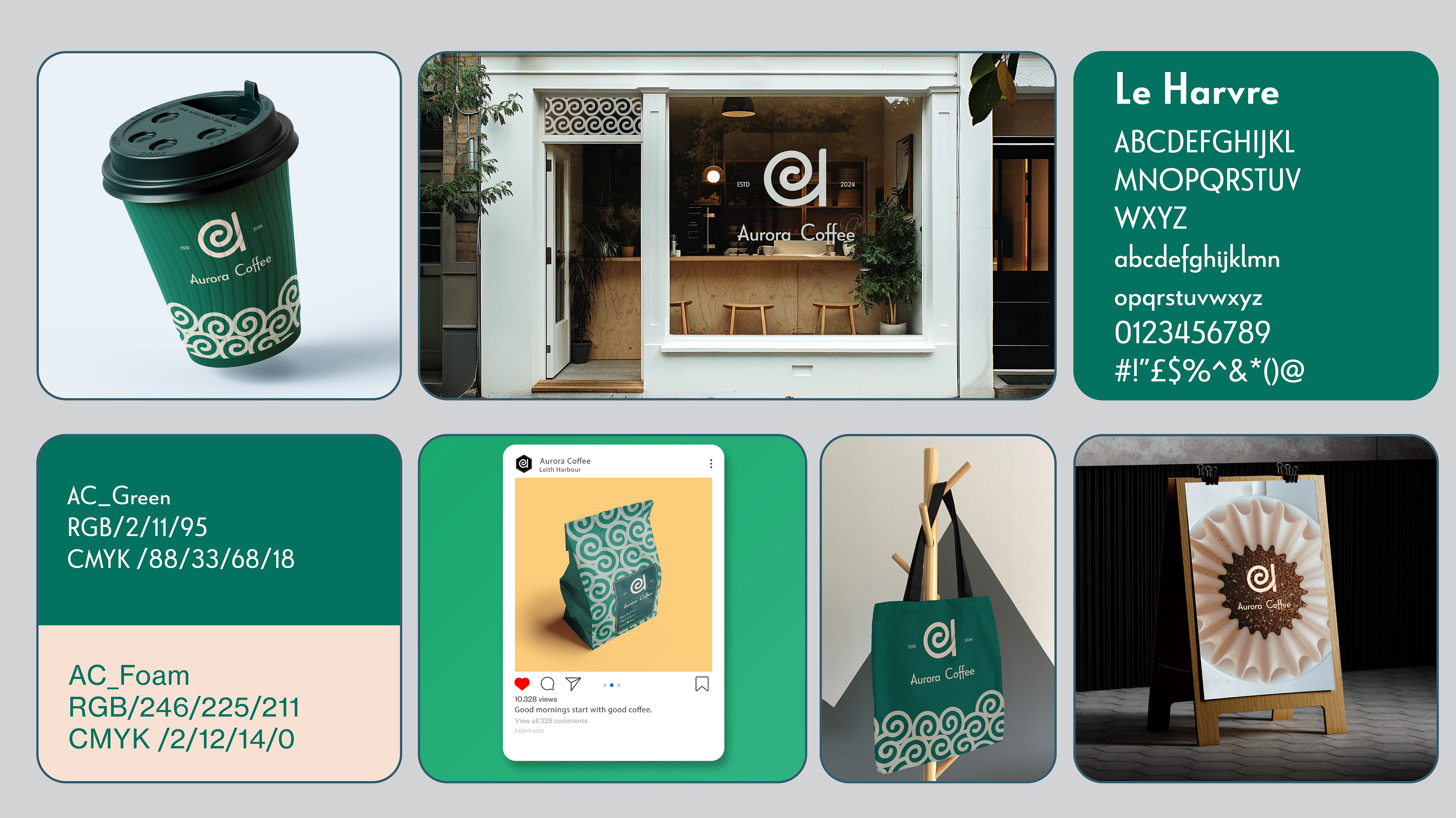
Project Summary Board
Design Thinking & Purpose
The project asks for a brand that appeals to the community and the coffee connoisseur, while also leaning into the outdoor and aurora themes. This coffee shop is based in a city, so I was aware that finding the balance without this feeling like a cliche, fantasy-style brand. I leaned heavily into the brand heroes and tried to keep the outcomes clean and refined, so they would work well in an urban environment, but without alienating a local community feel that was important. I was also aware that the coffee cup design would be a central part of the brand identity and marketing, as these act as an important signifier to other shoppers as people move about the city with them.
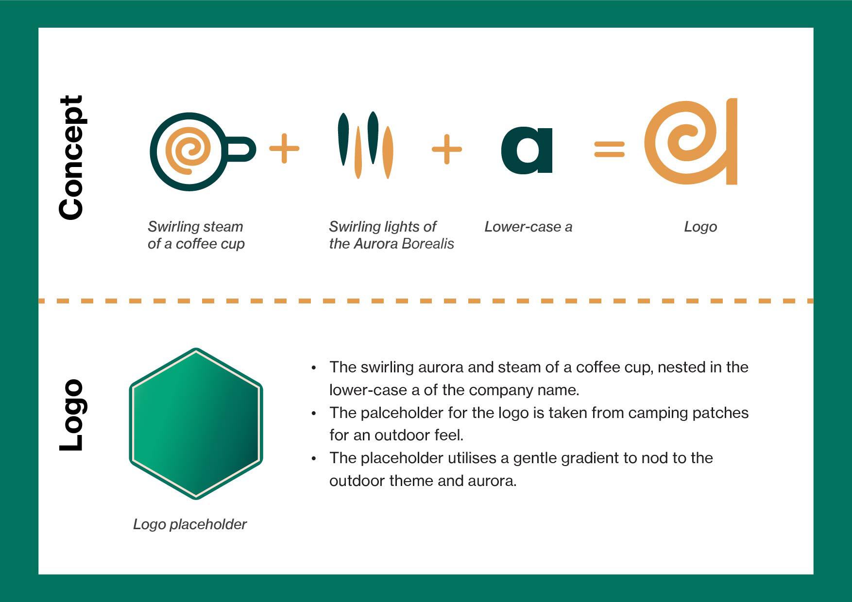
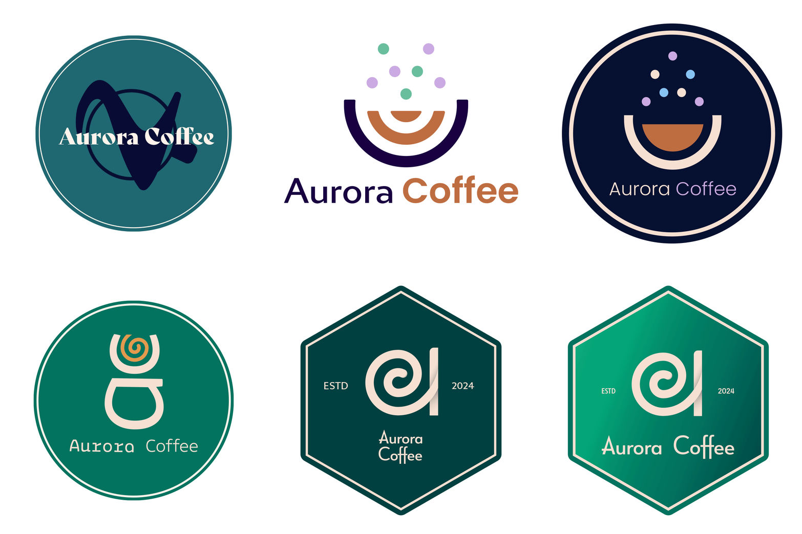
Logo development
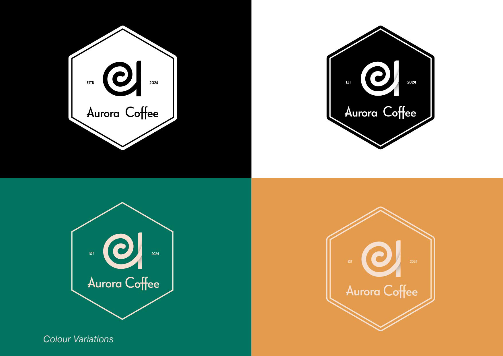
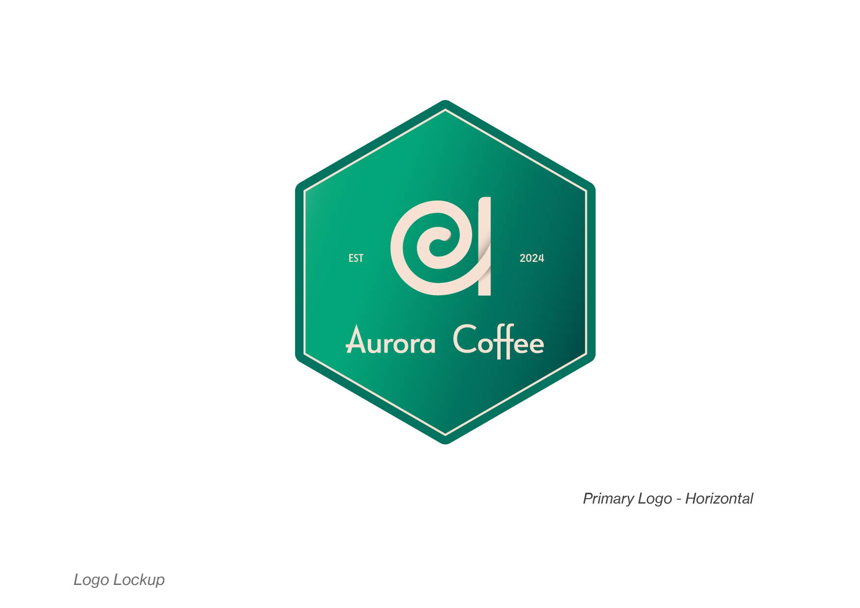
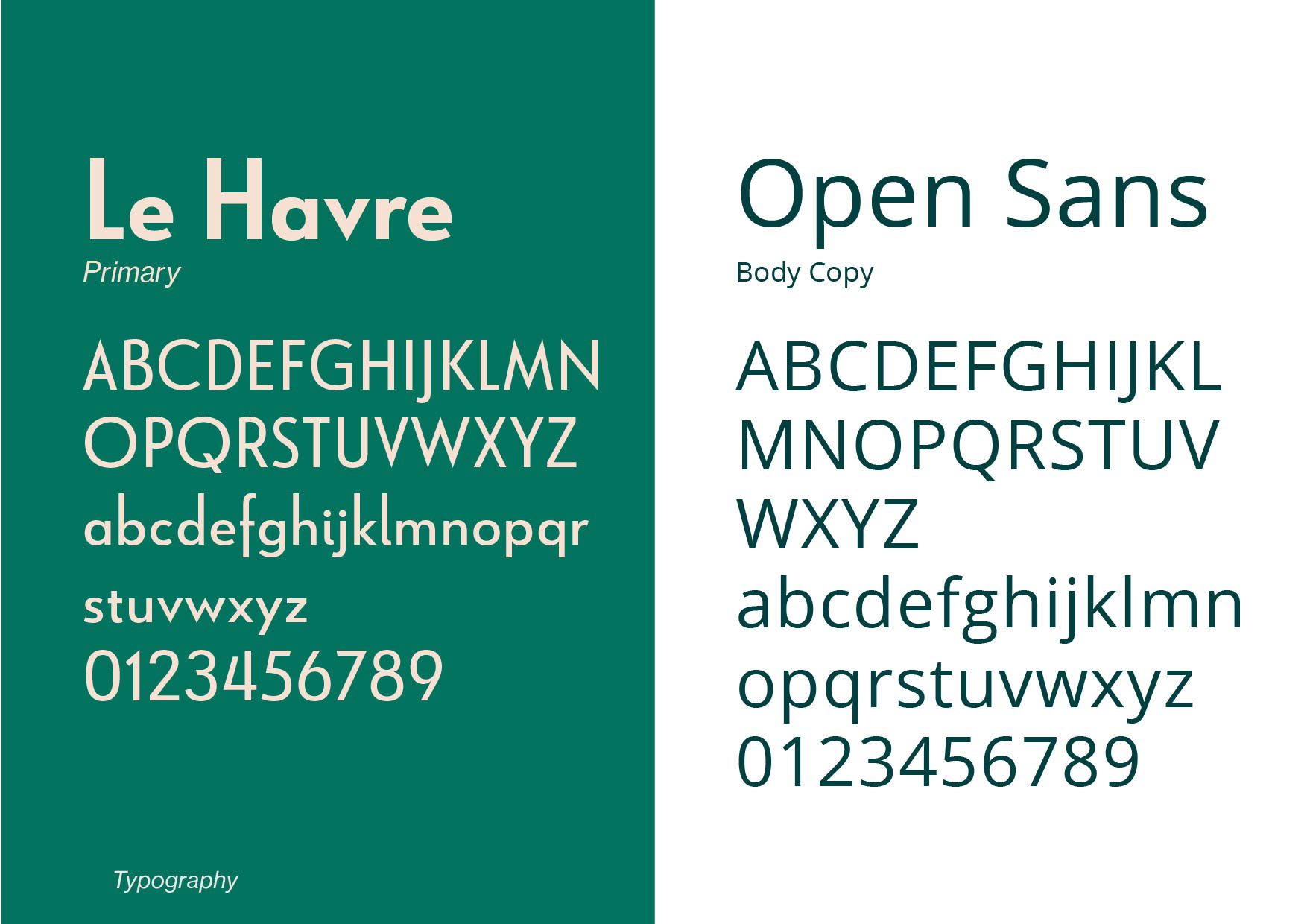
Outcomes
Outcomes are not possible to measure on the client side, as this was a personal project. However, within a Creative Lives in Progress portfolio review, the project was well received, with the packaging and coffee cup design highlighted as a success within the project and how I had considered the brand across store and social media. I also discussed how the project helped me see the role of the client, as you can only go so far on this type of exercise without losing a tangible audience and business focus/ outcome requirement. I did enjoy this task and look forward to my first coffee shop project with a live brief.
Aurora Coffee Branding
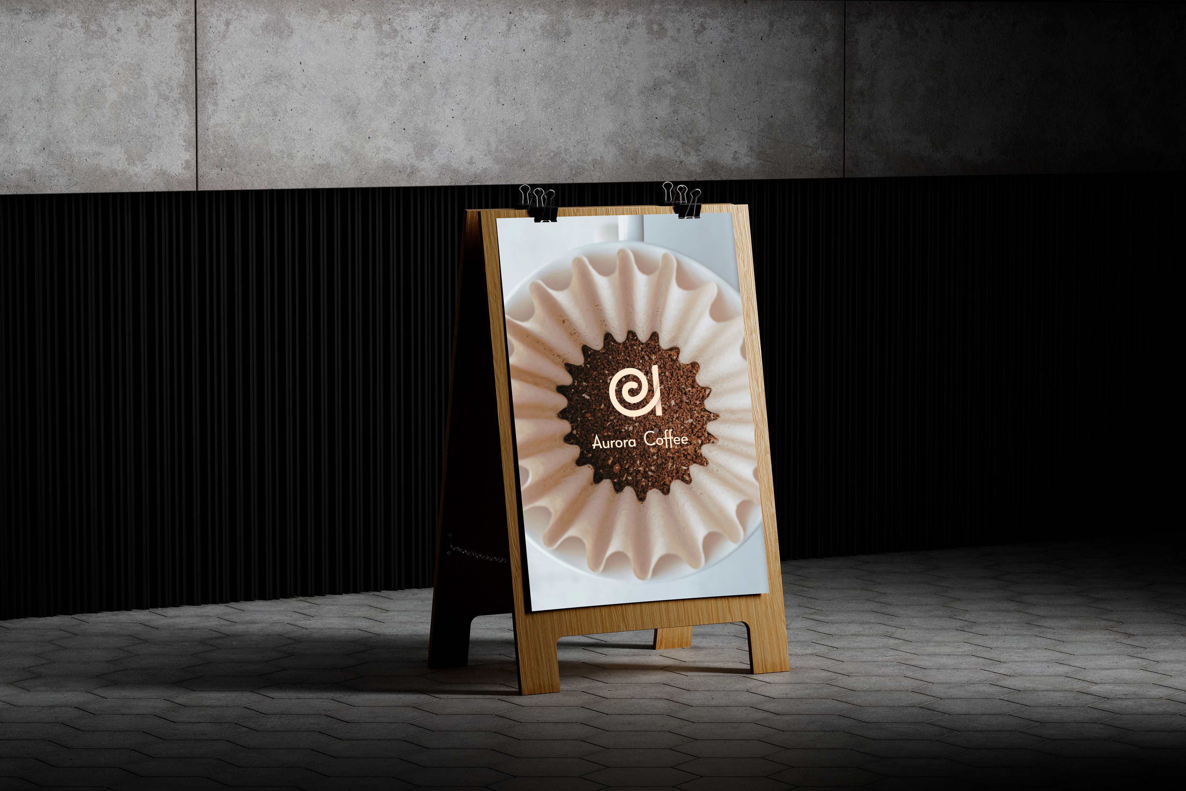
Hand brew cofee leans into the swirling themes
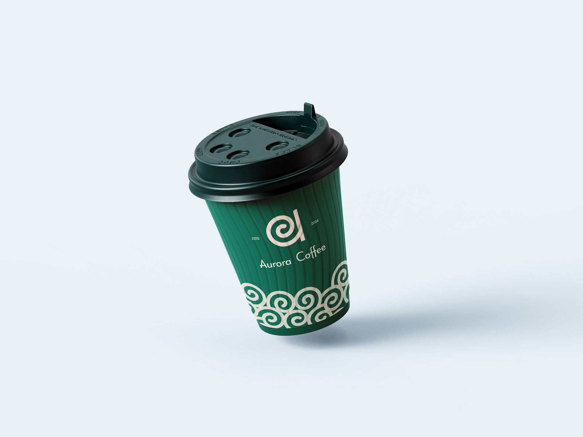
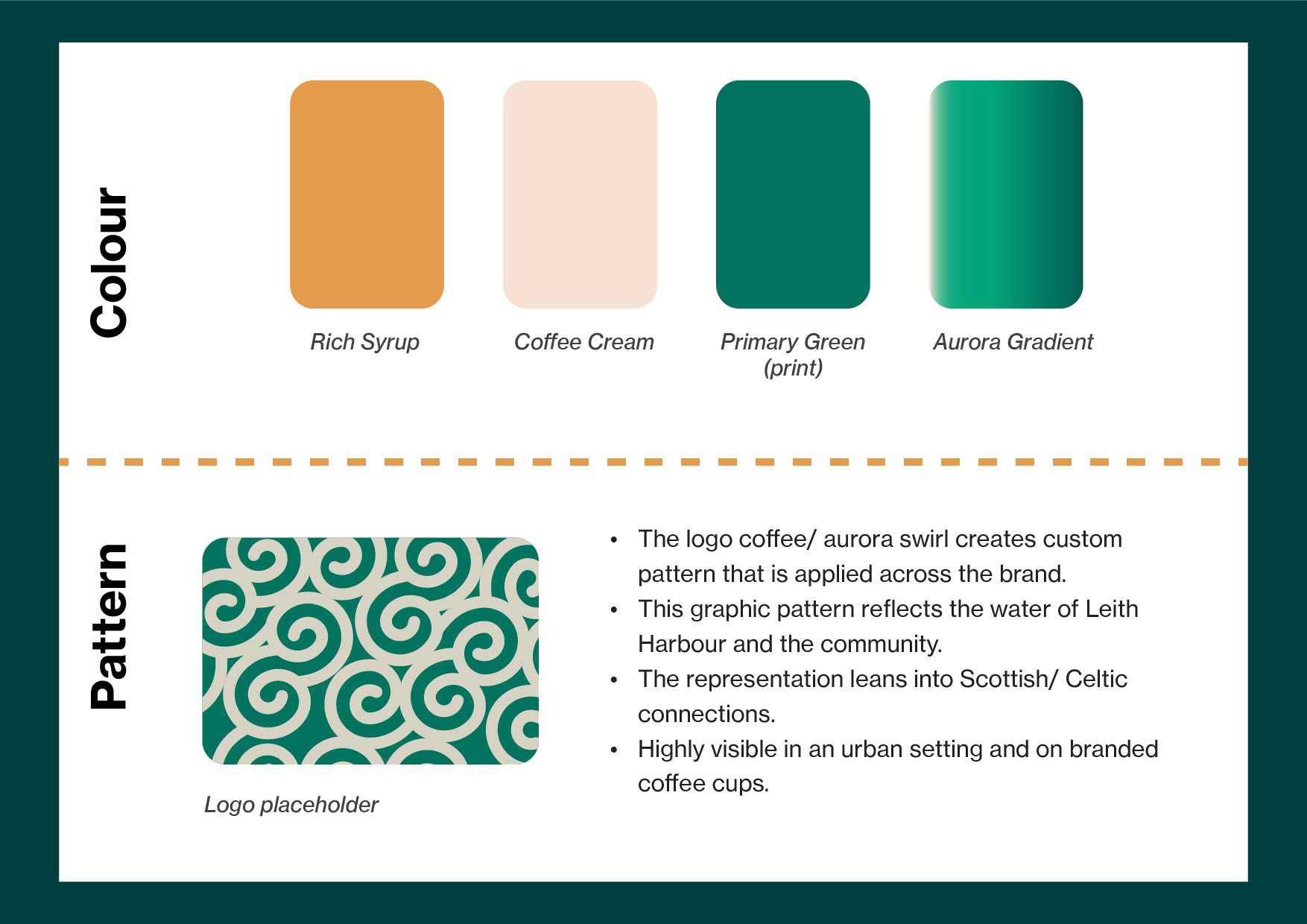
Bold pattern derived from the logo and leans into the Leith harbour, local community and Scottish - Celtic visual language. Bold and recognisable in urban environments.
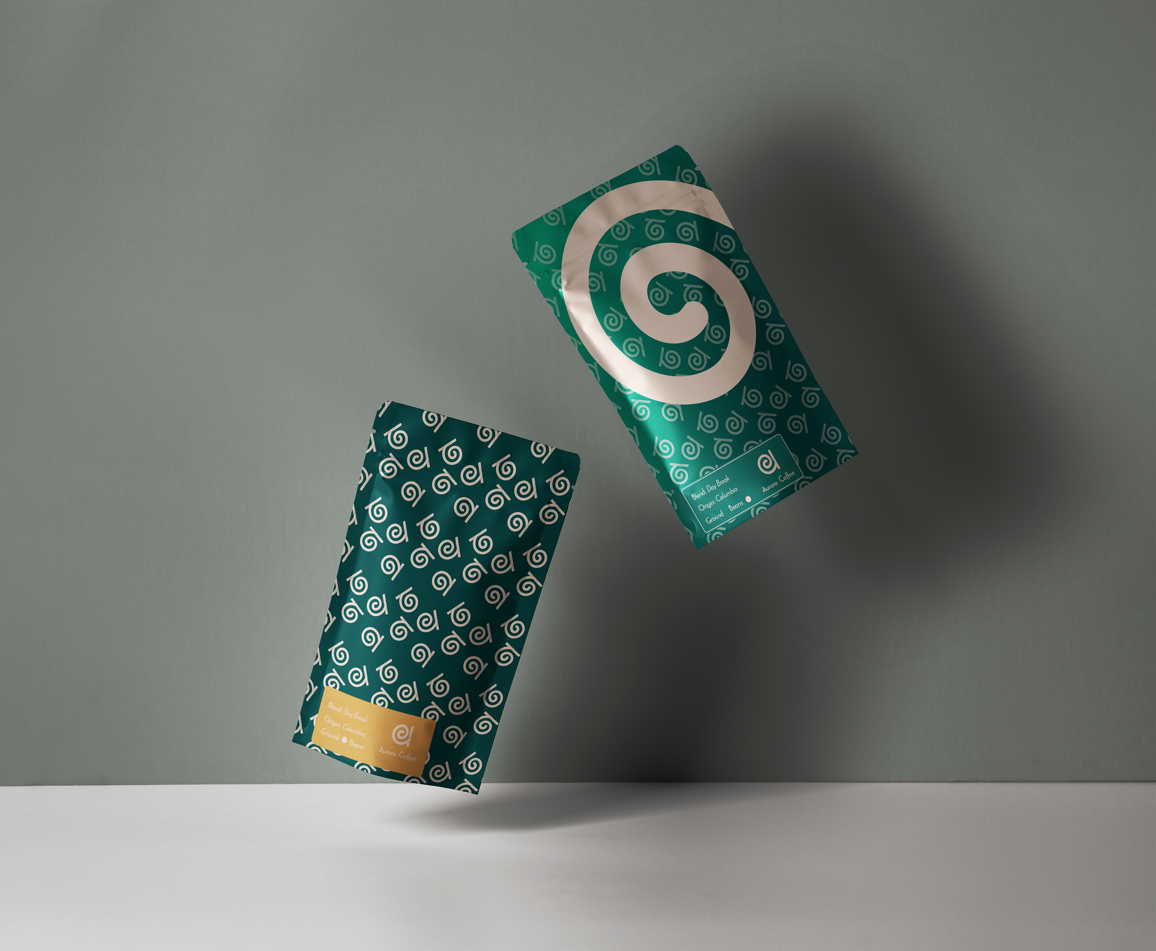
Packaging variations for in store sales.
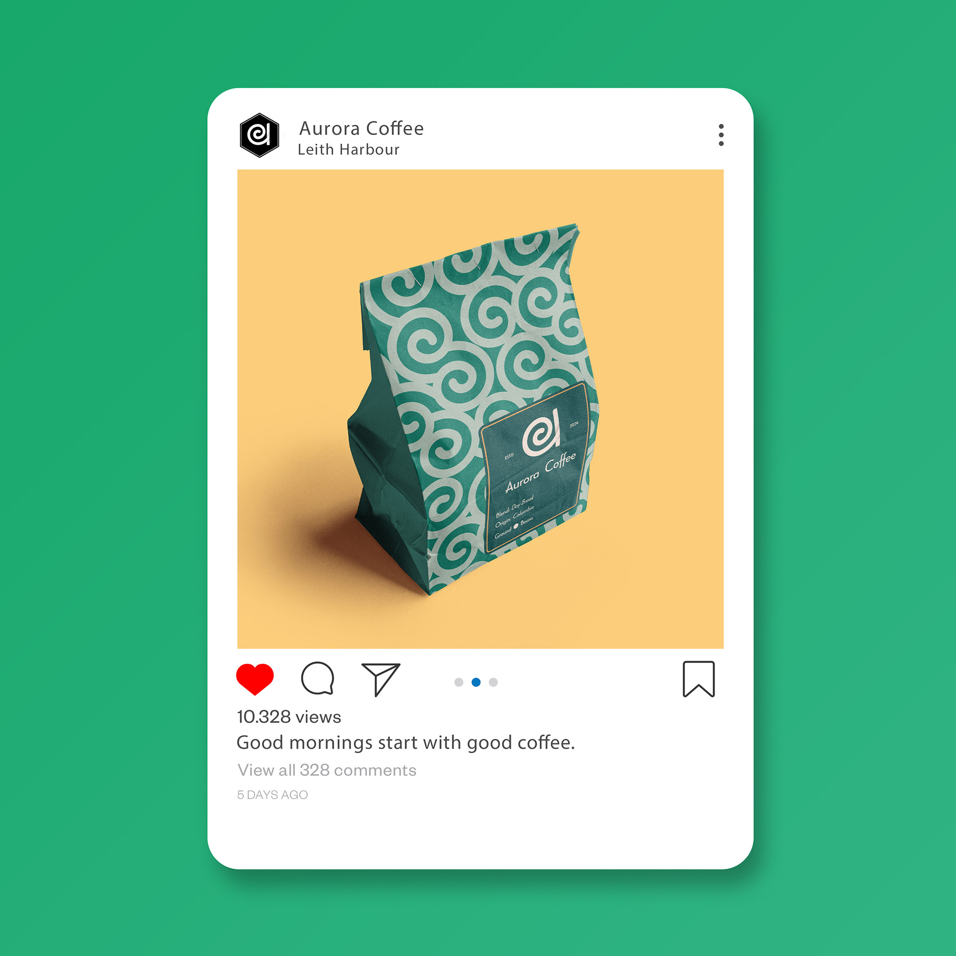
Social media promotions
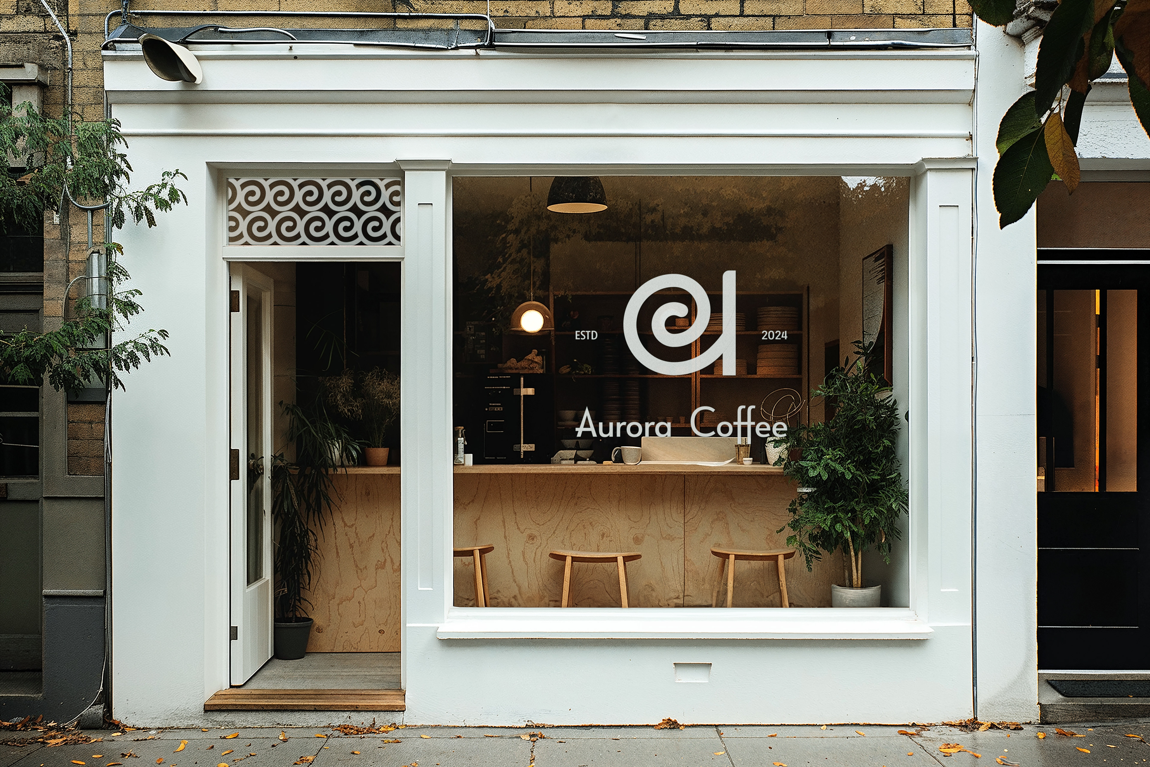
Visual representation of the brand in action.
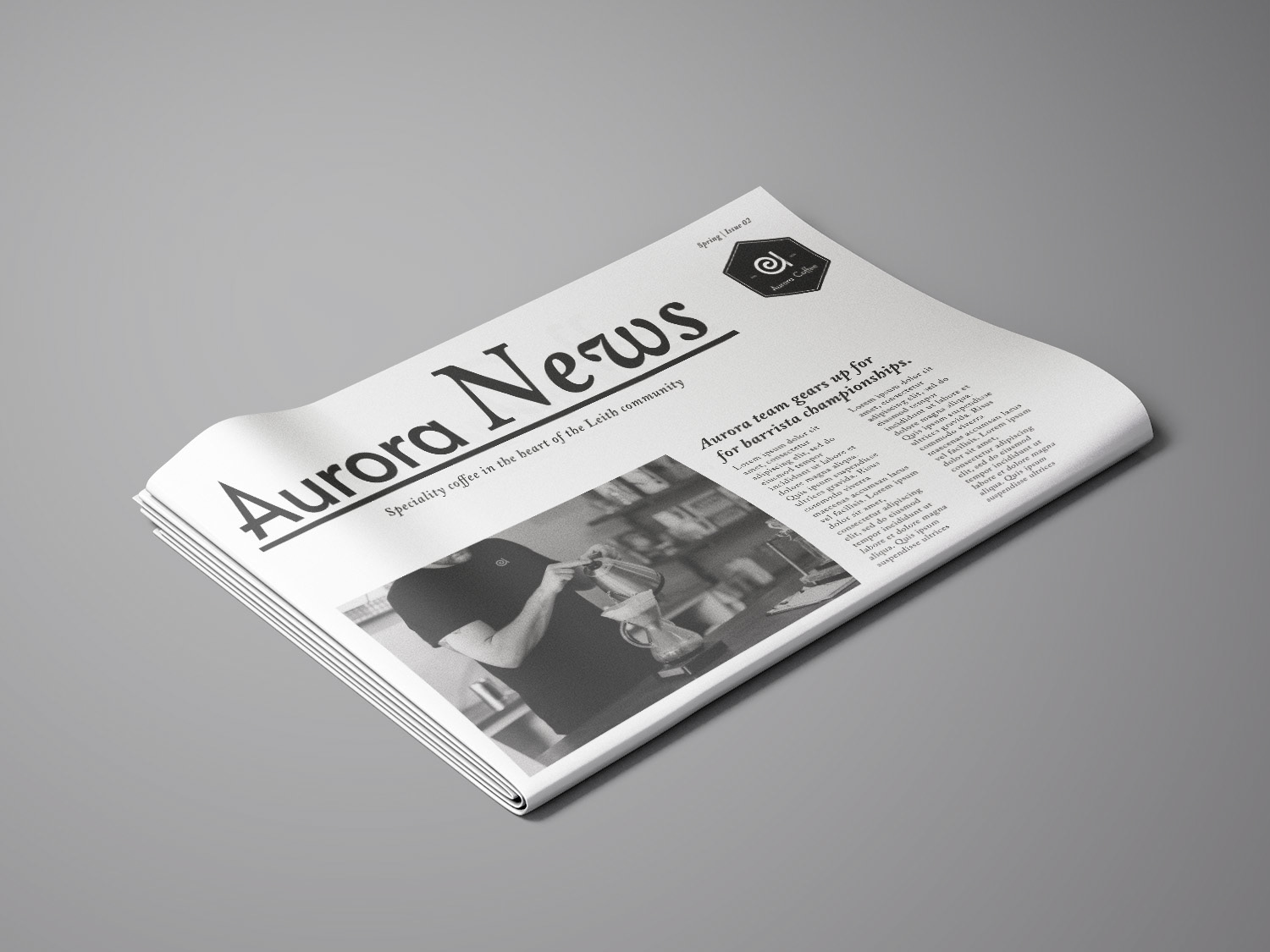
In store newspaper about the brand, the community and the speciality coffee scene around the city.
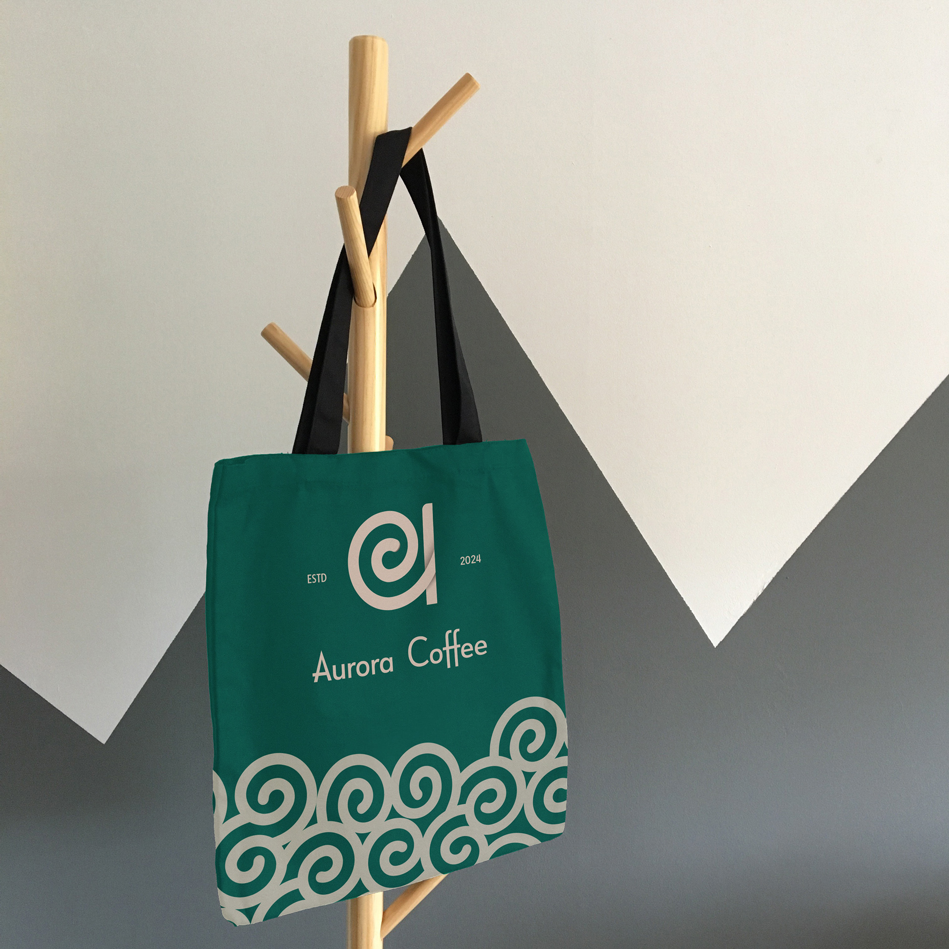
In store merchandies.